
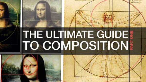
Note: This is Part One. For Part Two: Beyond the Basics, click here.
Composition – it’s perhaps one of the most important elements of photography. And with today’s technological marvels in lenses, it’s an even easier thing to forget – especially when bokehliciousis is so much more fun to talk about. Your composition is how you see – and that makes it infinitely more important than how out of focus the background is.
Obsession with bokeh is bad for your photography. There. I said it. I know it's not a popular opinion when there are a lot of people out there that drool over this very thing. Bokeh not only lets you obsess about something pretty insignificant, but it oftentimes makes for lazy composition. Henri Cartier-Bresson, Richard Avedon, William Eggleston, Alfred Eisenstaedt. These were not photographers obsessed with the shallowest depths of fields – these were iconic photographers capable of producing iconic photographs built on the foundations of masterful compositions and superb timing. Forget f/1.2. Think about what's around you, and use that to build a better photograph.
Keep in mind that these compositional “rules” are really just “guides” and don’t need to be followed to exacting precision (or sometimes even at all). Not every rule of composition can work well with every scene. Overall, composition helps to bring balance. And remember, as Tony Roslund says, the most important thing is talent. “All the other stuff is great, but it won’t help an otherwise shitty image.”
Center Composition
Let’s begin with the most obvious type of composition – center composition. If one were to hand a camera to an aunt, and ask her to take a picture, she would most likely photograph the subject in the center of the frame. Center composition places the important thing in the middle. When it’s done well, it excels in the use of symmetry. Center composition is like roasting a chicken. It’s easy to do, but it’s hard to do really well.
For truly great examples of center compositions, we refer to Wes Anderson.
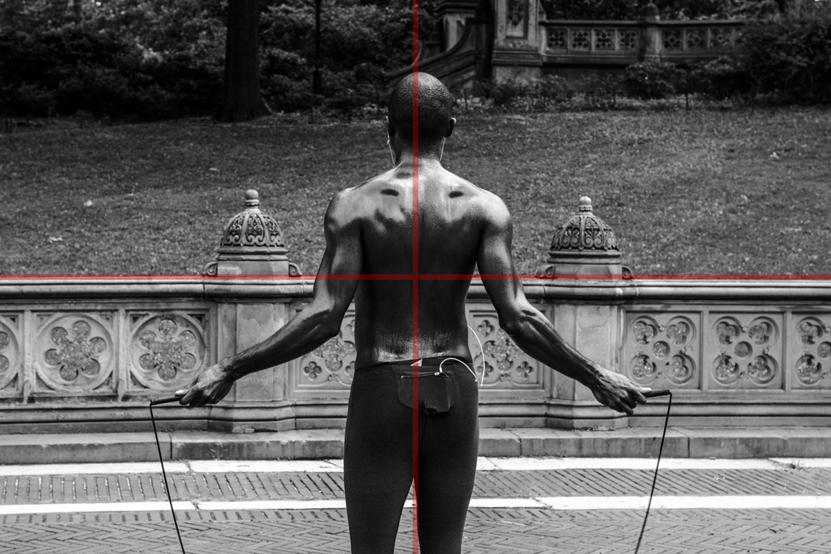
Center compositions can be broken down even farther than the overall objects and can use the position of things like facial features to actually indicate the next rule…
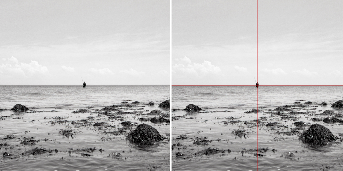
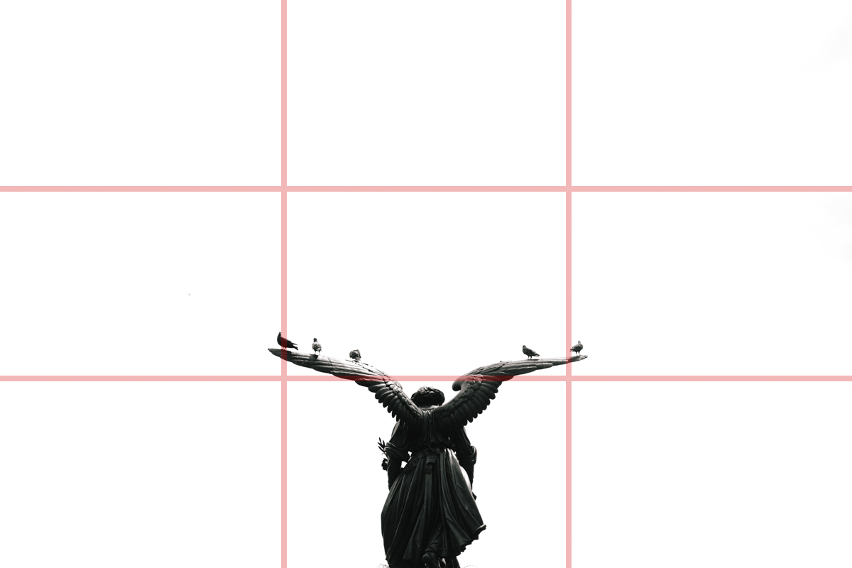
Rule of Thirds
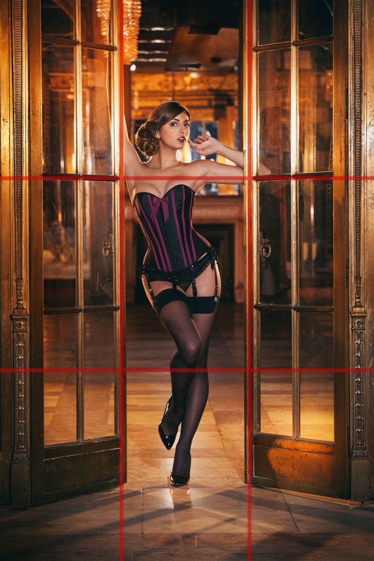
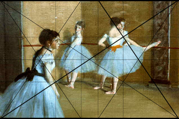
Once we learn a thing or two about composition, we start to use this. This is the first of the photographer’s “Golden Rules.” The Rule of Thirds says that an image should be divided into nine equal parts by two evenly spaced vertical and two evenly spaced horizontal lines. Important compositional elements should be along these lines or at intersections. These intersections are called “eyes.” A person’s closest eye to the camera should be placed at one of these intersections.
…or they can be much more complex, using multiple intersections and lines to draw the viewers eyes around the image.
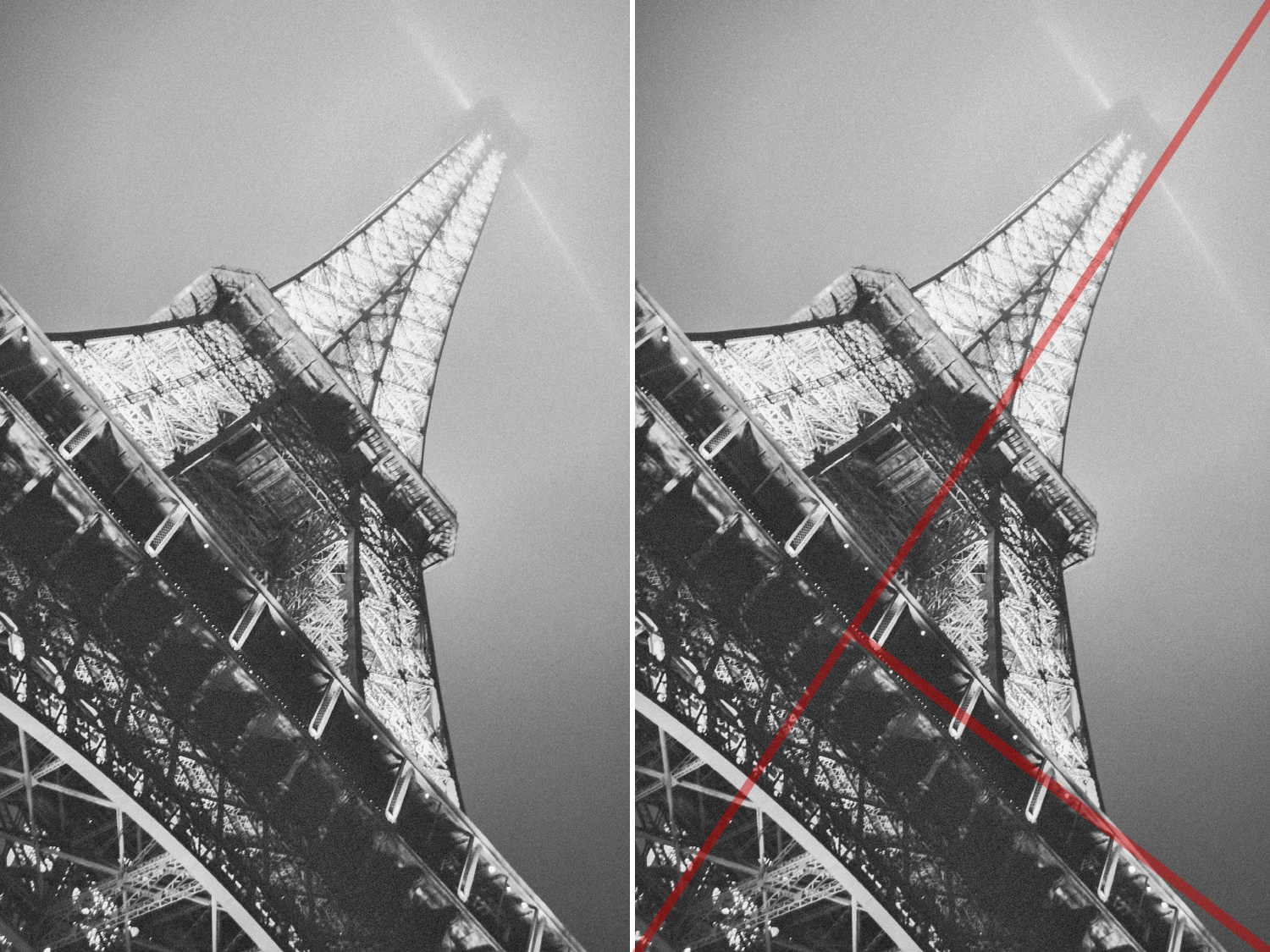
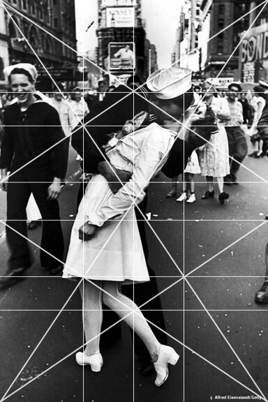
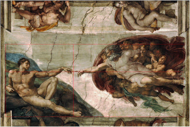
Golden Triangles
This rule works by having strong diagonal lines pass through the image, dividing it into three (or four) triangles. The strongest line (called a major line) divides and dominates the image diagonally. Then, from one corner, an intersecting line connects to the diagonal line perpendicularly (this is called a reciprocal line).
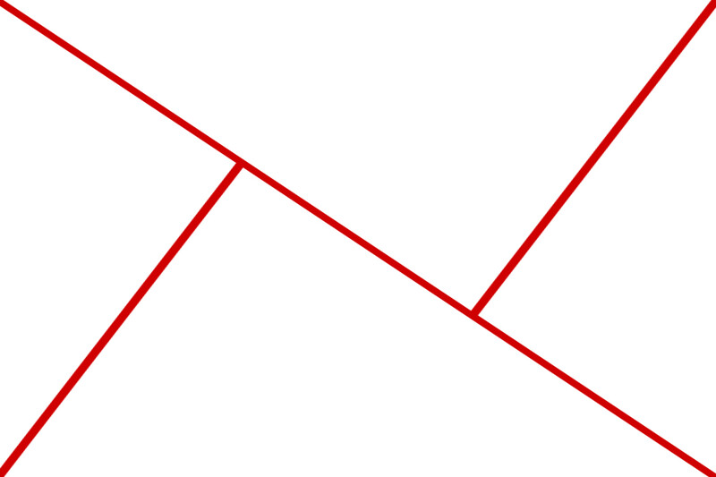
In some cases, a third line extends from the opposite corner creating another reciprocal line.
The resulting triangles all have the same ratios – also know as golden (explained much more in depth below). This works really well on images with perspective or strong architectural elements, but it also works well when wanting the subject to fill the entire frame. Putting elements of composition on a diagonal plane gives them a more dynamic presence.
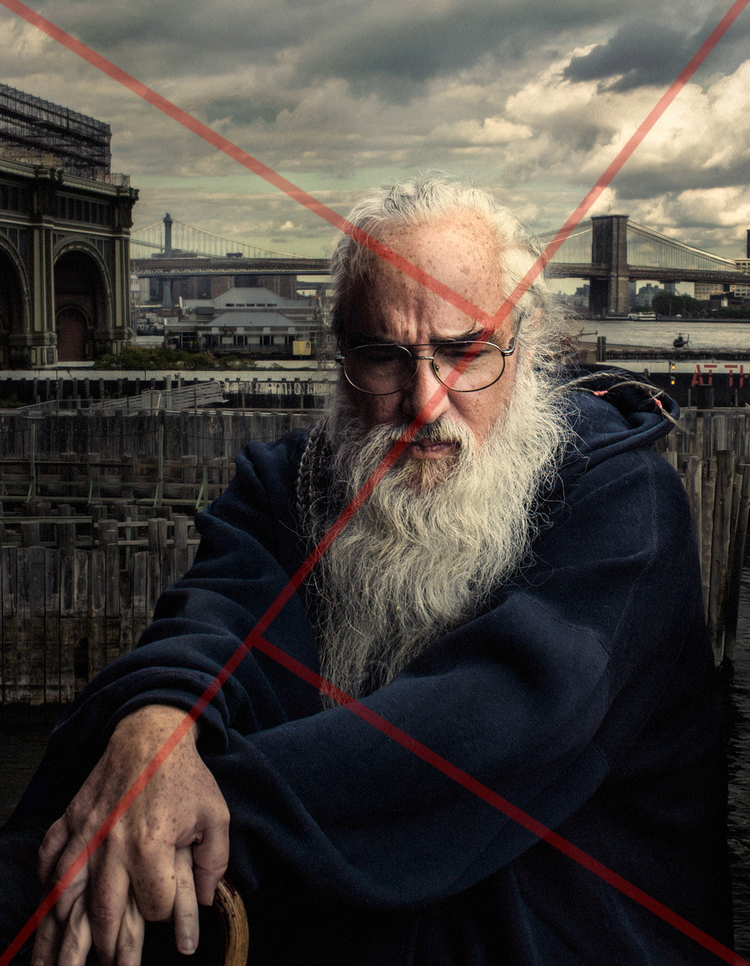
The Diagonals (Baroque and Sinister Diagonals)
One of the best things a photographer can do is study paintings and art history. Beyond the study of light, color palettes, color theory and the fact that it was the dominant visual medium for tens of thousands of years, studying great painters is the key to expert composition. When everything in a scene must be methodically arranged and obsessed over and placed just so in the frame, we are able to begin to understand why things are placed how they are. One of the more common compositions in art (do in large part to the boom of this style during the Baroque period) is using diagonal lines.
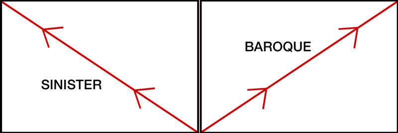
There are two predominant kinds of diagonals – “Baroque” and “Sinister”. Baroque Diagonals are read from left to right and Sinister Diagonals are read from right to left. One can only assume that this is an allusion to the notion that lefties burn in hell. In an amazing read by Adam Marelli, he breaks down the work of Alfred Eisenstaedt by using this “Sinister” composition of ballerinas.
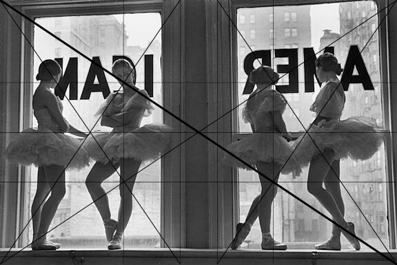
We notice the ballerina on the left (her face is at the eye and the only face visible – therefore she is the subject), looking to the right, drawing our eye in that direction across the image, creating the diagonal, and lining up with other important compositional elements (like the pointed toe). Read a much more comprehensive breakdown of Eisenstaedt’s work on Adam Marelli’s blog.
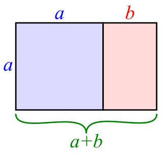
Golden Ratio / Golden Rectangles / Golden Spiral
Classic thinkers from Plato to Pythagoras to Kepler believed that geometry is a powerful underpinning of the cosmos. Plato supposedly even said, “God geometricizes continually.” Leonardo da Vinci had an obsession with proportions – creating large areas of his work around the exact proportions of the Golden Ratio. So did Salvador Dali. As this particular rule of composition is a little complex, let’s break it down.
-The Golden Ratio describes an aesthetically pleasing proportion where the largest shape is divided by a perfect square, and the resulting rectangle is in exact proportion to the original one – all the way down the drain. This, subsequently, results in a sort of spiral (more on that below).
-The Golden Ratio is best explained using the Fibonacci Sequence (0, 1, 1, 2, 3, 5, 8, 13, …) where each number is the sum of the previous two. The actual formula for the ratio is:
Algebraically, this is shown as:
This results in the number 1.618 (approximately). This is like rounding Pi to 3.14, but this number is called Phi. Using this number helps to illustrate the ratio.
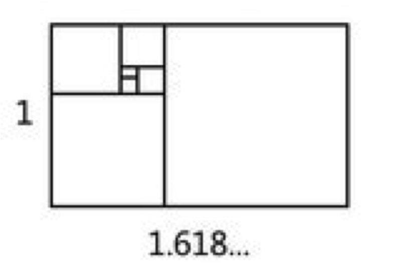
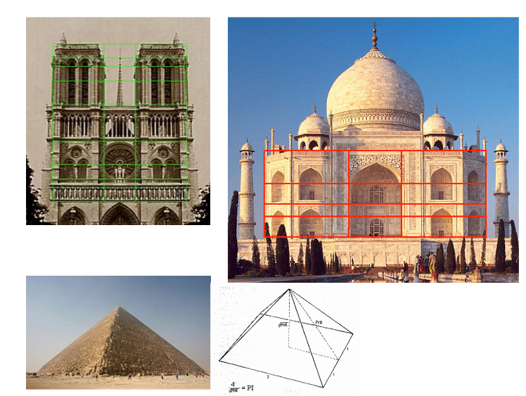
Imagine this rectangle has a width of 1 and length of 1.618. When we divide this up using the Golden Ratio, the result is that every square would have a 1:1 ratio and the leftover rectangle would always be 1:1.618. This method isn’t limited to rectangles and squares though. It also works on circles, triangles, pyramids and various other geometric forms. Theothiuacan (the pyramids of Mexico) as well as the Great Pyramids of Egypt both use the Golden Ratio. Stonehenge, Angkor Wat in Cambodia, the Temples of Baalbek, the Parthenon, the Great Mosque of Kairouan, Notre Dame and the Mona Lisa, all use the ratio. It’s found in the human body, in seashells, in hurricanes. Obviously, the Golden Ratio is pretty important. That’s because it’s EVERYWHERE.
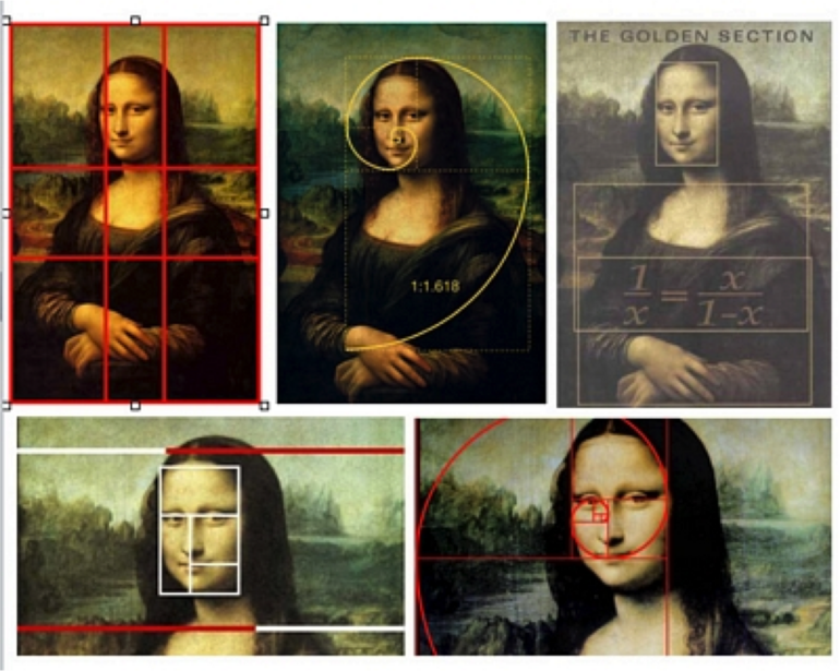
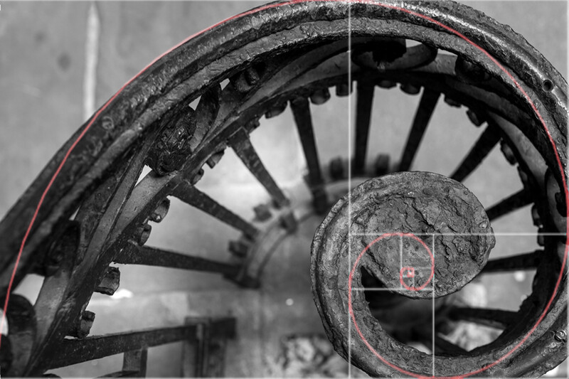
When we draw a curve along the outer edge of the perfect square’s intersection, we are given the golden spiral. It’s simply an easier way to illustrate the Golden Ratio in a more fluid way.
The second part of the Ultimate Guide to Composition discusses Frame Within a Frame, the Gestalt Principles, Negative Space and more. For Part Two: Beyond the Basics, click here.
If you're passionate about taking your photography to the next level but aren't sure where to dive in, check out the Well-Rounded Photographer tutorial where you can learn eight different genres of photography in one place. If you purchase it now, or any of our other tutorials, you can save a 15% by using "ARTICLE" at checkout.


Join the Fstoppers community for free
-
Post comments and join in the discussions
-
Browse the site ad-free
-
Share your work and get featured in the community
-
Compete in the photo contests for fun and prizes
51 Comments
so important to have in your head when you do you comp.
Completely agree!
Great article, Will need to read through a few times. Well thought out posting it on a sunday when people have more time to read through and not just skim things.
Thanks Mark!
A great review, it reminds me of my first photo class in high school and again in college. ;) It is always good to see this material every few years well presented.
I always think of this quote when it comes to composition.
"Learn the principle, abide by the principle, and dissolve the principle. In short, enter a mold without being caged in it. Obey the principle without being bound by it." - Bruce Lee
Thank you Ralph! That's a great quote!
Wow, what a quote!!
Great article.
Thanks Andrew!
That Wes Anderson video is amazing... so accurate. wow..
That guy is the master of center composition.
Brilliant summary highlighting some of the keystones to composition. This is what is no fascinating about photography to me. Looking forward to part 2!
Thanks Dave! Always appreciate the support
Awesome stuff.
Shared.
Hopefully it will improve thousands of photographers.
Thank you for the share! I hope so too!
I had no idea about all those guidelines. Which is great because I love learning new things that helps me improve!
Always glad to help!
Excellent article! Well thought out and clear, making it easy to understand the concepts. Best I've read on the subject. Well done, Chris!
Thank you Michelle! Much appreciated!
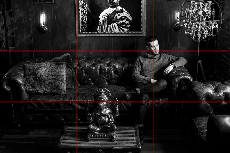
Gonna have to read through this one a couple of times. trying to figure out why all the lines are where they are. For instance the reciprocal lines in the monk painting and ballerina picture. Many seam to be just randomly drawn. Lots to learn. Thanks for writing the article
Hi Jeff! Thanks for the comment! Hopefully I can help explain a little more. In the photo of the man in the hoodie (I think this is the monk you're referring to). There is a dominant line from the bottom left corner to the upper right. The hands and the face line up with this. The reciprocal line on the top left uses leading lines from the building to correspond to the mans face. Hope this helps!
Thanks Chris. Yes I meant the monk in the hoodie :) I look forward to your next piece.
This is fantastic information. I think most know this but forget the geometry in every picture or the moment passes quickly that there is no time to incorporate the latter patterns in the shot . I dont mind if its landscape , portrait great you have the time , but for most shots it tends to be get the shot before the moment is gone .
I think most people generally search for visual balance in their photos. But I have noticed, that when I've spent a great amount of time studying, these guides become second nature and I'm able to capture them before the moment is gone. All it takes is practice...just like anything else.
Sometimes it's just nice to just take a photo!
It's always nice to take a photo!
Man paints since thousands, not millions years.
Other than that, the golgen ratio was proposed much before Fibonacci (the proportion between member of that serie, one against its precedent trends to it).
Euclides drew a line divided in two parts in such a manner that the proportion between the whole and the largest part is equal to the one between the large and the small.
Thanks for the comment George! Humans painted on caves millions of years ago, not thousands - unless the earth really is only 5,000 years old. The golden ratio was used long before Fibonacci - about 2,400 years ago! Fibonacci is created with discovering his sequence not even 1,000 years ago. Phidias precedes even Euclides with his design of the Parthenon - which I mentioned above alongside the Great Pyramids and other structures. His sequence just happens to describe the golden ratio / spiral / rectangles the best and most accurately.
The oldest human paintings we have notice about are from around 20.000 years ago.
And yes, the golden ratio is not based on Fibonacci as your article asserts, but rather the opposite.
I stand corrected!
Awesome article Chris. So many photographers struggle with this stuff.
Thanks Michael! It's true! It's uses lot of brain power when sometimes all we want to do is push the button.
Thanks Chris. I've recently taken to analysing my own composition using the various overlays available in Lightroom's crop tool. At first I was cropping a fair amount of my work, but as I progressed, I became more adept at framing the shot with these principles in mind. I'm not there yet by any means, but your article is a timely reminder of the importance of these artistic principles.
Thanks for the comment, Paul! Keep up the good work!
This article needs to be read more than once to understand its real significance. Great job Chris, and thank you.
Thank you for the reply, Roberto! Glad you appreciated it!
Thanks for taking it as far as you did. This was some great information.
Thanks Gabe!
is something wrong with server/my browser? I don't see any article here
nice article. I once thought about writing something similar due to a discussion obout how I cropped an beauty image
http://edgeworld.de/?p=552
Thanks Daniel!
So thats why Wes Anderson movies are so boring. That along with dull scripts.
"Obsession with bokeh is bad for your photography. There. I said it."
Obsession with any photographic effect is bad for your photography. Instagram immediately comes to mind...
Great! Thanks for not missing the point!
I was looking for something talking abot compositions just like this. Thank you very much!
I comment so late in the string. But here I sit in a Marriott hotel eating my eggs and hardwood bacon... all of which seem so geometrically pleased sitting on my plate. Indeed, composition is everywhere awaiting an ignited mind
Just a pointer: you said: "Theothiuacan (the South American pyramids)"... Theothiuacan is in Mexico, and that is part of North America.... I know that "North America" is understood as "United States"...but geographically Mexico (with Bermuda, Greenland and St. Pier and Miquelon) is part of it also... :)
Thanks for catching that. My mistake.
Fun fact: Sinister comes from the latin word SINISTRA. Which means LEFT. Not Left-Handed. Sinistra dexter means left-handed.
Full definition:
The Latin word sinistra originally meant "left" but took on meanings of "evil" or "unlucky" by the Classical Latin era, and this double meaning survives in European derivatives of Latin, and in the English word "sinister".
Now if my memory serves, it took on the meaning of Unlucky/Evil, becauuuusse who sits at the right hand of God? Jesus. Who sits on the left? The devil. Yup. I wish I could make this stuff up. So the SINISTER diagonal, is just a left diagonal :p like a Camera is short for Camera Obscura (aka A dark chamber)... Artists... we are witty beyond repair.
DEFINITELY loved this article and now I need to think more... or think less.. I don't know.
It would be a no brainer for Camera manufacturers to have this be a heads up display in the view finder, I know you can get grid on 'live view' but thats terribly slow to shoot with. So I have to try and imagine it..meh..