
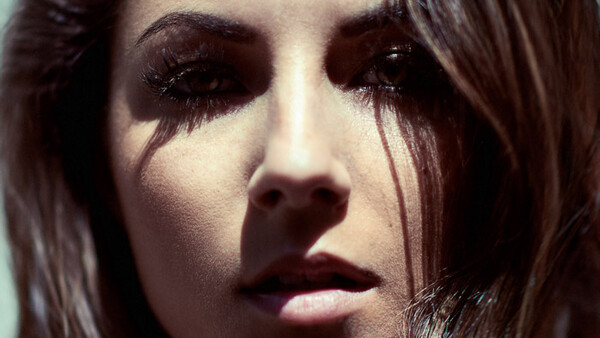
For most beginners, distinguishing hues, or noticing over saturated areas, can be an issue. Even some most advanced retouchers still have problems color correcting their images. Reaching the point where our eyes see colors properly takes time and a lot of practice. Fortunately enough, visual help layers in Photoshop can aid us separate luminosity, hue, and saturation. In this article, I will show you how to isolate the latter two to facilitate your color correction.
How to Isolate Colors
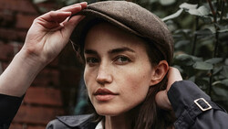
An image is made of luminosity, hue, and saturation. Using Photoshop, it’s very easy to separate one from each other. For example, removing luminosity will leave you with just hue and saturation, otherwise called color. This is the first visual help layer I’ll show you as it can actually replace the next three if you get used to it.
If you are used to dodging and burning, you are probably familiar with the turning your image to a neutral black and white. The process here is almost the same. First, we must create a blank layer filled with 50% gray – a solid color layer will do just fine as well:
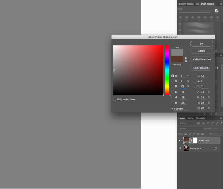
Now, to remove the luminosity of the image, we change the blending mode of the solid color layer to Luminosity. It will neutralize the picture and display only hue and saturation.
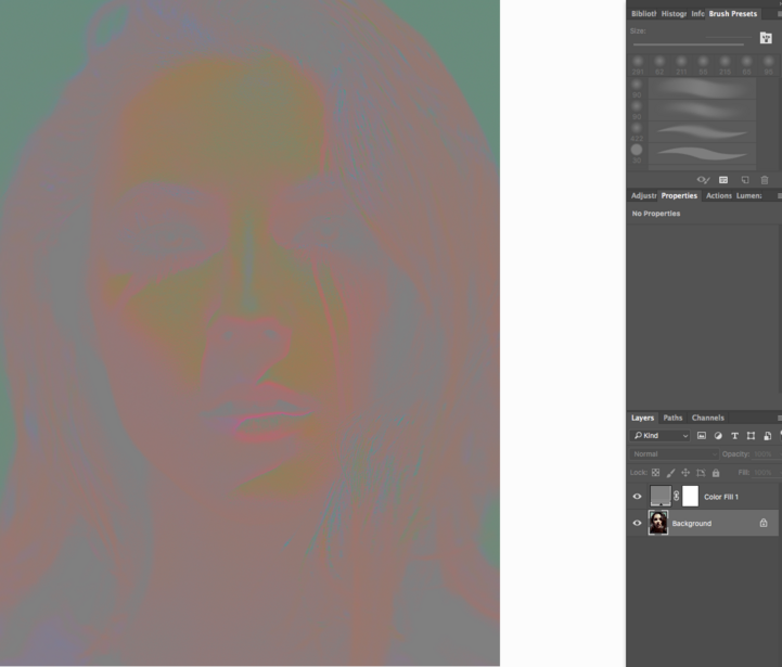
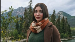
As you can see in the example above, some areas on the lips are over saturated (neon pink), there is some purple in the bottom left of the image, and the cyan might be a bit too strong in some areas.
Spot Hue Differences Better
The visual help layer seen above keeps both saturation and hue visible. However, sometimes it’s easier to correct one at a time, especially if you are not really good at distinguishing colors.
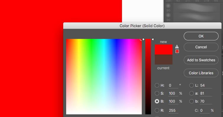
The hue aid layer is not much more complicated than the previous one. We start by creating a new solid color layer as well; only we fill it with a fully saturated color this time:
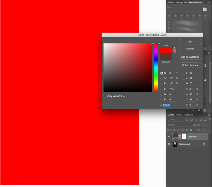
I chose red, but you can pick whatever hue you wish. It doesn’t matter. The only crucial thing is to have a fully saturated color. To make sure it’s the case, in the color picker of the solid color layer, check that the S and B channels are at 100%.
Once everything’s ok, change the blending mode to Saturation. It will fully saturate the image, while keeping the luminosity and hue intact.
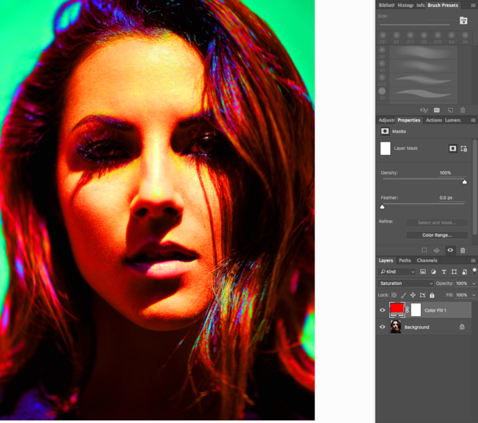
As you can see, the purple in the bottom left of the picture I mentioned before shows clearly here. Some green and yellow in the hair as well.
Find Over and Under Saturation Areas Easily
The saturation help layer is a slight bit more complicated. Or at least it requires more time to create, and I would advise creating a script or an action for it if you plan on using it often.
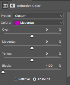
Create a new Selective Color adjustment layer, then for each color (reds, yellows, greens, cyans, blues, and magentas) pull the black point down to -100%.
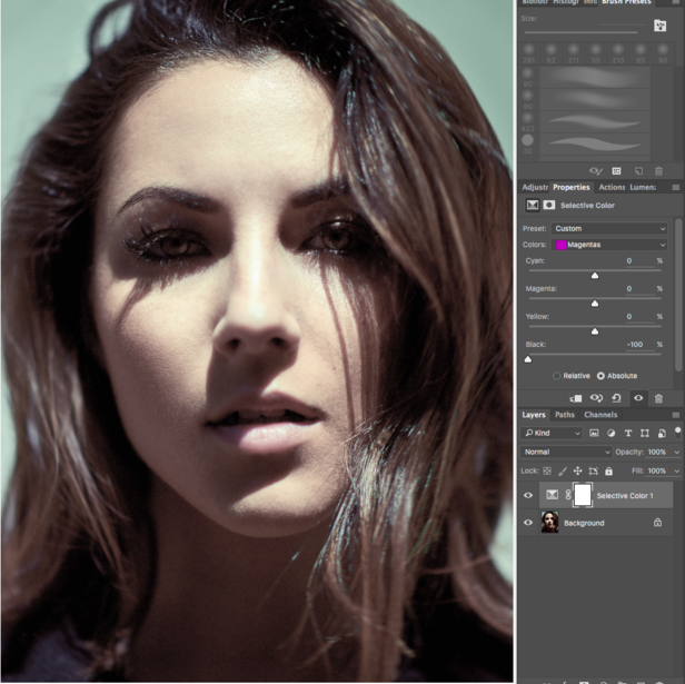
At this point, your image will look much flatter than before.
Then, for the three remaining channels (blacks, neutrals, and whites), push the black all the way to +100%, and change the blending mode of the adjustment layer to luminosity.
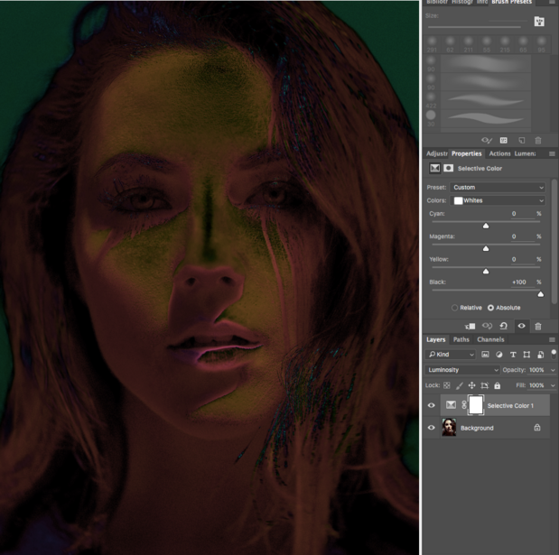
Any fully saturated area shows as white and any unsaturated zone is black. As I noticed with the first visual help layer, there is an over saturated (fully saturated) area on the lips, as well as a few zones that could use a bit of desaturation in the hair as they are as almost white.
How to Make Sure Skin Tones Look Good
Finally, for portrait, beauty, and fashion retouchers there is a good way to make sure you subject doesn’t have an oversaturated skin.
Start by creating a vibrance adjustment layer and remove vibrance totally.
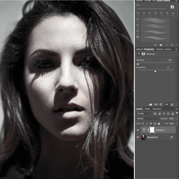
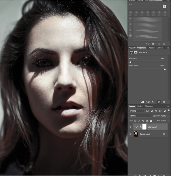
Vibrance doesn’t affect zones that are close to being fully saturated or that are skin tones (red/yellow mainly). So by pulling the vibrance slider to -100% we removed saturation everywhere but from the skin tones and very saturated areas. Thus making it easy to see where saturation could be adjusted a tad. You can make it even more apparent by cranking saturation all the way up to +100%.
All of these aid layers are easy to create, but they can be generated by an action just as well. It’s always a good idea to double check your colors when you finished retouching your image, especially if it’s meant to be printed. An oversaturated area will definitely not look pretty once on paper.
Also keep in mind, while these simple layers will help you to see hue and saturation better, they do not replace a properly calibrated monitor. These techniques are just meant to assist your eyes to separate each "layer" of the image, not make up for a bad screen.
Join the Fstoppers community for free
-
Post comments and join in the discussions
-
Browse the site ad-free
-
Share your work and get featured in the community
-
Compete in the photo contests for fun and prizes
7 Comments
Awesome tips! I can see how these will be of value. Do you have any suggestions on how you might go about correcting the offending areas? Would it be something as simple as adding a hue/sat adjustment layer with a mask and painting in more/less saturation?
It depends on what you want to correct. Saturation can be corrected with a Hue/Saturation or Vibrance adjustment layer, Hue can be altered in many ways (curves, levels, hue/saturation, selective color, etc.). I would always recommend using an adjustment layer as they are non-destructive and will let you mask everything but the zone you want to adjust.
Speaking of masks, you can actually go one step further and create luminosity/saturation/hue masks to isolate the areas you wish to correct :) Hopefully I'll find the time to write on this topic soon and get more in depth about the "how to correct" part.
One of the best most helpful articles on retouching i've seen in a very long time. Thanks for always putting out such quality work!
Excellent article! This will certainly be saved to my retouching reference folder.
My go-to WB cheat in Lightroom is to bring up saturation and vibrance to full blast and fine tune WB from there, then bring the sat&vib levels back down. It's helpful for working in tricky spaces where there is no true neutral to work with (or where the wb card wasn't quite effective enough). It also makes it easier to reduce color casts with the adjustment brush because any changes made are obvious when your image is overly saturated to begin with.
Can you do a Video on this? :)
Thanks so much for the post!
I'm color blind and this aid layers could be a good help for me. Are there more help layers?