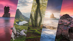
When speaking of retouching, most people think of cleaning skin and altering the body shape. However, retouching goes further than that. Colors play such a significant role in an image, that forgetting about them would be a great mistake. Just like a good makeup artist shouldn't limit their job to the model's face, a good retoucher shouldn't stop the job with cleaning skin.
In recent years with frequency separation becoming more and more popular, it seems like people have forgotten about color harmony and working on image tones. I won't blame anyone for doing so because it happened to me as well. Working on the technical aspect of a picture in Photoshop seems much easier than trying to perfect the toning of an image. Removing imperfections is quite easy because everyone can see most of them with very little practice. Then, it's mostly a matter of being able to be more or less precise with negative dodging and burning and the clone stamp tool to get great results.
With colors, the story is quite different. Firstly, not everyone can see them perfectly making it difficult to get the better out of an image. Secondly, colors are not easy to learn and master. In fact, most big video productions have a colorist to get the most of out of their images. A colorist is in charge to alter colors on the footage to create the desired mood but also to have something consistent across all the sequences.
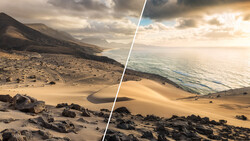
In photography, the use of colors is very much the same as in video. The biggest difference I find between photography and video is that people starting out in photography tend to retouch the crap out of their pictures and leave coloring alone, while videographers tend to work on color more and leave VFX alone. Neither approach might be perfect, but I think as photographers we should spend more time on colors. An amazing color grading can turn a good image into a world-class image. You can have the best content ever, the greatest lighting possible, and most beautiful texture, but if the coloring is not up to par, the result will never be outstanding. Colors have that power of creating a mood and transmitting emotion, something we should all use in our images. The same goes with toning for black and white images.
Natalia Taffarel, famous for her high-end retouching work, recently answered a couple of questions for RAWexchange. One of them was about finding the perfect skin tone. Her answer is worth the watch. She speaks about color harmony and its importance in retouching, as well as the fact that there is not a single perfect skin tone, but rather a multitude.
If you enjoyed this short video from Taffarel, I am sure you will want to learn more from her. With over 10 years spent as a high-end retoucher, she has developed quite an extensive knowledge that we probably can all learn from. Wacom just announced a webinar featuring Taffarel next Monday on Google Hangouts. She will talk about dodge and burn, light, and most likely about colors as well (as X-Rite will also be part of the webinar). To join in, head over to the Google Hangout.
[via RAWexchange]


11 Comments
funny thing is that almost everyone pro photographer know all these color wheels etc but almost noone can do something like that
http://cs628326.vk.me/v628326214/1fb1b/otQRIC-glBc.jpg
http://cs629316.vk.me/v629316214/1904e/yogOrSPDZH0.jpg
http://cs622628.vk.me/v622628214/3c8c9/ZlANr_MNgRA.jpg
http://cs624217.vk.me/v624217214/42aef/sfYg0ngHpm8.jpg
http://cs622416.vk.me/v622416214/491f0/PWLdhgCNw4E.jpg
Thanks for the interesting feature, Quentin. It would be great if there was a follow up, "How To Create...." tutorial.
This is a nice video... tried something like this to get this skintone... How is this?
Looks good..... do you have the link to the skin tone color wheell?
What was the color wheel she used in this video? do we have the link?
There you go: http://colorschemedesigner.com/csd-3.5/
The full article from RAWexchange is also available in english:
http://www.diyphotography.net/the-power-of-color-and-color-harmonies-in…
Hi Quentin, thank for this article. But I still have many question in mind. What we learn here for the skin tone can be apply to the whole picture ? So what are the color that I have to consider the most ? In my case (see the picture below), I have dark red (grappe) and purple : according to the wheel, for analogics colors, the skin should be orange ? Isn't it wierd to have an orange skin ? And where should I apply the orange, in the mid tones ? in the shadows ? the highlights ?
Thanks for your answer
Michel
PS : Sorry if it is not written in good english but i'm French.
It's also funny having the words "color/tone" and "perfect" in the same context, while addressing an audience through the internet; you know... youtube videos, random user displays... :D