
In a recent article, I shared a selection of easy-to-avoid photo editing mistakes. Today, it's time for five more. Some of them might sound obvious, while others are more subtle. What they all have in common: they can ruin an otherwise great edit.
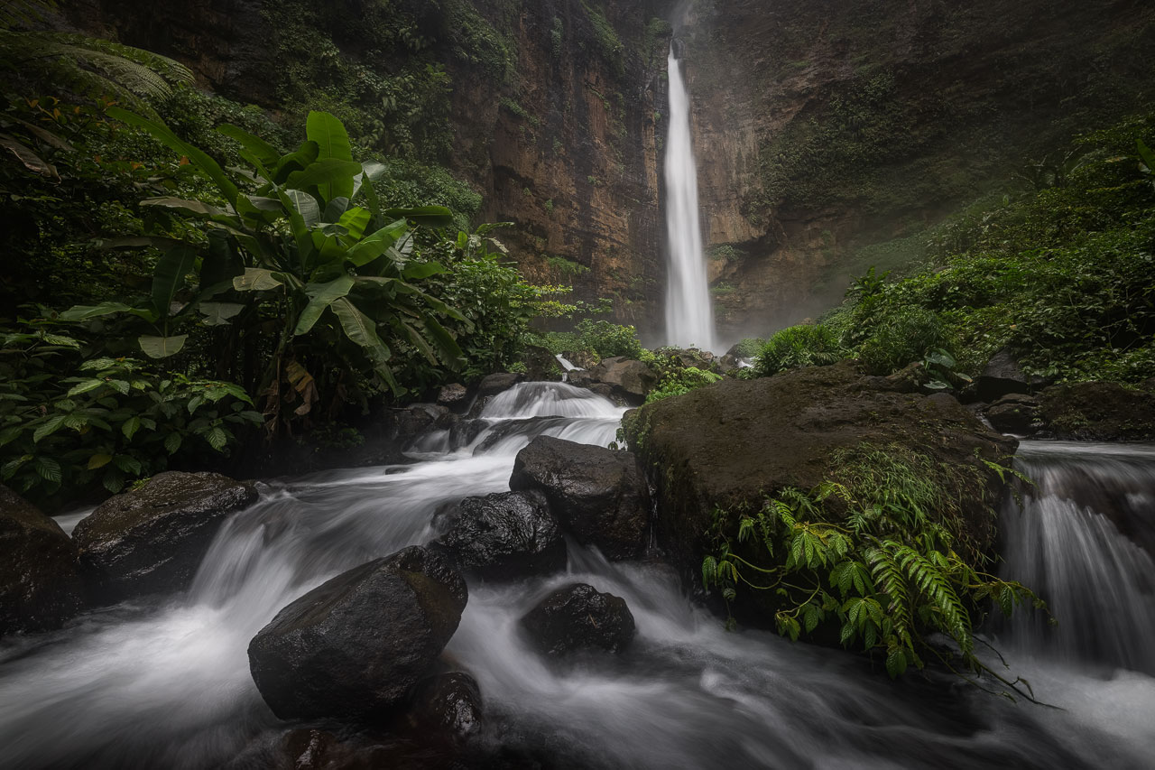
Too Strong Image Transformations
Image transformations can be a great tool for tweaking compositions you couldn't get right in the field. I have an article about this topic where I show techniques to reduce distractions in an image. But I also want to pass on a word of caution: whenever you transform a photo, be it through perspective corrections, scaling, warping, or other pixel-bending techniques, you affect the details of the image as well as the overall look.
While the changes you apply might improve the image globally, making the composition more pleasing and reducing distractions, you might inadvertently harm the finer details. I found that especially the warp tool is problematic because of how it transforms an image. It stretches and bends the pixels to varying degrees, and you can end up with distorted details if you are not careful. Perspective transformations, for example, are much less of a problem because there's more uniformity in how the pixels are affected.
Whatever tool you use, avoid too strong transformations, and don't postpone checking your photos at 100% magnification. It will immediately tell you if you went too far with an edit.
Being Careless With Hard Selections
Today, it's easy to create selections for various parts of an image. Thanks to AI, you can, for example, select the sky in a landscape photo with the click of a button. It can be tempting to trust those tools and quickly continue with an edit. But that's a mistake, which can cause headaches down the road.
Whatever selection tool you use, the results will seldom be perfect out of the box. Most of the time, fine-tuning is required to avoid artifacts when you make adjustments through those selections. Take the example below, where I tried to select the sky using Photoshop's built-in AI feature. It's a good first guess, but requires additional work.
In Photoshop, press "Q" to enter the quick mask mode and zoom in to 100% to check the selection. If you find flaws, correct them with the "Select and Mask" panel, which you access by pressing "Cmd/Ctrl + Alt + R". I show this in my article about better sky selections.
Another way of avoiding problems with hard selections is not using them in the first place. For many use cases, luminosity masks are the better alternative.

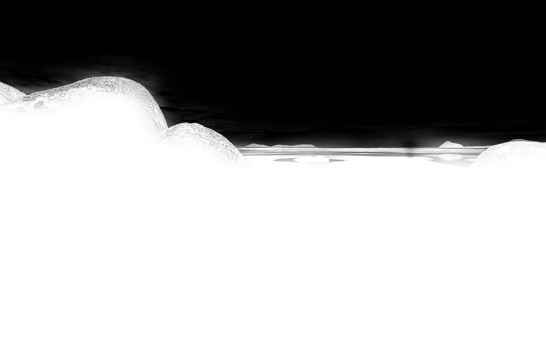
Too Much Saturation in Shadows
With the photo of the Pinnacles in Australia, I'm walking a fine line. The sunset that evening was one of the most colorful displays of light I had seen in months. In the final image, I wanted to represent the feeling of awe I felt when capturing it. That's why I focused a lot on the colors during the edit. I wanted the image to be vibrant, but not more so than reality. It was a constant back and forth between adding saturation in some areas and removing it from others.
Typically, as you add contrast to a photo and darken it, you also affect saturation, often increasing it. While this might be desirable in the highlights and mid-tones, you should limit this effect in the shadows. They often already contain a subtle blue or even magenta color cast. If it becomes too strong, the resulting image will look less clean.

It doesn't mean you should remove all saturation from the shadows. You want some of the ambient light reflected there. But checking the dark areas regularly and reducing the saturation through luminosity masks can give your photos a cleaner look.
Too Bright Reflections
Having reflections in a photo that are brighter than the reflected objects is a mistake I see a lot, and it's also a mistake I made. After I bought my first set of GND filters, my photos that contained water and other reflective surfaces often ended up with a sky darker than its reflection. It can sometimes go unnoticed until someone points it out, and suddenly, you see how wrong those photos look.
To avoid this mistake, regularly check the brightness of your reflections. If you use Photoshop, use the "Color Sampler Tool" to sample an area in the sky and its reflection. The "Info" panel will show you the colors of those samples, helping you to ensure proper brightness. In Lightroom, you can use another technique. Activate "Highlight Clipping" and temporarily increase the exposure of the photo. The sky should start to clip earlier than its reflection.
Forcing an Edit
The creative part of a photo edit should come naturally and not be a struggle. In past years, editing tools have become better and better in aiding you to achieve any vision you have for your photography. If you have to force the edit toward the final result, you might be on the wrong track. It often happens if you try to make a photo something that it wasn't.
It's better to try keeping it true to the scene you photographed. The photos I hang on the walls in my apartment are the ones that show the scenes like I remember them, not the ones where I went overboard with an edit.
I admit that I also make a lot of changes to my photos. Recreating an atmosphere inside a 2D medium usually requires more color and contrast. Sometimes, the composition needs fine-tuning via transformations. So, I'm far from a purist when it comes to editing.
But I also know if a photo is just not there. If a scene I photographed was boring, there's no point in forcing it into a direction that would make it look exciting. I rather focus my time on the images that have meaning to me and try to get the best possible result for them.
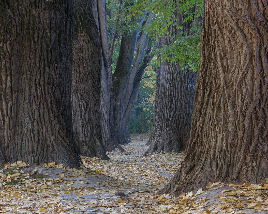

It doesn't mean you shouldn't be creative in your photo editing. There are no rules here, and experimenting is a great thing. Take the example above: I was at this beautiful alley one morning. And at that time of year, you can get fog there if the conditions are right. I wasn't that lucky and added it in post-processing. I even made a tutorial about it. In hindsight, it was a nice exercise, but nothing more.
Conclusion
Photo editing can enhance your images and bring your creative vision to life. However, you should be aware of the mistakes I share in this and my previous article in this series. Many of those are technical and easy to avoid. It also helps to come up with your own list. If you already have one, feel free to share some mistakes you see a lot with us in the comments below.


Join the Fstoppers community for free
-
Post comments and join in the discussions
-
Browse the site ad-free
-
Share your work and get featured in the community
-
Compete in the photo contests for fun and prizes
2 Comments
I really like this article for many reasons.
First and most importantly, it's really good instruction on technique/editing that we've all done.
Second, it's clear and concise, easy to understand
Lastly, and it's more of a personal thing for me, but the bullet point sections that give a good short description of the lesson/technique being taught. Without that I usually won't even watch the video. This helps decide if I want/need to dig deeper and watch the video. I've clicked on/started to watch a video and I'm familiar with what's being taught I get annoyed. I am be no means a master, I wouldn't even say I'm an intermediate in general knowledge. I know what I know and need/want to expand by knowledge, but my time is limited, so I want to know I've going to gain from my investment.
So, Fstoppers, I more articles will be formatted like this,
Title
Video
Summary/bullet points/a bit of writing.
For me, this will help me watch more of the videos. When I don't see that, I click right away.
Agreed. The writing style by this Michael is clear and concise. More importantly, it starts with context and doesn’t come off like an advertisement. I just read an article on F-stoppers that was highly irritating because it talked about a ”problem” without describing the solution in anything but the most vague terms. Actually read more like those Clickbait sites where you have to keep reading and hit next before you find out what they are talking about.
This article is the kind of content I love reading here; appreciate it. Keep it up.