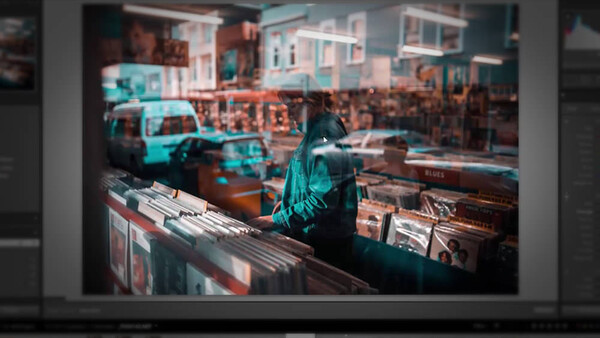
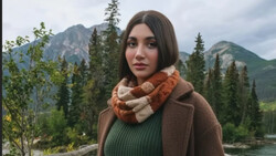
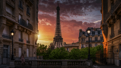
One of the strongest ways to create a style or mood, and even consistency is to really nail your color. For years I struggled with color, and it can be a subjective thing but there are also some basic colors that look good together. The most popular I would say is that of the orange and teal. Orange and teal together complement each other and this is a great video to show you how to get there quickly in Lightroom. .
You can also easily turn these settings into a Lightroom preset, and then have a starting point for your future images. Obviously, you shouldn't just apply a preset to all images without tweaking afterwards and adjusting to suit that particular image best.
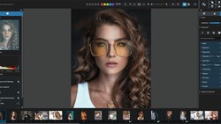
In this video, Paul talks about how to quickly get the orange and teal look in Lightroom via Camera Calibration, HSL and Split Toning to achieve the right result.
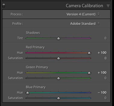
The heavy lifting of the look is done via the Camera Calibration by adjusting the red, green and blue primary hue. Red and green all the way to the right and blue all the way to the left. This will give you a great starting point for the look and you can of course you can lower it if you don't like it pushed all the way. Further refinement in the HSL can be done by using the selector point and dragging on the colors in the image you wish to change, using hue for the color, saturation for the intensity and luminance for the brightness.
These are great basics for making drastic color adjustments, and the Camera Calibration tab itself seemed to me when I first started, as something you shouldn't mess with due to its name but it's actually one of the most valuable tools to edit color.
This video is great guide for those just starting out with color grading and the author even offers you the free Lightroom preset for download.

Join the Fstoppers community for free
-
Post comments and join in the discussions
-
Browse the site ad-free
-
Share your work and get featured in the community
-
Compete in the photo contests for fun and prizes
7 Comments
OMG Image quality is horrible look in all color artifacts in the background.
Yeah, he definitely should've used a raw file for this tutorial instead of a jpg.
I agree, and always use RAW certainly :) but it does work on the right type of images, especially cityscape backgrounds.
Worst edit ever.
I don't get the popularity of that look.
No flesh tone in the world looks like that.
But one thing to keep in mind: Most of the people post on Insta.
Who cares about image quality when posting an image in post stamp size anyway?
I saw also so many bad composites and cloning on Insta, but everyone likes it, because no one cares.
That's the kind of edit you do to please the masses on Insta. But nothing professional, imho.
I can do the same thing with a 20 dollar orange filter.
RiP Destroyed Image
When you wanna be one of the cool Instagram kids! #trendy