For the past decade modern cinema has opted for the orange and teal color grade to provide a wonderfully cinematic feel, and thanks to the new tools in Lightroom you can turn your shots into cinematic masterpieces, too.
In photography, many of us are trying to achieve an image that resonates with audiences. We want something atmospheric that stands apart from the run-of-the-mill snaps that so many people take. One way to create that moody, cinematic effect is through the use of color grading.
Color grading refers to the technique used to stylize colors in particular images or videos. That is, to impart specific colors onto an image to alter its original make-up. That's what I'll be doing today in Lightroom Classic. Using the Color Grading tool in the Develop module I'll be adding an orange and teal grading scheme that is so commonplace in contemporary movies. If you're unsure of what that looks like, just think of films like Iron Man, Transformers, or Tron Legacy. If you still don't believe me, have a read of this Guardian piece on the color grading craze.
Below I'll walk you through every step to achieve the orange and teal effect in Lightroom and then show you how to refine the processing so that it feels even more cinematic, setting things apart from the everyday snap. This process works best with raw files so try your best to shoot in raw in order to make this effect work effectively. If not, JPEGs will do fine you just may not have as much versatility when it comes to color correction. I chose this shot of downtown Tokyo because of the bright lights, the gorgeous reflections, and the ton of color that appears all throughout the frame.
Start by Adjusting the Shadows
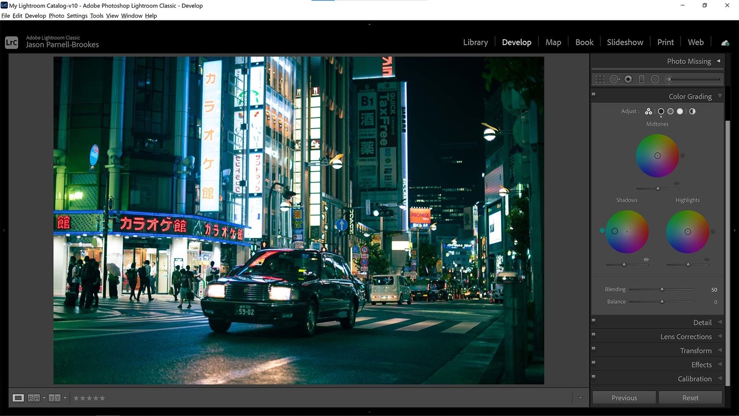
I color graded the shadows first because they were the most prominent slice of tones in my photograph
After importing my photo into Lightroom Classic I headed to the Develop module and scrolled down to the Color Grading panel. From here there are three color wheels that display in a triangle. The top wheel controls the midtones, and the bottom two control shadows and highlights respectively. To make changes to the wheels all you have to do is click and drag the selector within the wheel to change hue and color saturation.
I started with the shadows as I find it's easier to build up a foundation of color before tweaking highlights. This works especially well in this image because my photo is mainly dark because it was shot at night. I clicked and dragged in the shadows color wheel until I reached a sufficient teal hue to the shadows, I didn't want to saturate the shadows too much though because I still needed to apply my other color grades.
Next, Warm up the Highlights
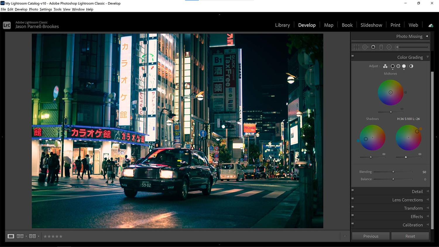
I moved to highlights next because these were the next most apparent section in my photograph. I added some orange to warm up the photograph after adding the cooler teal tones in the shadows
Since the other prominent part of my scene was bright highlights I decided to affect this next. In the highlights color wheel, I clicked and dragged until my selector was far in the orange, towards the most saturated corner in the top-right. I did this because the highlights were a little weaker than the shadows and so to get the orange hue I needed to make them very saturated.
Control Those Midtones
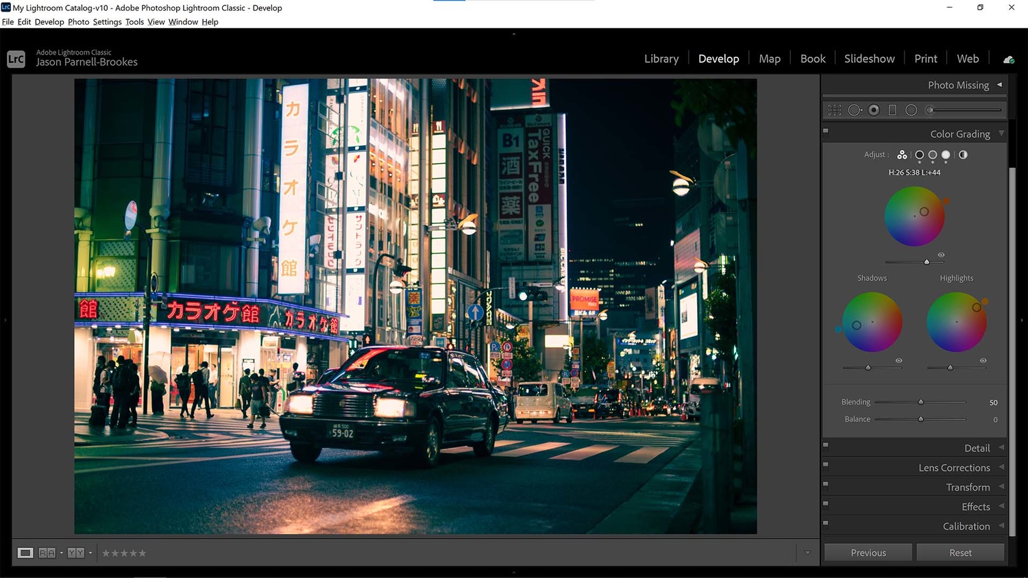
Lastly, I altered the midtones to include a slight orange hue to allow for a smoother blend between darker and lighter areas
I felt that the teal hue in the shadows was overpowering the image a little, so in order to correct this, I decided to add a little red and orange to the midtone color wheel. This lifted slightly brighter areas without subtracting from the cooler shadow tones in the frame. Notice how little I'm adding here, that's because in this scene it has a big effect on how warm the over image is. By pushing it much further the frame would be mainly orange, so striking a good balance between the colors now will help achieve the best final result.
Blend and Balance
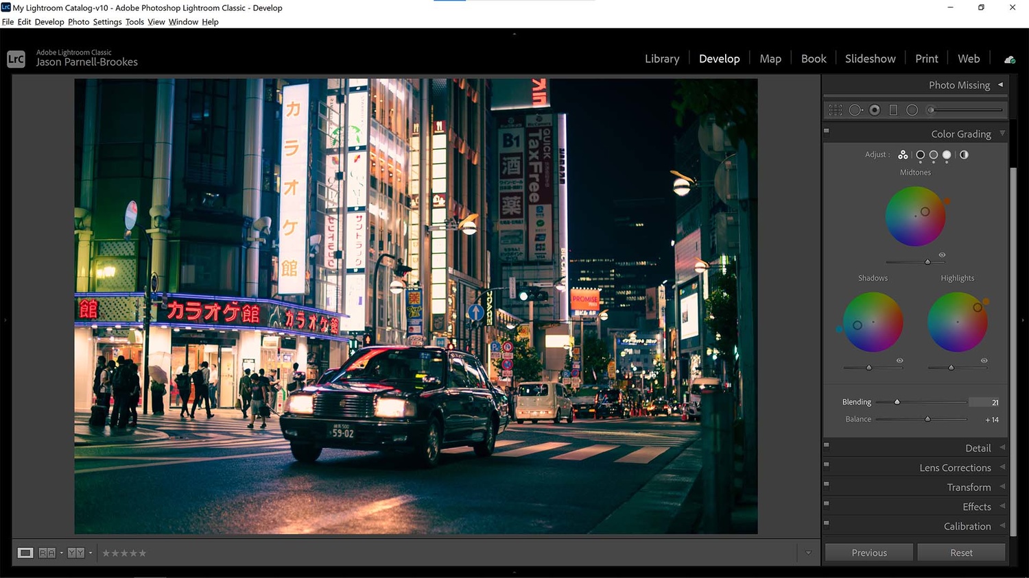
The blend and balance sliders control the disparity between shadows, midtones, and highlights making the tone blends either more or less apparent
Now that I've got my color hues and saturation amount set in the color wheels it's time to move to the sliders underneath. The blending slider will control the overlap between the three color wheels. The lower the slider amount (down to 0) the harsher the cut-off between the three color bandwidths, though it never becomes entirely harsh as there is still some residual overlap built into the tool. Throw the slider all the way to the right (100) and all three wheels overlap entirely, which provides a good soft blend but can become a little muddy for some scenes. In my photo I found a blending setting of 21 to be the best, it provided a good separation of tones between each wheel yet was still soft enough to make the scene look natural
The balance slider simply controls where the midtone range lies. Push it to the left and the midtones will be marked in the darker portions of your scene, and slid to the right it will control lighter tones. This balance is useful to manipulate the boundary between shadows and highlights as it is moved left or right. Since the shadows were already quite overpowering in this scene I moved the balance slider to 14.
Add a Final Curves Adjustment
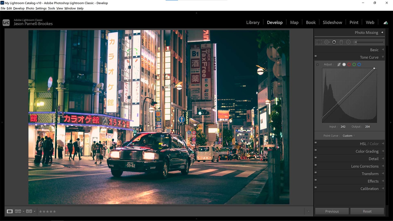
I finalized my shot by adding a tone curve adjustment to make dark blacks more gray and to brighten the highlights so they sparkled
Just as you would polish a piece of wood to finish it, so too must we finish our photograph to give the desired look. I decided that I wanted to enhance that cinematic, atmospheric effect even further by lifting the darkest sections of my scene so that the shadows were muted, giving it a matte effect.
To do this I scrolled up to the Tone Curve panel and raised the shadows point in the bottom-left of the histogram up slightly, held against the left wall of the graph. This changed the darkest blacks to a more muted gray but it's important to remember that any change you make to the histogram's control line will have a knock-on effect throughout the shot. My highlights were a little underwhelming now so I brightened them slightly by dragging the highlights control point in the top-right corner of the box to the left so that the line now fell more or less parallel to the original baseline in the box.
Once you have some experience with the color grading panel in Lightroom it's relatively straightforward to recreate the orange and teal effect across almost any image. It can be a little tricky to stylize a selection of photographs together though, especially if they have very different lighting. But with a little tweaking and some careful balancing, it can be done quite quickly. Of course, it's not just the orange/teal effect that color grading is great for, it's also useful for some fantastic stylized effects for any number of color combinations.


There are about a bazillion O and T presets out there or you can DIY. Or not...just go easy on it so it's not so obvious that it's the "latest" trendy look.
I guess to be picky, lifted blacks are pretty uncommon in "cinema". That's more of a "film" or "antique" look that comes from various imaging artifacts like a faded print or a poor scanning job. That's a totally valid and artistic way to color grade, but if you're emulating movies I think the black point should remain closer to 0 and the deepest shadows should remain neutral in their color.
Thatcher Freeman it's extremely common to use diffusion on the lens of a camera (ie a black pro mist filter) they lower the contrast in the shadows and cause halations around the highlights...very similar look as to what this is trying to achieve... it's not just a film look.
I'm familiar with those filters, but even when those are used, the colorists in Hollywood will still set the black point to be very close to zero, and also make sure the blacks aren't tinted in an unnatural way. Sometimes the *shadows* will be tinted, but the darkest blacks will remain neutral and dark in the overwhelming majority of films that I have seen. You can see that in the final image made in this article, the night sky in the top right is both tinted blue and is fairly bright (for something that would be a pure black irl), and that's not a coloring you commonly see in movies. The second to last picture in the article does not have this problem.