
Many photographers struggle with the simple act of giving their work a title. Some of us reduce the title to a literal description, while others choose a poetic word that adds nothing. In both cases, the title stops supporting the image and becomes a formality, and avoiding titles altogether leads to the same issue. Here, I outline the common mistakes and a few practical ways a title can guide the viewer’s first steps into the photograph.
Most photographers handle technique easily, but stop when they need to title their own images. The task seems difficult, although naming can make the practice more conscious and even enjoyable. A title helps you see what actually works in your practice and what gradually brings your decisions together into what becomes your style (as explored in Why Your Style Is Defined by What You Don’t Do and How Your Strategy Shapes It). The difficulty here is not to invent a beautiful word but to understand what exactly you want to designate in a specific photograph.
A title does not supplement an image and does not decorate it; it forms the entry into the work. Through it, the viewer receives the first reference point: where to begin looking and which direction to move next. If you treat naming as part of the process rather than as a last-minute signature, it becomes noticeable how much the perception of even long-familiar images changes. The same frame starts to sound different depending on which aspect you choose as primary. In other words, where you want the viewer to begin reading your photograph.
A title becomes necessary not because the viewer does not understand the image, but because without it your authorial interpretations fall apart. A photograph offers too many possible entry points, and each viewer chooses their own. A title holds attention on what is truly important and prevents the work from turning into a set of random readings. This is not a restriction but a way to preserve the author’s voice in a visual environment that has become too dense and uniform. And this is where it is easy to make mistakes that do not ruin the frame but distort the direction in which it is read, worsening perception.
Common Mistakes
Mistakes in choosing a title begin even before words appear, by completely ignoring the need for a title. This is also a choice, to leave your image untitled in order to give freedom of interpretation. Such a photograph leaves the viewer alone with an arbitrary reading, but is that your intention? Added to this are apologetic labels such as “untitled,” “experiment,” and “random shot.” They devalue the work in advance and show that the photographer distances themselves from their own decisions, offering the viewer an image without an authorial position.
The next type of mistake is connected to a mismatch between the title and what happens in the frame. Literal formulations repeat what is visible and do not create a point of entry. Empty abstractions such as “contemplation,” “harmony,” or “energy” create a false sense of meaning without relying on any element of the image. Genre labels replace a decision with classification: “atmospheric,” “sad,” “fashionable.” Compensatory titles try to pull the work upward through text, adding meaning that is not present in the frame. In all these cases, a title stops functioning as a tool and becomes an external shell disconnected from intention.
There are also opposite mistakes—when a title begins to dominate the photograph. Over-explained formulations turn the title into a textual commentary and compete with the image. The search for a beautiful word for the sake of sound separates the title from the decision, making it decorative. Excessively long titles lose focus and fragment perception. And finally, a contextual rupture appears when the title does not correspond to the way the work will be shown: on a wall, in a series, in a book, or in a feed. As a result, the photograph loses precision, and the title stops setting direction. To avoid these traps, it is important to rely not on chance but on stable types of decisions.
Typology of Approaches
Being precise in expressing your thoughts is not the simplest task for a photographer. But one thing helps: different photographs require different accents. Sometimes a work is constructed around the moment before something begins, sometimes around the atmosphere or the space outside the frame. This logic allows you to build your own naming system and choose a title according to intention rather than a formal description of the scene. The ways to direct the gaze can be roughly formalized as follows:
-
Temporal: The title relies on a phase of time and fixes the moment before or after an event, setting the direction of reading along the temporal axis. This principle works where the image captures preparation for an action: not what has already happened, but what is about to begin. Instead of the literal “decorated hall,” a title such as “Anticipation of the Celebration” makes the feeling of expectation central.
-
Sensory: The title conveys the physical sensations of the scene: warmth, humidity, sharpness of light, density of air—what cannot be seen but can be felt. This approach animates the image through what the camera does not directly record: smells, temperature, wind, blinding light. As Bruce Gilden once said, it seems: “A good photograph should smell.” A smell can be sensed and named, and that name brings the viewer closer to the atmosphere of a place or event.
-
Boundary: The title draws attention beyond the frame and points to a space that is not visible yet still shapes perception. This principle adds depth where the image appears flat. A formulation such as “Beyond the Hill” creates a sense of continuation beyond the frame and shifts the viewer’s perception accordingly.
-
Symbolic: The title adds a cultural or contextual layer where the object begins to operate more broadly than itself. This approach has long existed in painting and transferred to photography. Since the Middle Ages, an open book has symbolized knowledge, while a closed one symbolizes secrecy. It is important not to overload the image with meaning, but only to indicate a direction.
-
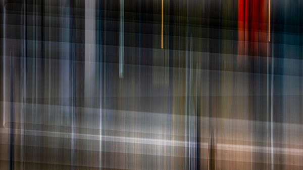
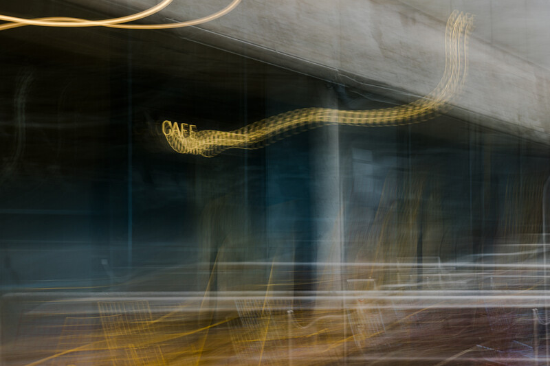
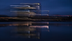
Structural: The title accentuates form, rhythm, lines, repetitions, and the construction of the frame, offering to look at the image as a structure. This principle works where attention is held by lines, reflections, repeating elements, or the character of movement, and the title clarifies that this construction is central.
-
Observational: The title fixes a specific visual element or detail without interpretation. It indicates what is noticed rather than what it means, such as a connection of forms or a particular glare. This title-hook guides the viewer to begin looking from the specified element.
-
Affective: The title sets the general emotional tone of the scene and fixes the state in which the space or object exists. This principle works where mood matters more than action: calmness, tension, fatigue, lightness. A short formulation gathers perception into a single sensation aligned with the frame.
A title does not function as a label but as a tool for directing attention. It highlights one element of the image and turns it into a point of entry, shifting the gaze in the needed direction. It may be time, sensation, structure, or state—the mechanism remains the same. A title narrows the number of possible trajectories, holds attention on the chosen axis, and sets the vector of perception before the viewer examines details. The photograph remains the same, but the order of reading changes.
Mechanics and Application
If you take the same frame and try to title it according to different principles, the difference becomes especially noticeable. And the inevitable question arises: which of the titles will be more accurate for your work? Which approach should you choose to get the most?
The answer depends not on beautiful words but on the author’s decision. A title should not replace the image or explain it for the viewer. It formulates what lies at the foundation of the frame and turns that decision into a clear orientation for perception. In this sense, a title is the verbalization of authorial intention and simultaneously the key to reading the photograph. Through the chosen word, the viewer enters the work in the direction you set, without losing freedom of interpretation but staying within the logic you consider correct.
Where a title is absent altogether, viewers have no point of support. They begin to search for their own versions of what is happening in the image, and the work falls apart into unrelated interpretations. In this noise, the semantic center of the frame is lost, and with it, the authorial position. A precise title returns attention to what is truly important to you and explains why this photograph exists among others.
Conclusion
In professional practice, a title functions more broadly than within a single frame. It structures a series, allows you to see differences between works, and forms the order in which a project is perceived on a wall, in a book, or in a portfolio. The same applies to presentation: a title creates context, embeds the photograph in a given conversation, and makes it part of an authorial statement rather than a separate visual fragment. Naming becomes not a decorative gesture but an element of strategy through which you form your presence in photography.
The context of display requires separate attention. The same image sounds different depending on the medium: on a wall, the title must withstand the distance between the work and the viewer and serve as a point of orientation; in a series, it must help reveal the structure of the project; in an online feed, it must simplify reading under rapid contact. Naming becomes not a universal formula but a tool that adapts to the way the photograph will be encountered.
When naming principles become consistent, they form not a set of words but a system of decisions. Titles begin to work as steadily as compositional or technical techniques: they hold the logic of the project, emphasize differences between works, and create a recognizable verbal layer that supports the visual language. Naming becomes part of style, because style is not an effect but the repeatability of choice. Titles do not strengthen a weak photograph, but allow a strong work to sound clearer and cleaner. And if you treat them as a tool rather than as a formality, they begin to work across the entire system: from a single frame to authorial presence as a whole.


Join the Fstoppers community for free
-
Post comments and join in the discussions
-
Browse the site ad-free
-
Share your work and get featured in the community
-
Compete in the photo contests for fun and prizes
21 Comments
"Should you Strengthen Your Photographs With a Thoughtful Title?"
For some photographers, this is not an option. It is a requirement.
As one who has thousands of images on file and available for licensing with multiple stock agencies, I am very used to writing titles for my photos. If the "title" field is not competed, the image will not be accepted by the agency and it will not be able to earn royalties for me.
Writing titles for images to be placed with stock agencies has a strategy to it. A smart stock photographer will think to the title as a way to bring the image to more buyers;; to get it to show up in more keyworded image searches. The agency may limit you to 20 keywords, or 40, or 50. But a title can be written in a way that gives you additional keywords, as the words in the title do show up when those words are searched for, yet they do not count against your maximum keyword allotment. So it behooves the photographer to use each word in the title carefully and strategically.
The titles for stock photos is not just about keyword searches. Titles can often be used to inform the potential buyer of your images about some aspect of your photo that may not be true of the other similar looking photos that show up in their searches. For instance, if I am posting a photo of a Whitetail Deer, a big buck, I may want to use this wording:
"Trophy class Whitetail Buck - photo taken in the wild - not in a captive fenced-in preserve like most buck photos are"
Yes, that may be a clumsy sounding title, but it gets a point across that may be the difference between a sale and no sale. That could cause the potential buyer to have doubts of the legitimacy of the other big buck photos that are showing up in the search. Some clientele really do care a bit about the background information behind the photo, and will make their choices accordingly.
This is a valuable experience, and you’re absolutely right about how titles function in stock photography. I’m curious about one thing though: have you ever found yourself choosing a title not just for search or sales, but to direct attention to a detail you personally consider important?
It happens quite often, even if we don’t always think about it consciously. Even calling an image “blue sky” instead of just “sky” already tells the viewer what to look at and what to evaluate: the quality of that blue, not the subject itself.
Alvin Greis asked me:
"I’m curious about one thing though: have you ever found yourself choosing a title not just for search or sales, but to direct attention to a detail you personally consider important?"
Yes, I do that regularly. In fact, that is another thing I had in mind when I wrote this in my comment above:
"The titles for stock photos is not just about keyword searches. Titles can often be used to inform the potential buyer of your images about some aspect of your photo that may not be true of the other similar looking photos that show up in their searches."
Examples could be to use the title to point out that the vegetation that a bird is perched on is native, not an invasive foreign species like multiflora rose or honeysuckle.
Or a title could be used to point out that a deer is a true albino and not just leucistic. Or that an oil rig is part of a fracking operation, not just regular oil drilling. Or that a spotted fawn seen in November means that its mother gave birth 3 months after the typical birthing period for Whitetail Deer. Alll kinds of things a title can say, that can cause the viewer to take note and choose one's photo above all the other photos that show up in their search.
Yes, that’s a good example, and this is exactly where the overlap becomes visible. In both cases, the title highlights a detail that might otherwise go unnoticed.
The difference is in why that detail is emphasized. In stock or licensing work, the title points out information that helps the image stand out among similar results and supports a selection or purchasing decision. In artistic photography, the same gesture exists, but without a competitive or explanatory goal. The title doesn’t add information to prove value, it quietly steers attention toward what the author considers significant inside the image itself.
The mechanism may look similar, but the intention and the context change how that mechanism functions.
If you market your work to the general public, you should know by now that the more time you engage with a potential purchaser, the greater the chances of a purchase.
Unless you're Rembrandt or da Vinci, you probably can't get away with the enigmatic treatment. People who are spending at least ten times as much as they would for a Mall•Wart print want to be in on something… that they can enjoy explaining to their friends and guests as they show off your work in their home — even if they bought it because the colours went with their sofa.
I found it worthwhile to not only include a title, but I added a paragraph "story" about the piece. What was I thinking when I took the shot? Is there some hidden meaning? Perhaps a an explanation about why a particular shot is unusual?
After doing this, I found people spent about twice as long in my art festival tent. My sales went up by about 15%, but more importantly, my repeat business doubled. People seemed to really like the stories!
Here's my work in a gallery, with the "story tags" hanging below each print.
From a marketing perspective, this approach clearly works. When you’re selling prints in the $3–5k range, context, stories, and explanatory text become part of the product. Buyers want something they can tell and retell, just as with works by Leonardo da Vinci or Pablo Picasso.
My point is slightly different. I’m not arguing against stories as a sales tool. I’m interested in how a title functions as a guide for the viewer’s attention, rather than as a way to justify a purchase.
Alvin wrote:
"I’m interested in how a title functions as a guide for the viewer’s attention, rather than as a way to justify a purchase."
Last year I licensed 40 images to my region's Economic Alliance, which was established to bring more tourism to my part of WA state. It's kind of like a chamber of commerce, but for a bigger region. I had to write a title for each image. And the sole purpose of the title was to cause the viewers of the image to be interested in coming to north central Washington state to see the wildlife for themselves. So for instance if one of the pics was of a Common Loon, the title would not be so much about that particular loon or that particular photo, but rather something like:
"Northcentral Washington hosts several pairs of breeding Loons every summer, where they nest on small lakes in the Okanogan Highlands ... these lakes are all easily accessible to visitors who want to see nesting Loons and their cute chicks!"
So it is kind of a combination of guiding the viewers' attention and a sales pitch .... but the sales pitch is not pitching the image, it is pitching my client's tourism opportunities.
My titles and image captions were my way of showing the Economic Alliance that they needed my photos to help grow wildlife tourism in our area. Without the titles and captions that I wrote, I do not think they would have licensed so many images.
I think this is exactly where our contexts diverge. In your example, the title is doing its job perfectly: it guides attention toward an outcome defined by the client. The image functions as a tool, and the title completes that function.
What I’m describing is a different situation, where there is no external goal to sell tourism, explain usage, or motivate action. In that case, a title doesn’t promote something outside the image. It narrows how the image is read, directing attention toward what the author considers visually or perceptually important, without turning into a pitch.
In artistic photography, this distinction becomes critical. When the image is meant to stand on its own rather than serve a client objective, the title shifts from persuasion to orientation. That shift may not be central to your type of work, but it fundamentally changes how the image is encountered.
Alvin Greis wrote:
"What I’m describing is a different situation, where there is no external goal to sell tourism, explain usage, or motivate action. In that case, a title doesn’t promote something outside the image. It narrows how the image is read, directing attention toward what the author considers visually or perceptually important, without turning into a pitch."
What you describing seems to me like the type of title that would typically be used in fine art, like for an image that is shown in a gallery or in a carefully curated online presentation of images. Does that assumption jive with what you are thinking?
Yes, that matches what I have in mind.
And this isn’t limited to galleries. The same logic applies to books, magazines, and even newspapers, where the meaning of documentary photographs can shift quite a lot through a title or a short descriptor. A title works a bit like those moments in a video where a secondary detail is marked with a red circle, quietly saying, “look here.” It doesn’t add information, it directs attention.
A handbag in an online catalog doesn’t need this because it doesn’t require interpretation. It needs facts, not a story. But once a photograph moves beyond describing an object and starts describing a situation or a relationship, that kind of guidance becomes part of how the image is understood.
I've been pondering this subject for a day or two, trying to think of something besides... you can't really be serious that a one or two word title is going to influence perceptions of a prospective buyer, can you? I understand your angle that the title, and as one of the other commenters said about descriptions, lead a buyer into and possibly through the image. Both seem like two sides of the same coin... engagement with the viewer. I certainly have no objection to titles if that's how you choose to present your work, but do you have any research or evidence that a title makes a difference to your audience, or accomplishes in the mind of the viewer what you think it does? As I've said before, Jackson Pollock purposely left many of his pieces untitled so as to not plant ideas in the mind of the viewer. Let them be free to make their own interpretation. Isn't that as valid logic as yours?
I looked at all of your images for sale on Saatchi Art, giving special attention to the titles. I don't quite recognize that titles provide any special insight into the image. And creating titles is no quick or easy task. In fact, it can be frustratingly tedious. That said, if I put your kind of a price tag on my work, I would have to throw the kitchen sink at my communications to boost its perceived value. Titles, descriptions, backstory, biography, resume, etc. I would probably have to find a reputable art gallery, one with a physical presence and gallery director committed to selling my work. Connections and relationships in the art world are the only thing I can imagine that would generate sales in that price range, for strange and unknown reasons too. In that case, I would have to fully believe my work was worth it, and have a gallery with influential sellers of the same opinion.
This comment moves the discussion away from how titles function and into assumptions about motivation, pricing, and legitimacy. That’s a different conversation.
What's the purpose of talking about a title's function if we have no practical use for it? Without placing titles in the context of where and why viewers interact with our images, it seems like just an academic discussion.
It depends on what we call “practical.” If usefulness is limited only to sales, search, or conversion, then the discussion stays purely instrumental.
But photography also operates in contexts where the practical task is not selling, but being read correctly. In editorial, documentary, and artistic settings, guiding attention is a practical function in itself. A title can help the viewer notice relationships, priorities, or points of focus inside the image. That may not translate into metrics, but it directly affects understanding.
And if this sounds “academic,” that’s not a problem. Academic inquiry is simply about producing new knowledge and clearer distinctions. There’s nothing inherently impractical about that.
Ed wrote:
"I looked at all of your images for sale on Saatchi Art, giving special attention to the titles. I don't quite recognize that titles provide any special insight into the image."
After reading this, I went and looked up that art site with Alvin's name and found his page there. I looked at each image, and each title, to see what the title was trying to get me to notice about the image. With two exceptions, I could not see the titles giving any additional strength to any of the images.
One exception was "Sparks Racing". I would not have thought of the streaks of artificial manmade light being in competition with each other if the word "racing" had not been provided. Of course I would automatically think of them being in motion, because that is of course the only way such images are made. But I wouldn't have thought about a competition between the streaks of light without that title. So the title seems to have worked the way Alvin describes in the article.
The other exception was "Autumn Photograph" .... this title indeed helps me to understand the image, or at leas helps me know how to fit it into a category. The title suggests that it is an outdoor scene, because autumn looks the same as any other season indoors, so it must be out in nature where autumn looks different than other times of the year. So now that I know it is an outdoor scene of nature, I see it differently than I would if I had no idea what it was. I like it more. I have an aversion to manmade things, so if I thought that an abstract image may have used manmade things as its original fodder, I would be more likely to reject the image because I usually don't want to bother with things that have been made by Homo sapiens.
"The Construction Photograph" ..... hmmmmm. I am looking and looking at it, trying to see something in it that in some way has something to do with construction, but I just can't see how construction - in any form or interpretation thereof - has anything to do with the image. So in this case the title confuses me and causes me to dismiss the image and look for something else, something that I "get" and relate to. If it is "just" an abstract image, about only color and form and light and dark, then I readily accept it and enjoy the image on those merits. But if I think it is supposed to be about construction, and can't figure out how in the world it has anything to do with construction, then I no longer enjoy the colors and form as much because I am now in a state of confusion and frustration because the title does not match what I am looking at.
"Market Square Eater Photograph" .... another "hmmmm" reaction. I look at the image with the title in mind, and don't see anything that resembles a market square. Nor do I see anything that could be even loosely interpreted as a market square. Then I think about the "eater" word in the title and I think about something eating an entire market square, like a hurricane or tornado or evil fictional character like a motorman or something, and none of those thoughts or concepts seem to be anywhere in the image. So then I think of a person at a market square eating, a market square eater, and look for that in the image, and nothing about the image seems to fit that at all, If it is "just" an abstract image, about only color and form and light and dark, then I readily accept it and enjoy the image on those merits. But if I think it is supposed to be about a market square and eating, and I can't figure out what it has to do with those things, then I no longer enjoy the colors and form as much because I am now in a state of confusion and frustration because the title does not match what I am looking at. So I am again left feeling confused about the image and what someone sees in it that no one else would ever see in it, and I again move on to see if there is something that I can understand.
If a title suggests that there is something there in the image that the viewer would not see at first, then that thing sure as hell better be apparent to the viewer after they spend time examining the image and trying to think outside the box about how the title relates to it. Because if you make such a suggestion, and then don't deliver on it, you are just causing dissonance in your viewers and frustrating them. Many of us do indeed like a little mystery, but almost all of us demand that mysteries be solved.
The "Scratched Reality" series ...... well my attention is already immediately drawn to the things that appear to be scratches on the image, so I didn't need the title to draw my attention to that because it already just grabbed my attention. So I think about reality and how the scratches relate to reality, but I can't really see any literal or direct correlation between the image and reality and scratches. So again I am a little confused because my brain likes to have everything nailed down and logical and when I can not connect all of the dots that are put in front of me it creates a little dissonance, and when I sense dissonance my instinct is to get away from the dissonance. I do not like dissonance and I sure as hell don't want to accept it or embrace it. So in the case of this series, the titles actually cause me to want to move away from images that may be more appealing to me if that confusing title had not been seen.
EDIT: I have a lot more thoughts about all of this but I just suddenly don't feel like typing anymore. So I may revisit this later.
What you describe here is actually a very precise account of how you read images, not a failure of the titles themselves.
You approach a title as a promise of resolution. If it introduces a direction, you expect that direction to become legible and logically closed through inspection. When that closure does not happen, the experience turns into dissonance, and your instinct is to step away. That reaction is completely consistent and clearly articulated in your comment.
My use of titles operates differently. I do not treat them as explanatory keys or puzzles that are meant to be solved. They are not instructions for decoding the image, nor guarantees that a specific meaning will reveal itself. Their role is to shift attention, sometimes to create friction, sometimes to destabilize an initial reading, sometimes simply to prevent the image from collapsing into “just color and form.”
In other words, the dissonance you describe is not an accident, but a boundary. Some viewers prefer abstraction to remain visually self-contained and unresolved only on formal terms. Others are willing to sit with a title that does not close the loop. Neither position is wrong, but they are incompatible expectations.
Your comment makes that distinction very clear, and I appreciate how explicitly you articulate it. The reaction itself becomes a useful marker that the text operates as intended.
Photographs rarely speak for themselves. When I see a photograph entitled, e.g., IMG_97259A, the photographer has turned me off and I immediately move on to the next photo. I don't need the technical details (though including them may sometimes be appropriate), but I require a caption that includes as much as possible of the classic who, what, when, where, and why.
Informative article with just one flaw.
The author needs to give examples of each section of the title types, to better illustrate how titles can be made effective.
Agreed! Sometimes it is more effective to just show someone something than to try to get them to think of it themselves .... especially if they are not even sure what it is that they're supposed to be thinking of. Give me an example or three and then I will be able to think up my own examples.
I understand the request for examples. They would certainly make the text more instructional.
This piece is intentionally not written as a how-to guide. Its aim is not to demonstrate naming techniques, but to show how titles could function as a cognitive mechanism. Examples would shift the text from analysis into instruction. I didn’t want that.
Just a couple of illustrative examples would be great for someone like me who learns by example. No need for any how-to instructions. But otherwise a great article.