
Something I get asked often is how to add color tones to your images. Often the easiest option is to use filters either in Lightroom or with a plugin software such as Google Nik. However, as you delve deeper into the world of color grading you will eventually become curious how to create your own effects.
There are obviously an enormous number of ways to achieve a certain look to your photos. The Adobe Kuler plugin for Photoshop is an incredibly powerful option that is available to anyone with Photoshop (for free) and provides complete control over the look and feel of an adjustment.
The first concept to grasp is color theory. You know, the whole color wheel thingy and colors complementing one another… Well this is huge. And while you don’t need to be an expert on the subject, it helps to know the basics which will eventually lead to a better understanding of the subject as you use it in practice. One article I have found extremely helpful on his topic was written by one of my favorite landscape photographers of today, Ted Gore. Gore has won several accolades in his field and produces some of the most amazing images I have ever seen. His article titled “Color Theory and Landscapes Photography” goes into great detail about color harmonies and how to work them into your images. He explains the difference between analogous, complementary, and monochromatic color harmonies (as well as several others that are much less obvious) and gives great examples of how he uses them in his work. I highly recommend this read as it applies not only to landscapes imagery but color grading and application on any photograph. At its core the idea is that certain colors simply work well together and are pleasing to the viewers’ eye when introduced into an image with subtlety. For example, blue and yellow are complementary colors. When the darker tones in an image are “cooler” and the lighter tones are “warmer,” the image is more aesthetically pleasing than if the color tones were simply left to chance.
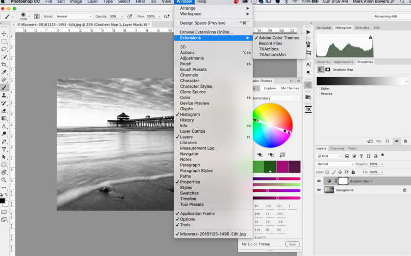
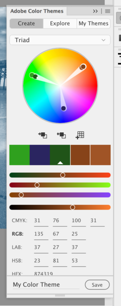
This is where Adobe Kuler comes in. For one, the Adobe Kuler tool is free if you already have a Creative Cloud membership and you can also install the tool directly into Photoshop (directions provided here). Once installed, it is available by going to Window > Extensions > Adobe Color Themes which creates a new tab in your workspace. How is this useful? The tool provides a built-in color wheel which allows you to create custom complimentary color tones. More importantly though, it contains a ton of color pallets already available for use that follow the “rules” of color theory.
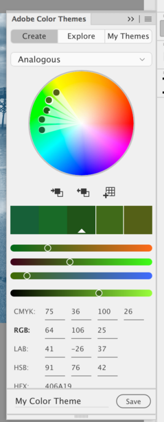
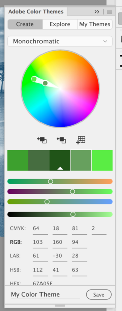
Once you have the plugin installed, open the tab to explore its options. Under the Create tab, you can use the drop-down to select from any of the color theories mentioned in Gore's article including analogous, monochromatic, and triadic. Your selection here will change the colors selected in the wheel above and by moving the cursor around in the wheel, you will always have colors selected that match their complement(s) based on the color theory you have chosen. This is helpful if you want to tone the image based on colors already present. For example, you can hover over any pixel/color on your photo and by simply clicking, it will bring up the exact combination(s) of complimentary colors for the color selected based on the color theory you have chosen in the drop down. You can then save the selections you have made to be used in your color swatches.
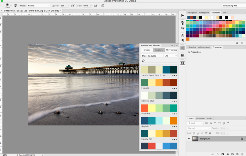
Secondly, you can open the Explore tab which offers several variations of predetermined color pallets already available for use. These selections of color are essentially what other Adobe users are already using and are colors that work well based on their position in the color wheel.
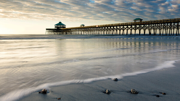
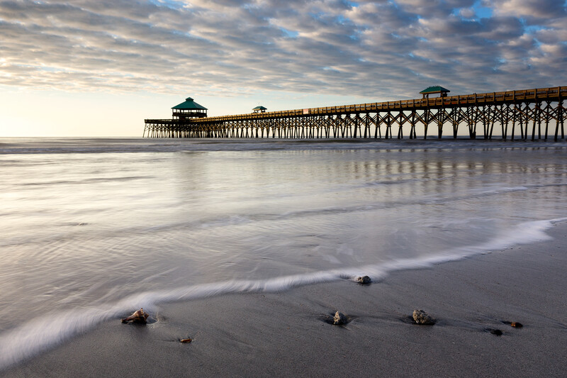
So how do we use these color combinations? The easiest way is to create a Gradient Map adjustment layer. In this example, I have a photo of Folly Beach just outside of Charleston, South Carolina. I want to tone this image to suit the pastel look of the light that particular morning. If I hover over to the Explore tab, there is a theme under the “Most Popular” drop-down titled “Sandy Stone Beach Ocean." Directly to the bottom right of this color theme are three dots. If you click the dots you have the option to Add to Swatches. Click this option and if you don’t have swatches enabled, simply navigate to the Window menu up top and look for the Swatches options to add it to your workspace.
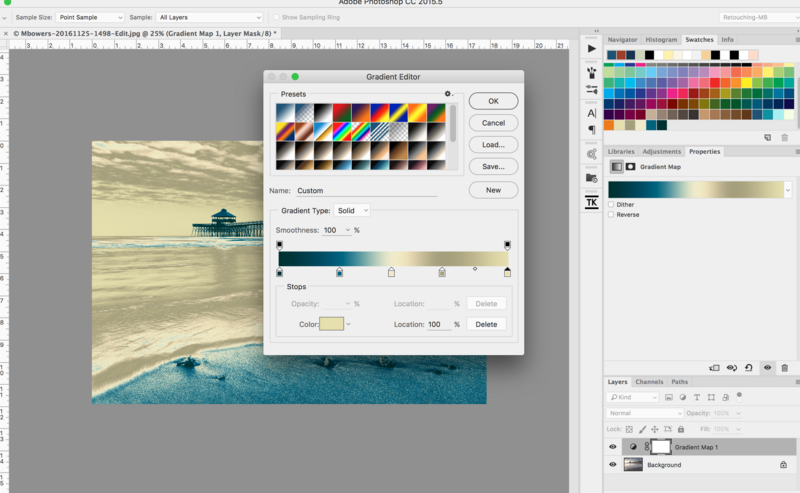
Once the color pallet is added to your swatches tab, you will notice that the colors from “Sandy Stone Beach Ocean” have been added to the very end of your swatch. Open a Gradient Map and add three new points to the bottom of the gradient for a total of five. Then moving from left to right (shadows to highlights), select each gradient point and then hover over the respective color in the swatches pallet to add that color to the gradient point. By connecting the darkest color from the swatch to the shadows side of the gradient, you will enhance contrast in your image in addition to adding color instead of lowering contrast. Experiment and see what you get. You don’t have to use all five colors, you use two only if you want. Once all five colors have been loaded into the gradient, click OK and view the results. Terrible, I know.
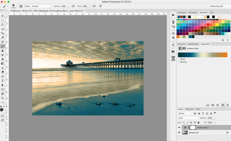
Next we need to change our layer blending mode. Color, Softlight, and Overlay tend to work well but again, play around and see what you get. In my example I decided to use the Color blending mode simply because it was pleasing to me. Obviously this is subjective and the effect was still too strong.
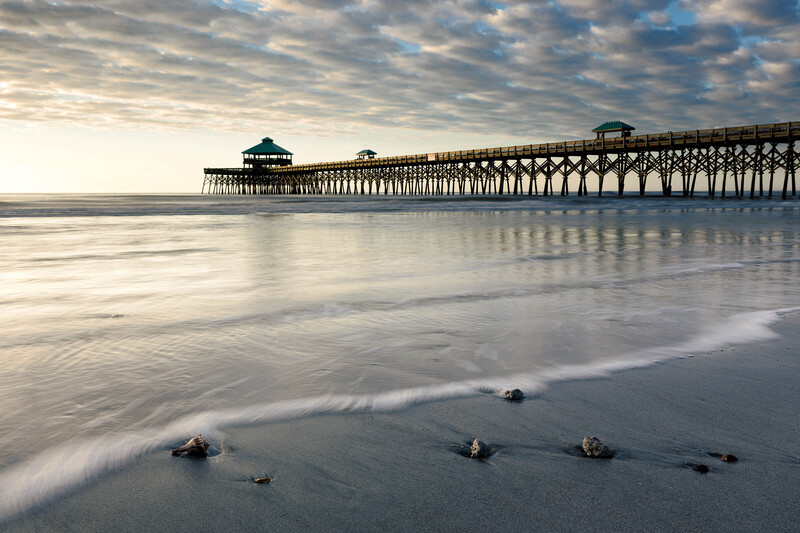
Finally, I lowered the layer opacity to around 20% which gave me a very pleasing look. In almost every situation you will need to do this as the effect can be quite strong otherwise. Here is the final result:
This is a very basic tutorial on the use of this incredibly powerful tool so I would encourage you to do some research and experimentation your own to see what sort of results you can get. I found this video by f64 Academy on YouTube to be a great explanation of the process. I hope you find this article useful and I would love to see some of your results.


Join the Fstoppers community for free
-
Post comments and join in the discussions
-
Browse the site ad-free
-
Share your work and get featured in the community
-
Compete in the photo contests for fun and prizes
2 Comments
This is pretty cool. I'm not sure it'll replace my usual method of color grading, but it's definitely fun to play around with. Thanks for the article!
Absolutely! Thx for the feedback and please share the article with others if you find it helpful.