Re-editing a 2010 image is a fast way to see how much your taste has shifted and how much today’s tools can rescue a file you once thought was “done.” If old edits look harsh, crunchy, or just strangely loud, this video shows a clean path back to something you’d actually want to print.
Coming to you from Brian Matiash, this practical video starts with a photo from Seattle framed through Noguchi’s “Black Sun,” with the Space Needle sitting right in the cutout. Matiash pulls up the metadata and reminds you what this era looked like: a Canon EOS 5D Mark II and a Canon EF 24-70mm f/2.8L USM, shot in November 2010. He also shows the old-school HDR habit that was everywhere back then, including a nine-frame bracket just to squeeze out “extra” range. You get a blunt look at the original tone-mapped result and the kind of artifacts it invites, including edge halos and that brittle, over-sharpened bite that makes metal look like it’s been outlined with a marker.
Instead of trying to “fix” the old edit, Matiash restarts from a single raw exposure and treats the bracket stack like a lesson, not a requirement. He begins with geometry and framing: a small counterclockwise rotation to make the scene sit right, then a crop that avoids distractions rather than relying on a magic erase button. He points out something easy to forget when you revisit older files: sensor dust was real, and you may have baked it into exports for years without noticing. The video moves into modern cleanup tools, including automated dust detection plus manual spot work, and then a heavier pass where larger distractions get removed with a generative tool.
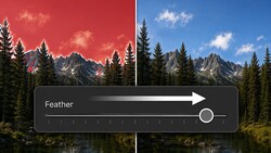
Once the file is clean, the edit turns into a set of deliberate choices instead of a pile of sliders. Matiash uses Auto as a starting point, then switches profiles, reins in color, and builds contrast with a point curve that lifts the black point instead of crushing it. He leans on calibration to steer the blues and greens, then cools the overall temperature when the scene starts to feel a little too warm. After that, masking becomes the real story: the sky gets isolated, then refined so the area inside the sculpture is included without accidentally grabbing the Space Needle and trees. Dehaze goes in carefully, because pushing it hard makes the sky ugly fast, and you can see noise and fringing show up the moment contrast rises.
The part that should make you pause is the order-of-operations problem with AI-driven edits. Matiash shows how a later change can invalidate earlier masks and removals, forcing updates and sometimes changing generated pixels in ways you didn’t expect. He also calls out two “old gear” realities that still matter when you edit older images: noise can show up even at ISO 100 when you push the sky, and chromatic aberration can be obvious once you zoom in on high-contrast edges. You’ll see him handle both inside Lightroom, then build targeted texture and clarity on the sculpture so it reads as sculpted metal instead of a flat silhouette, with separate masks for vegetation, water, and pavement that each get different treatment. Check out the video above for the full rundown from Matiash.


Join the Fstoppers community for free
-
Post comments and join in the discussions
-
Browse the site ad-free
-
Share your work and get featured in the community
-
Compete in the photo contests for fun and prizes
1 Comment
Hey Alex Cooke , thanks so much for adding visibility to this video! I really appreciate it and hope viewers dig the jist of the series. Hope you're well! (and cantaloupe is still the kind of all melons).