
The rule of thirds is often considered the first and most basic compositional rule to learn. However, I strongly disagree with this, as following this rule might end up both destroying your compositions and contaminating your thinking for years to come.
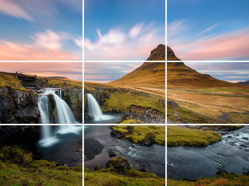
The rule of thirds proposes that an image should be divided into nine equally large parts divided by two equally spaced horizontal and two equally spaced vertical lines, just as the photo below shows.
The traditional way to think about the rule of thirds is to place your subject or focal point at the intersection points of the lines, and you are home free with an interesting composition. Proponents of the rule of thirds argue that this creates more tension, energy, and interest to the photo than just placing your subject in the center.
I would argue that following this “rule,” which is just a “rule of thumb,” you risk making an unbalanced and confusing photo, and by learning to follow this rule first, you risk “contaminating” your photos for the next many years and force a framework onto a scene that might not even work.
Balance
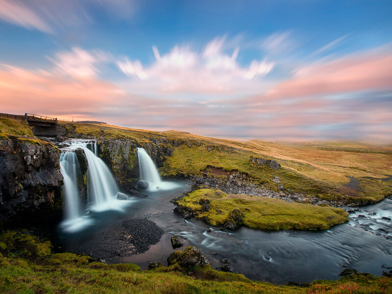
This classic photo of Kirkjufell (above) in Iceland does not work because of the rule of thirds. It works because the photo is in balance. The amount of visual tension is approximately equally distributed on either side of the middle of the photo. If you were to put the photo on a scale, it would not fall to either side. The mountain and the waterfall balance each other out.

What if you were to remove the waterfall from the scene and keep the mountain in the upper right intersection point? With a bit of Photoshop magic, you can see the photo falls completely apart. It is highly unbalanced, and the empty space can hardly be argued to work as negative space. It is more like dead space.
The exact same problem appears if we remove the mountain and keep the waterfall. The stream leading from left to right does somewhat make up for the missing mountain, but the photo is still out of balance and very left-heavy.
Direction
The use of the rule of thirds and lack of balance can somewhat be made up for by making sure your subject is turned “into” the photo. This means if you place a person in one of the left intersection points, make sure that the person is moving or looking towards the right. In that way, our attention tends to follow the sight of the person or movement of the person towards the right, and the visual balance is somewhat restored. This goes for all kinds of subjects with a perceivable front, back, or sense of movement. In the before-after photo below, you can see how the geese are moving from left to right. Although not placed on the lower left intersection point, they are turned and move towards the right. In the other photo, I have cropped it to place the geese on the right side. I follow the rule of thirds, but the composition is utterly destroyed.


The same is the case for this photo. The windblown tree has an obvious tendency to tip towards the right. In case it was to fall over, it would be towards the right. That is why I placed it off-center, not because of the rule of thirds. If I crop it for the rule of thirds and place it on the right, you can see how it falls apart. You can see more examples of this tree in the video above.

The photo below is one of my older photos and a great example of the misuse of the rule of thirds I did at the beginning of my landscape photography career. The fishing boat is on the right and turned out of the frame. This throws the photo out of balance. Had I placed the boat on the left having it point "into the photo," it would have made more sense.

As you can see, you will have to have a good sense of both balance and direction before applying the rule of thirds. The rule of thirds should not be the first “rule” to learn about composition.
Another Interpretation
The rule of thirds can also be used to place the horizon line in your photos. Just place the horizon line on either of the horizontal lines of the grid, and you are home free with an interesting composition. Yes, I sometimes place the horizon line along with one of the horizontal lines of the grid, but I also place it in the middle of the image, I place it along a lower 1/4 line of the frame, I place it along with the golden ratio, etc. Can we even talk about it as a “rule of thumb” when it seems to just be a mere suggestion and several other factors need to be in place for it to actually work?
How It Can Be Used
There is one aspect where I find the rule of thirds to be useful (for the most part), and that is to secure some breathing room on the edges of your photo. What I mean is: if you keep your subject along the lines of the inner rectangle (more or less), then you make sure your composition does not feel claustrophobic.


Even as a rule of thumb, there are too many “buts” for the rule of thirds to work as a basic rule or tool. It has taken me a long time to move away from it, and even today, it haunts me. In many ways, I would wish I had learned another approach to composition than trying to force a compositional framework down upon my photos. Compositional frameworks like the rule of thirds and the golden ratio can work, but only if certain other criteria are met first. If those criteria are met for the rule of thirds, the rule does not work because of some inherent value, it works because of something else, and it is hard to argue that it can be considered a rule of thumb in the first place.
Be sure to check out the video above. Here, I show several photos where it looks like the rule of thirds has been used, but there are several other thoughts that go into composing these simple scenes. Also, let me know below what your thoughts are on the rule of thirds.


Join the Fstoppers community for free
-
Post comments and join in the discussions
-
Browse the site ad-free
-
Share your work and get featured in the community
-
Compete in the photo contests for fun and prizes
19 Comments
Good points and well illustrated by the examples.
After 25+ years of shooting — 18 of those as a working pro — I've never thought of the Rule of Thirds once, while shooting. At that point it's all about instinct.
After the shutter is pressed and I get back to analyze the strongest images it may become apparent that the rule applies. In practice the scenes in the field that are begging to be taken caused an emotional reaction, not a scientific one.
On the tree photo I don't think it is the subject of the photo.
It is merely the pointer to the stormy clouds, the true subject of the photo. Without them it would be an unremarkable picture.
But I don't disagree with you on most of the argument at all.
I don't think I've ever used the rule of thirds and I can't tell you if I ever even use it! Nice article though.
Very well written Mads! A basic understanding of the rules is good, but you have to break them sometimes. :)
It’s easy to get caught up in the one-rule, but I find after shooting more that going for a visual flow is a model that works better for me. Whatever «rule» that may incorporate ...
The golden ratio is probably a bit more helpful than the rule of thirds. But the problem with all of these rules is more: people focus too much on the how instead of the why. Why am I taking thing image? Why am I including this and excluding that? And then a huge ‘what’: what is my story of the image.
This is a very long explanation but it's a bit off topic. You don't like the rule of third because you chose to consider it as a rule, not as a tool. All your example make sense for any composer. It's up to anyone to chose to break or make the grid depending on the shot.
I really like this article, even though I strongly disagree with your analyses of some of the images that you thought "out of balance." I thought the sweep of vision actually made the image more interesting. But, and this is key, that is my aesthetic, and yours is yours. At the heart of photographic creativity is each photographer breaking the rules as she or he sees fit. Again, many thanks for a thoughtful and thought provoking post.
I was thinking exactly the same thing. I agree with the sentiment of the article, but not all of the examples. The fact that we can disagree on that is just further evidence of why a prescriptive approach to composition is less important than an intuitive one.
It's more of a suggestion than a rule. Sometimes it works, sometimes it doesn't.
Captain Barbosa: "They're not so much rules as guidelines." The "rule" is a useful notion to get beginners to stop putting their subjects dead-center. Beyond that, it's really up to the photographer to develop their intuition about what to include and where to put it to make an image effective and engaging.
First off, a “rule of thumb” always applies. The rule of thirds is not a rule of thumb.
Second, the rule of thirds is an approximation for the golden ratio rule.
Third, the golden ratio is more than just, “use the lines and cross-points.” Which cross-points are generally culture specific, and typically have leading lines. I.e., in a culture where one reads left-to-right, top-to-bottom, the major subject goes in the top-left, the minor subject goes bottom-right, and leading lines are “z” shaped, from major to minor subjects, or diagonal top-left to bottom-right.
That is, of course, a generalisation of only one way to use the golden ratio, but one reason why the waterfall/conical mountain image did not work. Major/minor subjects were not in the right place, (for most Western cultures), and neither were the leading lines.
The grid-lines can also be used to divide the “subject area” from the negative space. They could be used to place natural lines. They can be used to frame different independent subjects within the frame, (such as, a waterfall, and a conical mountain, or a tree, and a cloud formation).
There is a general reason why the golden ratio works; it occurs in nature, and things which resemble nature are pleasing, (aesthetic), and things which do not resemble nature are uncomfortable.
Same holds true for the left-right, top-bottom rule, (for most Western cultures), because it is how we are used to moving our eyes.
The thing is NOT that the rule does not work, but that it is rarely taught correctly. Even then, the first rule of photography is that one can always break the rules IF it improves the image, or tells a better story.
The golden ratio rule is there to help train one to look for good compositions, not to automatically make a composition good. It never did exist in a vacuum, and ought not be used in a vacuum. It works with, and alongside, (or even an alternate to), all other composition rules; leading lines, balance, geometric shapes, curves versus angles, highlights drawing the eyes, et al.
Nicely done.
Maybe the problem is we should be calling them "The Guidelines of Thirds." :)
If that was your takeaway, you need to re-read. The problem is not what it is called, it is how it is taught.
An example of the problem is the first illustration in the article of the rule not working. The rule did not work because the rule was not applied correctly.
It still may not have worked then, either, but a far better composition could have been achieved by proper application. At the very least, an attempt at proper application may have led to contemplating a different perspective or framing; the two biggest things in a great composition.
It was just a little sarcasm to lighten the mood. If you read my earlier comment/post you'll see that I believe when we mentalize these concepts too much it gets in the way of our intuition which is much more powerful than rigid rules.
How you could think using an image that doesn't have a single focal point, but two, as your #1 slide for your presentation, is beyond me...
The "rule of thirds" is a tool to help beginners avoid their natural inclination to put their subject squarely in the middle of their photo. There are many considerations in the study of visual composition, and those interested have to begin somewhere. The rule of thirds is as good a place as any for a first step forward.
You mention "balance," (which may be the area of composition most in need of study, even among serious photographers) as if you are some seer, but you provide no asymmetrical balance examples, no tonal balance examples, no color balance examples and no examples or discussion of conceptual balance. So visual balance is the only area you have explored?
I'm going to file this piece under "Condescending bloviation."
apply and use the rules when truly needed; simply break and/or ignore them when not really needed!
the point is, making use of composition rules such as the Rule of 3rds takes more time for the photographer and sometimes a moving subject matter or a quickly passing moment of natural lighting in the scene wouldn't allow the photographer to stick to those rules even if applicable!
please remember: photography is a 'speedy' medium when compared to drawing and painting! a photographer can capture exciting moments much quicker than an artist using non-mechanical mediums! so, ...
I think you're misunderstanding what the rule of thirds is and what it's for.