

The single most effective thing you can do to improve your color photography has nothing to do with color at all. Stop shooting in color. Not permanently, not because you want to become a black and white photographer, but because spending a few weeks without color will teach you more about what makes a photograph work than years of shooting in color ever will.
I know how that sounds. It sounds like advice from someone who romanticizes darkrooms and silver gelatin prints, someone who thinks photography peaked in the 1960s and everything since has been a slow decline. But the argument here is entirely practical, and it applies whether you shoot portraits, weddings, landscapes, street, or product work. Color is doing more work in your images than you realize, and not all of it is good work. It carries so much visual weight that it can disguise weak light, mediocre composition, and flat tonal relationships. A photograph can look appealing in color while having almost nothing going for it structurally. Remove the color and there's nowhere to hide. You're left with the bones of the image: light, contrast, form, and spatial relationships. Those bones are what make any photograph succeed regardless of whether it's ultimately presented in color or monochrome. This article isn't about processing techniques or achieving a certain aesthetic. It's about what happens to the way you see and the decisions you make when you deliberately take color off the table.
Color Hides More Than You Think
Consider a sunset portrait. Warm golden light wrapping around your subject, cool blue shadows in the background, maybe some deep oranges and purples in the sky. It looks gorgeous. The colors alone generate enough visual interest that you might never question whether the composition is any good, whether the background is distracting, or whether the light is actually doing anything interesting with the subject's features. The color palette is so inherently pleasing that it papers over every structural weakness in the frame.
Here's something that trips up a lot of photographers who haven't spent much time thinking about luminance: two completely different colors can share nearly identical brightness values. A rich red and a mid-tone green might look dramatically different in a color image, creating strong visual separation between elements. Convert that same image to black and white and those two elements collapse into the same gray. The "contrast" was never really there. It was hue separation masquerading as tonal separation, and while hue separation works perfectly well in a color photograph, it means your image has no structural contrast underneath. The tonal foundation is flat. This matters because luminance contrast is the backbone of every photograph, color or otherwise. An image that relies entirely on hue differences for its visual structure is one bad conversion or one slightly off white balance away from falling apart.
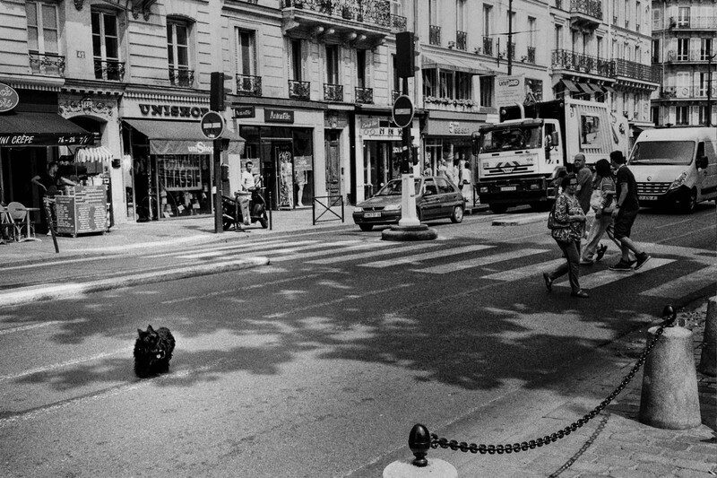
Try this the next time you shoot a portrait against a colorful background: one where the subject's warm skin tones separate nicely from the cooler tones behind them. Convert it to black and white in post or just desaturate it on the back of your camera. In a surprising number of cases, the subject will melt into the background because there was never any meaningful luminance difference between them. The "separation" was entirely chromatic. That's not an academic problem. It means the image was always weaker than it looked. Setting your camera's picture style or film simulation to monochrome while still shooting raw lets you preview this in real time. You'll start catching these problems during the shoot instead of discovering them later, and that changes how you position subjects, choose backgrounds, and evaluate light on the spot.
You Start Seeing Light Instead of Color
Something subtle but profound happens when you take color out of the viewfinder: light stops being a mood and starts being a shape. In color photography, the warmth or coolness of light does an enormous amount of atmospheric work. Golden hour feels warm and inviting. Overcast light feels soft and moody. Blue hour feels cinematic. Those associations are so strong that they can trick you into thinking the light is "good" when it's actually doing very little to sculpt your subject or create visual interest in the frame. You're responding to the color temperature, not the light itself.
In black and white, you can't lean on that. There's no warmth, no coolness, no golden glow. All that's left is direction, quality, and intensity. Side light that rakes across a face and carves out cheekbones, eye sockets, and jawline becomes immediately apparent as either present or absent. You can't coast on the fact that the light happens to be a flattering shade of amber. It either creates dimensional, sculptural form on your subject or it doesn't. This is a genuinely uncomfortable realization for a lot of photographers who have spent years chasing golden hour without thinking much about what the light is actually doing beyond being the right color.
Hard versus soft quality becomes impossible to ignore as well. Warm tones feel inherently pleasant to the human eye, so even direct overhead light at noon can produce a color image that feels acceptable if the tones are right. Strip the color away and that same light looks brutal, creating deep eye socket shadows and harsh, unflattering contrast. Shooting in monochrome teaches you to evaluate the quality of light on its own terms and to make deliberate choices about whether you're using hard light intentionally or whether you need to find open shade, use a reflector, or wait for different conditions.
Perhaps the most valuable perceptual shift is learning to see how light transitions from bright to dark across surfaces. The gradient from highlight to shadow across a face, the way light falls off across a wall, the tonal progression from foreground to background in a landscape. These luminance transitions are what give photographs a sense of three-dimensionality and depth. In color, they're easy to overlook because your eye is busy processing hue information. In black and white, they become the entire visual experience. Photographers who train themselves to see these transitions carry that awareness back into their color work, and the difference is visible. They start composing for light first and treating color as something that enhances an already strong image rather than something that has to carry an image on its own.
Composition Gets Honest
Color is a compositional tool whether you intend it to be or not. A bright red element in an otherwise muted scene will grab the viewer's eye no matter where you place it in the frame. That's useful when it's intentional, but it also means you can get away with sloppy placement because the color contrast is doing the organizational work that your composition should be doing. Put a person in a red coat in the middle of a dull gray street and the image "works" in color because the eye goes straight to the coat. Convert it to monochrome and suddenly the person is just another mid-tone element in a frame that has no leading lines, no meaningful use of space, and no structural reason for the viewer to look at one part of the image over another.
When you remove color as a compositional crutch, everything else has to step up. Lines, shapes, negative space, the relationship between foreground and background, the placement of light and dark masses within the frame. These become your only tools for organizing the image and directing the viewer's attention, and because they have to work harder, you get better at deploying them. Tonal contrast specifically becomes your primary method for creating visual hierarchy. You learn instinctively to place light subjects against dark backgrounds and dark subjects against light backgrounds to create depth and separation. You start thinking about the frame in terms of luminance zones rather than color zones. This skill is directly, immediately transferable to color photography because luminance contrast is what gives a color image its structural integrity. Hue and saturation are the surface layer. The tonal framework underneath is what determines whether the image reads as coherent, dimensional, and intentional or flat, muddy, and accidental.

Black and white also enforces simplification in a way that color rarely does. A frame packed with visual information can look "vibrant" or "energetic" in color because the variety of hues creates a sense of richness. The same frame in monochrome just looks cluttered and chaotic, a mess of competing gray tones with no clear subject or visual pathway. This is a harsh but useful lesson. You learn quickly to subtract elements from the frame, find cleaner backgrounds, and build images around fewer, stronger visual components. You develop a better feel for negative space because it's so much more obvious and usable in monochrome. Areas of uniform tone become resting places for the eye, creating rhythm and breathing room in the composition. Photographers who develop these instincts through black and white practice tend to produce cleaner, more deliberate color images even when shooting busy, complex scenes.
The Practical Exercise
None of this requires you to buy a film camera, commit to a new artistic identity, or fundamentally change what you shoot. It's a focused training exercise with a straightforward method and a finite timeline.
Set your camera to its monochrome picture style, film simulation, or whatever your manufacturer calls it. If you're shooting with a mirrorless camera, this means your electronic viewfinder and rear LCD will both display in black and white, so you're composing and evaluating in monochrome in real time. This is where the actual perceptual training happens. Looking at the scene without color while you're making decisions about framing, positioning, and timing is fundamentally different from converting to black and white in post. The critical detail: shoot raw. Your raw files retain all the original color data regardless of the picture style applied, so you're not giving anything up. You can process the final images in color, black and white, or both. The monochrome display is just a training tool for the shoot itself.
Commit to at least two weeks, ideally four. A single session will show you the concept, but it won't rewire your habits. You need enough time for the initial discomfort to pass and for the new way of evaluating scenes to become instinctive. The first few shoots will probably feel frustrating. Scenes that normally excite you will look flat through the monochrome viewfinder, and that frustration is the point. It means you're seeing for the first time how much work color was doing.
Shoot whatever you normally shoot. The temptation will be to go looking for "black and white subjects," whatever that means. Resist it. The entire value of this exercise comes from applying the constraint to your regular work so you can evaluate how your normal compositions, lighting choices, and subject selection hold up when color isn't available to bail them out. When you review your images, pay attention to specific things. Are they flat overall? You weren't creating enough tonal separation in the scene. Are subjects blending into backgrounds? That's a luminance contrast problem you'd never have noticed in color. Does the composition feel directionless, like there's no clear entry point or visual flow? Color was likely providing organizational structure that the underlying composition lacked.
After the exercise period, you don't abandon black and white. But even when you return to color as your default, you'll find that you're seeing differently. You'll catch yourself evaluating tonal separation and light direction before you think about what the colors are doing, and that shift in priority is permanent.
Why the Best Color Photographers Already Think This Way
This isn't a fringe technique or an eccentric personal preference. The principle that monochrome literacy improves color work is embedded throughout professional imaging. Cinematographers and colorists routinely desaturate footage to evaluate tonal balance before applying a color grade. The logic is simple: if the image doesn't read clearly in monochrome, if the subject doesn't separate from the background, if the eye doesn't know where to go, then no color grade will fix it. The tonal structure has to work first. The same principle applies to stills, and photographers who understand it produce fundamentally stronger images.
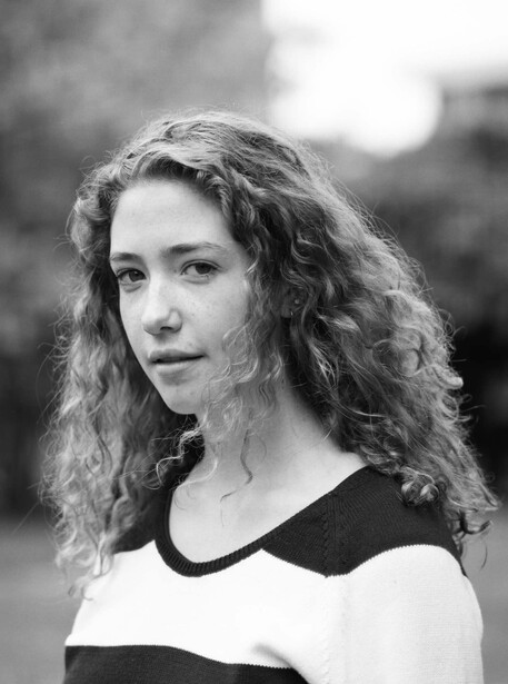
Many photography education programs include dedicated black and white shooting not as an aesthetic elective but as perceptual training. It's treated the same way a musician practices scales or a painter studies value sketches before working in color. The goal isn't to produce monochrome work. It's to develop visual skills that operate at a level beneath color. Fstoppers' The Well-Rounded Photographer takes a similar cross-training approach by having photographers work across genres they wouldn't normally touch, building transferable skills through deliberate unfamiliarity. The landscape and cityscape work in the Photographing the World series demonstrates the kind of light awareness and tonal control that monochrome practice develops, applied to full-color images that are striking precisely because the underlying luminance structure is so strong.
There's also a direct connection to post-processing. When you sit down to edit a color image in Lightroom, Capture One, or any other raw processor, the most powerful tools at your disposal operate on luminance. The tone curve, the luminance sliders within HSL panels, dodging and burning. These are all tonal tools. A photographer who has developed a trained eye for luminance relationships through black and white shooting will be faster, more decisive, and more effective with these tools because they can see what needs to change without fumbling through trial and error. They understand the tonal architecture of the image because they've spent time working in a world where that architecture was the only thing visible.
The Permanent Shift
Black and white photography isn't a genre, a style, or a nostalgic callback to a previous era. Used deliberately, it's a diagnostic instrument. It strips an image down to its structural essentials and shows you exactly what your light, your composition, and your tonal choices are doing without the distraction and the flattery of color. The problems it reveals were always there. You just couldn't see them.
The investment is small. Toggle a camera setting, commit to a few weeks of shooting, and pay attention to what changes in the way you evaluate a scene. The payoff is disproportionately large and entirely permanent. Once you learn to see in terms of light direction, tonal contrast, and luminance structure, you don't unlearn it. It becomes the foundation underneath every image you make, in every genre, in every format, for the rest of your time behind a camera. Before your next session, switch to monochrome mode and see what you notice that you never noticed before. That single observation is where the whole exercise begins.






5 Comments
Great piece, Alex; timely also. Just got done looking at some of the late great Martin Parr's contact sheets from when he was working on "The Last Resort" and forgot they were black and white sets of color film. I think even Ansel Adams once said he could express more of his original intention without color (although of course he shot color, too). I think this speaks to that.
Black and white because I had to for work, not because I wanted to. It may have made me a better photographer, doesn’t really matter as long as they kept paying me.
The idea here has been presented many times. However, I've never ever heard anyone testify to having learned better composition and lighting from having given up color in favor of black and white for any length of time.
If cluttered composition and distracting elements are your problem, I'm not convinced a black and white image by itself will necessarily become a definitive teacher. At least not without the help of a better photographer pointing them out. Most novices don't recognize why their pictures need improvement. In fact, many distractions in the background of a busy picture become less noticeable as a gray tone than in color. Better black and white also asks for structure in the way highlights and shadows are organized... too many of each one scattered around in too many different places leaves a cluttered picture on the basis of tonal values alone. Would a novice making a black and white conversion understand that?
Black and white definitely has some unique considerations, but I suspect a poor color photographer would just make poor black and white pictures, simply upon the act of converting one to the other alone. Would be nice to hear from people who have tried it.
Back in my 4x5" film days, I would expose a B&W Polaroid. I used it for examining lighting, composition and exposure. I think it really helped to make my studio lighting way better, not depending on 'color contrast.'
True for me too.