
A few years ago I was talking with a fellow photographer about the color correction of portraits. While on the topic of using white balance cards and color charts in order to get a perfect skin color, he interrupted me and said, “You can't have perfect skin color with these.” I immediately thought to myself, “Oh, yeah?” Oh, yeah. That was the truth, and I will explain why below.
Color Calibration
I remember my first photographs with a point-and-shoot camera in a room lit by tungsten light bulbs. The resulting pictures were with a dominating yellow color. Someone told me then: “You have to fix your white balance.” That was the first time I heard about such a correction. The white balance is an overall color shift tool in the digital world. You can set it in your camera or in a post-processing software. The proper way of setting a white balance is by using a white balance card and snapping a frame with it filling a big portion of the frame. You can use a white sheet of paper if you don't have such a card, and although it will take you in the ballpark, it won't be absolutely correct.
If you want to go further in the journey for a perfect color, get a color correction chart. Using such a chart helps you fine-tune the different color hues for your camera and lens combination. Your color will be almost perfect with just a white balance card, but with a color correction chart the photographs will be altered with minute color adjustments, and thus reaching the color-perfect goal.

Perfect Doesn't Mean Perfect
“But in the introduction you said you can't have a perfect skin tone regardless of the perfect color calibration,” you might say. Technically speaking, your color will be perfect in theory after these two steps, but when you look at people's skin in the following photographs, you will find there are color deviations, and sometimes they are quite big.
Imagine me, knowing my color was perfectly dialed-in, banging my head, because on my color-calibrated monitor the skin sometimes looks way differently than it was in the real world. I would calibrate the monitor again, I would create new color profiles, adjust the white balance from the white balance card, but the color would be off.
Below is a fresh example from a photoshoot of several people and you can clearly see that skin colors have different hues; some look fine for a Caucasian person, others look either more yellow or too pink. The picture looks creepy, but once you think about the technical side of it, the creepiness goes away. You can see that the white of the eyes looks normal thanks to the white balance card, but skin color in real life for some of those people looked more natural than on the photographs. You may tell me that “It's OK to have different skin hues for each person,” and you will be right. The problem I'm trying to solve here is when the skin on the photograph is very different from the skin color under the environment conditions you saw it with your eyes. In these examples the camera settings are the same, the lighting is the same, the white balance is all set using the white balance card.

Skin Is Not a Piece of Textured Color Paper
If you are photographing objects like paintings, fabric, and paper, the chances of having a perfect color are bigger. The reason lies in the type of texture you work with. When you calibrate your colors using a color chart or a white balance card, you are taking a photograph of a surface that doesn't have the layers, glossiness, transparency, texture, and all other properties of the skin. You are photographing a flat colored matte material. The tools that help you dial the white balance in guarantee that the colors of the flat matte material of the color chart will be white indeed. Nobody promises anything about other surfaces. That's where I got fooled believing the skin color would also be perfect.
Skin is a multi-layered thing that has lots of characteristics. If you have worked with 3D or had chance to see how skin texture is artificially designed you will understand some of its complexity. Each skin layer has color, transparency, moisture, elasticity, and texture. These properties are different on different parts of the body, and different for every human being.

Skin is a multi-layered complex object that refracts and reflects light in a different way.
When you light a multi-layered object like skin, the reflected light changes because of these properties. We are able to see objects because of the reflected light. We perceive colors by the colored light that is reflected from the surfaces. The more the moisture, the more specular highlights and the more contrast the skin will have. Some skin is more transparent and have more of a light red, light yellow, or light brown hue. Some skin reacts in a different way to some light color hues than others. When you light skin with different light sources (hard or soft) and from different directions, it changes the hue because light penetrates the layers from different angles and is reflected in a different way towards the lens.
How to Have a Perfect Skin Color Then?
Unfortunately you can't automatically have a perfect skin color, but you can have a color that is pleasing to your eye or the eye of those who will receive the photographs. There's no such thing as a “perfect color,” but there is such a thing as “a color that is close enough.” Of course, for artistic purposes you can have whatever color hue you want in the final result.
My approach is first to get the color in the ballpark using the white balance card and (sometimes) the color correction chart. For a white balance and color correction chart I use the Color Checker Passport. Since I switched from Lightroom to Capture One Pro, I can't use the color profiles created by the Color Checker software in Capture One, and I'm only using the white balance card tool. I photograph a picture with the color chart in frame, and for this particular product the white balance card is a square from the grid on the left of the chart.

In my post-processing software of choice, I go to the white balance tool and click in the square marked in the picture above. This sets a correct white balance for the colors on the chart, and hopefully it's close enough for the skin of the majority of people you will photograph on the set. If your software supports synchronizing of the white balance setting, you can copy it on all images from your series. Now it's time to judge by eye if there's a significant color shift from the skin color you think is normal, and try to color correct only the hues of the skin color, whether using global or local adjustments tools.
I won't talk in details how this is achieved, because there are excellent articles on perfecting the skin tone in post-processing software written by fellow writers at Fstoppers. You can choose to read those that match your current workflow. Know that it's OK to manually tweak skin tones in post even if you have used automated tools for calibrating your color.


This should put the lie to those people saying that camera tech is 'bigoted' towards white people.
If the majority of your subjects have "white" skin, then film and sensor design will naturally evolve in the direction of rendering it more and more and more accurately. Don't believe that?
Fuji introduced Fujichrome to the US market in 1971. I shot a sample roll (with one of the photos gracing the back cover of my university's yearbook). It was perhaps not surprising that most subjects with pink skin showed a noticeably yellowish cast. As Fuji's chemists and photographers had few, if any, subjects of European extraction, this bias went unnoticed.
Japanese loudspeakers had a similar problem 40 years ago. With recordings of Western music, they often revealed residual midrange colorations similar to those of Japanese instruments -- those colorations not being noticeable with recordings of such instruments.
By the way, the adjective "Caucasian" refers to Eastern Europeans with (literally) white skin and black hair. The racist anthropologists of the late-19th century chose them as the "standard" to which "whiteness" was held.
And then, you'll have some clients who will view your color corrected, chopped and channelled, lowered and louvered images on their crappy as possible, totally uncalibrated computer monitors, the ones that their companies bought by the truckload...and you'll sigh, knowing you did your best anyway.
The truth is that even if a monitor is not calibrated, the eyes got used to the color shift and percieve the colors in a "correct way."
I find that, for video content, certain players and browsers are bigger issues when distributing. Vimeo does not see color the same way YouTube does, and sometimes I'll need to account for that with an adjustment layer. Scary stuff!
Yeah. That's so true.
Did you actually test that by comparing uploads of the same video on YT and Vimeo ? Because as far as I remember, there was a time I used to worry about those gamma and colors (especially reds) not being strictly identical between platforms, and since I didn't find a "proper" solution (coding to x264 didn't do the trick at the time), I just compromised on a middle ground I could live with and that's it. I never tested again and just export using the default codecs.
It's a fool's errand. Any given individual's skin color differs in differing environments. Even should you achieve the perfect skin tone in your image, the lighting used to view the results will change it. Good enough is good enough. Of course we may disagree on what is, in fact, good enough. :-)
Your comment is good enough,
I don't know about them.
Adjusting skin tone colour and uniformity in Capture One is a relatively easy task, they even have a tool specifically for this very issue.
Alexander was talking about using ColorChecker DNG profiles (which is an Adobe proprietary format) in Capture One.
Your method is the standard thing that can be done in Capture One and it's helpful for the readers but doesn't relate to what Alexander mentioned.
Sorry for the confusion, I was not replying to Alexander, simply pointing out the Skin Tone tab is C1, as that seems to be the obvious solution to this "problem". ColourChecker "profiles" would not be the tool I would choose to overcome skin colour variation, it is far too blunt an instrument. As you state, every person is different, and even lighting situation is different. Do you really want to be creating a profile for every person and every set up?
Besides, C1 fully supports ICC profiles, so if you really wanted to, you could go that route and create profiles that way.
I find that the Skin Tone tab in conjunction with C1's excellent selection tools deals with this much more subtly.
Cheers,
Jason.
When I worked with Lightroom I created color profiles for every lighting scenario. Despite that the skin needed extra tweaking, as I stated in the article, although I didn't notice the need of that the first few years working with a color chart, because I thought "it should be perfect."
Yes, Capture One supports ICC profiles but they are built software that needs some expensive hardware that I don't want to pay for. Even with it, I won't have perfect skin tone, so why bother buying them :)
Hi Tihmor,
"When I worked with Lightroom I created color profiles for every lighting scenario. Despite that the skin needed extra tweaking"
This is my point exactly. Profiles are a base starting point. They are like a more advanced grey card shot. If you want correct white balance, you shoot a grey card for post. If you want "accurate" colour, (and yes I know it is not perfect) shoot a colour chart and make a profile. (There are a range of options available, form as you say "very expensive" right down to free, features and ease of use vary accordingly). If you want pleasing skin tones, Tweak individually.
That was my point, that using profiles to solve this issue is not the answer. You should be shooting a grey card for white balance, and if it matters to you, or your clients, shooting a colour checker as well and perhaps creating a profile if correction is warranted.
You will not achieve the type of skin tone "accuracy" you allude to with a profile. There are only two remotely skin coloured patches on a colour checker, hardly a good enough sample to work from when trying to capture the subtlety of human variation.
By highlighting the Skin Tone tool that is in C1, I was trying to point out that fact, and that since you said you use C1 I thought you might appreciate it. It is designed to solve your exact concern with skin tones.
Cheers,
Jason.
I agree, Jason.
The only thing I'd correct is that white balance is shot with a white card, while a grey card is for exposure.
I was using "grey card" as a generic term. I use one of these.
Hi Tihomir, check this http://www.lumariver.com/ ... it is really great tool for camera profiles. You have many options to tune it. I was looking for something like this when switched to LR from C1 :-) Sometimes it can help.
Thanks. I hope other readers would appreciate that too.
Welcome :-) I was also using xRite Colorchecker with LR and tried also more softwares to make camera profiles and there were bigger differences. xRite LR plugin made shadows too saturated. Adobe Profile Editor made it better. Lumariver was the best for me.
From what I remembered, That i1 software required buying some i1 calibration hardware (and a chart of theirs of course). Knowing that I won't have perfect skin tone (and I work with people most of the time), I will stick to the thing I already have although I use just the neutral white balance patch nowadays.
Yes, that's true.
Can’t follow this because color of skin is related to the light on the skin, this light introduces variables .
Light, med and dark tone skin can’t all be correct in a single image you must choose on.
Sometimes removing some of the Blue will render a very close match, although shooting my Hasselblad really doesn’t need correction for skin or should I say rarely.
Worst contamination is green from the grass below I always try to block that out with a reflector below.
As I showed in the example above, all subjects were with light skin and I had to color correct some of them in post, because their skin looked more yellow or more orange than it looked on set. When having medium and dark skin tones the differences can be way bigger.
You mean removing blue after shifting temperature to colder one? Or just like that? :)
It's all about the calibration ;) - this method is cheap!!
https://www.facebook.com/TakingPhotographsIsNotACrime/photos/a.391151617...
This has to be given as a free brochure to all our clients, so we make sure they will see the same colors as we do on our monitors.
You cant Calibrat BUY EYE! 🤣🤣🤣
I shoot School Picture Day for more than 20K Students and Skin tones are a very common issue, finally I make a change on the workflow to achieve almost perfect skin tones for all the kids, I make my white balance on the field with a ExpoDisc and the X-rite color checker, and adjust the just a little to match my Printer and final product is great, I apply the same with the rest of the projects but someone says clients when they see images on screen want corrections, my first question is your monitor is calibrated? answer is always no! I say to the client calibrate and If you notice not good color I make the change period.
The problem is under certain lighting conditions skin color changes. The automatic tools for calibration calibrate the colors with flat matte single-layered samples (color patches or hardware readings). They do not understand skin, because it's a complex thing. They guarantee the color patches will be the correct hues on your screen or on your printer. However, skin may look a bit off, because of its layers properties for every person.
It's the same as hotspots on a moist skin vs. dry skin. Light changes everything and it's not about the calibration, but the lighting and skin properties.
So if we are in a skin colour topic... Calibration is only a small part of troubles with colours.
What about colour contamination from objects around the subject? For example if you have a red-headed woman do you consider a redness of her hair being bounced back to her skin? If you wear a blue shirt as a photographer when making photo do you consider it as a element that also reflects blue hue and adds it to a subject colour? Do you consider hues of the walls in the room you're making photo, or hues of overall scene in outdoors (like tons of green hues when shooting in park etc.). In other words - assuming you're correcting colours in a 'lab' environment how you separate them in real life scenarios?
Another topic of colour calibration and profiles - take look at invariant and untwisted profiles. Colour correction kind of makes sense until you start doing any changes to photo like brightness/exposure. Then things starts to change... again! It is so complex topic that it gives me headache whenever I want to do something right.
One more... colour rendering might also vary between different RAW converters, even when having calibrated profile (??? which is weird for me but might be related to 2nd point i mention about handling exposures and brightness). For example I have shoots done with X-Rite passport and generated profile for both ACR and RPP and in both of those programs I get different colour rendering.
Ahh would forgot about this one: remember that colour perception for humans work more complex - it's not only about colour you see, but also about colours around making things perceived different colour than they are in reality. In theory calibration should fix this issue, but for example if I work in studio I don't really see in my own eyes how 'real' colours will look like. I can see roughly how scene look using constant light, or modeling light, but camera sees what I can't!
There are tons of variables in this equation! Would like to give you some hints about doing it right, but only real solution I found is to train your eye, aesthetic and don't chase the 'true' colour, but colour that work in general on whole image. It also mean a lot of manual changes, I feel your pain - if it is somehow relieving we are all on the same train there so don't lose hope :)
Тhat's the naked truth.
However the color contamination from the environment is fixed by the white balance card and the color profile as they affect the color charts too.
You are correct about everything else. I stopped being a true-color chaser as long as the photo "looks nice," and unless it's a product shot.
Contamination will be fix by profile as long as person being a flat surface :) I can imagine situation where you make two shoots with colour chart in a nature environment (like park, no trees around but grass) - one pointing little more to the sky, and one pointing more to the grass side. Which one to use and why? On real photo I would expect to have a lot of greenery at bottom of person face which is normal if you think about it :) Great advice from Barry Cash is to overpower hues from nature by blocking it (reflector) or by overriding it (fill flash).
That's true for partial contamination. If a person is fully contaminated the white balance and the profile will fix these.
There are times when partial contamination doesn't have to be fixed if the environment, that is contaminating, is visible. But other times, like making a headshot in an office with a red wall on the right and a window on the left, it's good to put a flag between the person and the wall or color them with the appropriate light hue.
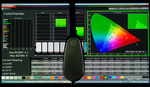
Have had zero luck with the CCP, utterly unusable over the top colors.
Check Adobe (left) vs CCP colors (right).
The saturation in blues and reds is way too high.
From what I see that's not just a white balance correction, but a profile in (probably) Lightroom. Is that correct?
If that is correct, are you sure your card was shot in a "flat light" scenario, because I see your light is a bit from the side (nothing wrong with the light). But if you shoot the Color Checker Passport square to the lens in this case, there may be some texture on the matte color patches that may fool the software. I'd shoot it a tiny bit towards the light, but not too much.
That's just a wild guess. Let me know what the real situation was.
Sorry, just saw this response.
I generated a profile in LR as per the instructions for CCP.
The card was shot in flat light conditions.
I played with directional lighting afterwards.
What is your Capture One workflow? It doesn't work with a DNG profile from the Color Checker Passport. It applies its own internal color profile designed for your camera and you can set the white balance based on the Color Checker Passport chart. The color offsets Lightroom does based on the DNG profile are not available in Capture One. This means you have to either rely on the Capture One profile or tweak the colors manually, and probably create your own camera profile there.
The colors of the bottom image seem more natural to my eye. That's why I think the white balance of the Lightroom image is off or the color profile is off.
I'm using Adobe Lightroom, no experience with Capture One.
The blues of the bottom image are way off the original color, for what it's worth.
What lights do you use? Are they consistent as temperature from shot to shot? If you make 5 shots of the color chart in the same position and apply 5 different white balance settings or 5 DNG profiles, does it give consistent results?
I guess you're using the Color Checker Passport software for creating DNG files and you give it a frame that is at least 30% filled with the color chart.
What happens if you only select the white balance with the eye dropper? You are using the "neutral" white balance patch, right?
We have several issues here: (1) photographing not flat, but a complex oval shape (human face) that (2) itself reflects colour of the nearby objects (coats, shirts, hair), (3) all stationed in a set and in an ambience that is usually different than during the editing. (3) is most difficult to overcome because in editing, we may change the preference – in our mind, we can mix the results from the set with our 'feeling', "how the colour should really look like." As for the (1) and (2), three readings of colour balance at least are required (highs, mids and shadows), using the colour spectrometer, because the charts will fail: light reflections happen right *behind* the charts, and we must access that area in 3D space.
Don't forget that the skin is semi-transparent unlike the color charts. You can take perfect readings of color charts at different positions on the set and you will get fairly close to the desired results, but the skin may not look correct.