Two photos of the same subject, shot by the same person with nearly identical gear, can read completely differently: one holds your eye instantly, and the other leaves you scanning corners for something to land on. That gap comes down to a single skill, and once you name it, you start seeing it everywhere in your own work.
That skill is subtraction, and Pat Kay makes the case that clutter isn't really a clutter problem at all. When a photo feels busy, what's actually happening is that the viewer can't find the subject. Kay leans hard on the idea of a "main element," the single most important thing in the frame that everything else exists to serve. Junk on the street, competing bright spots, background objects you never noticed when you pressed the shutter, all of it obscures that main element. Kay's argument is blunt: your photos probably don't have a clutter problem, they have a subject problem.
Kay also pushes back on the standard advice handed to anyone with busy images. Everyone tells you to shoot minimalism, find a wall, put a power pole against a blue sky, stick one person on an empty beach. Coming from a design background, Kay admits to loving minimalism and being biased toward it, which makes the counterpoint land harder. Telling someone with cluttered photos to shoot minimalism is like telling someone who can't cook to open a restaurant. Minimalism is a style, a finished aesthetic. Subtraction is the underlying skill, and Kay breaks the fieldwork into three levels ranked by what each one costs you. The first costs nothing: zoom. Every millimeter of focal length is a decision to include or exclude, though cropping tighter without deciding on your subject just gives you an aimless crop.
The second level costs sweat, and this is where Kay's example of physically running comes in. You usually can't move a mountain or ask a camel to shift left, so the only real control you have is moving yourself. Kay shows a first frame of camels crossing dunes that's merely acceptable, then describes sprinting a full minute across sand to a different dune to catch the animals walking the ridgeline against nothing but sky. Same camels, same light, same camera, with the foreground deleted by foot instead of by crop. The third level costs vision, and it's subtraction before the scene even exists. I'll leave the details of that one, plus the second decision Kay holds back until the end, for the video.
Where this really connects to a broader shift is in how much of good composition happens before the shutter rather than in Lightroom afterward. The instinct to fix a busy frame with a crop or a cleanup brush treats subtraction as a post-processing step, but Kay's three levels move the work upstream, into where you stand and what light you wait for. That maps onto a principle that translates well beyond photography: you make a frame clearer by controlling conditions, not by patching the result. A street photographer who picks a dark alley with a single shaft of light has already removed the buildings, the poles, and the wires before anyone walks into the frame. Choosing the situation does the editing for you, and it's a habit that scales from travel work to portraits to anything where you can position yourself deliberately.
The practical test Kay lands on is worth carrying into every shoot: stop asking whether a photo is simple and start asking whether it's clear. Could a stranger understand this image in one second? Fewer elements make that easier, which is also why minimalism is so hard to do well and so easy to fake. A power pole against the sky is technically simple but says nothing, because with nothing else in the frame, the subject has nowhere to hide and has to earn the entire image on its own. Subtraction, in Kay's framing, isn't about what you remove, it's about deciding what deserves to stay. Watch it play out in the video above, including the run across the dunes and the second decision Kay saves for last.




Join the Fstoppers community for free
-
Post comments and join in the discussions
-
Browse the site ad-free
-
Share your work and get featured in the community
-
Compete in the photo contests for fun and prizes
1 Comment
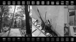
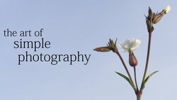
I agree with the principle stated here that composition is a study of subtracting elements which do not support the subject. I disagree with the conclusion that the viewer must understand the point of an image in one second, or that subtraction to the point of creating a minimalist image is necessarily good. Minimalist images can be compared to elevator music. Enjoyable, relaxing perhaps, but not much worth exploring in detail. However, complexity has holding power.
The introduction of the video compares a busy city scene on the left with a simple rural scene on the right. Yes, the image on the right is understood at first glance, but the the viewer is immediately left to decide whether to continue looking or leave. The image on the left gives the viewer an abundance of elements to look at, all of which are clearly related; the image is well balanced. There are no obvious distractions which do not serve the purpose of the photograph. It's busy, but not cluttered. There is nothing in the picture that I would remove. To me, it's far more interesting than the scene on the right. The idea that the "eye has no place to rest" is a hackneyed concept, over applied and without much merit, in my opinion. Contrarily, for many of my photographs, I want the viewer to keep moving throughout the image.