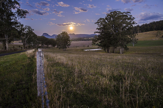
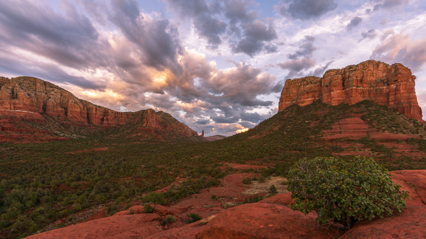
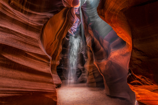
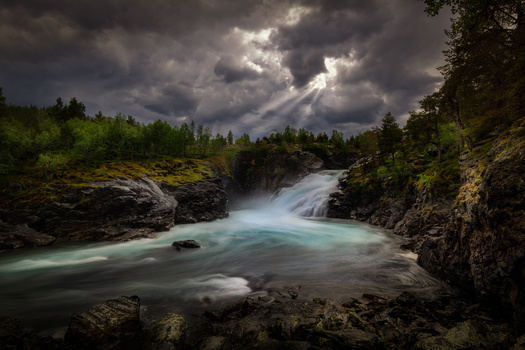
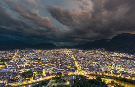
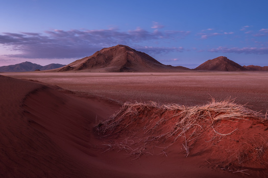
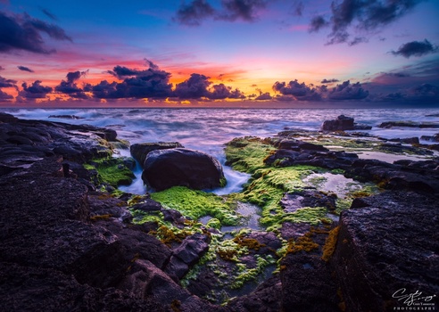
Contest Submissions
Click on the thumbnails below to comment and rate each image.
Click here to learn about the Fstoppers rating system and what each star value means.
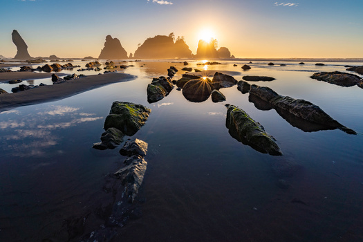
Click on the thumbnails below to comment and rate each image.
Click here to learn about the Fstoppers rating system and what each star value means.


6 Comments
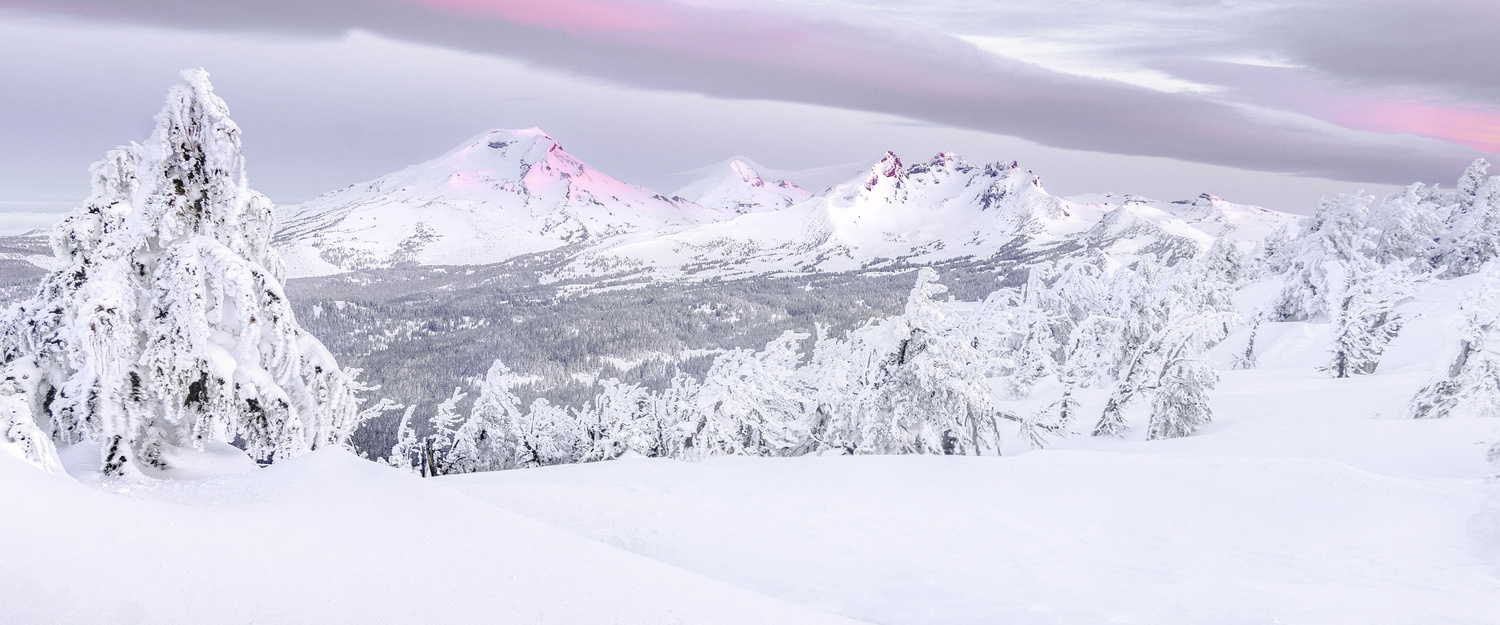
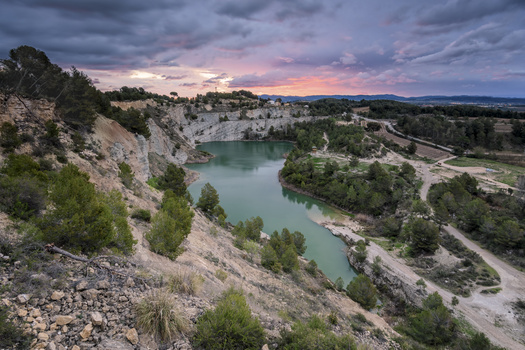
That's the white balance/auto exposure from your camera not being right for the snow, you have to adjust it or it does this.
it almost looks intentional, I like the effect but would make it a little more subtle
Are you talking about the brightness of the snow or the color? Im confused as to what "this" is, but I'd love to improve the image if I can!
The issue is that most cameras don't handle snow properly with their automatic settings, so your white balance makes the snow slightly blue, like on your picture https://fstoppers.com/education/better-way-fix-snows-blue-color-cast-ph… . Don't worry I'm guilty of this myself... W're so used to blue snow in photos we don't even realise it. As far as the lack of contrast is concerned, that's probably due to the overcast light, there's no contours on the snow or trees, so it lacks a sense of depth. Manually I guess you could do some dodging and burning but I have 0 experience in that, since I'm against using photoshop on my photos. However like Dillon says, it makes for a nice softness effect. But as is, I can't tell the trees appart. I think that's why the rating is only 2 while I'm sure you realise the scenery and the light have the potential for a 4. The community is rough.
I don't see any blue cast on the snow on my monitor to be honest.
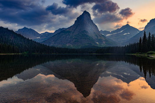
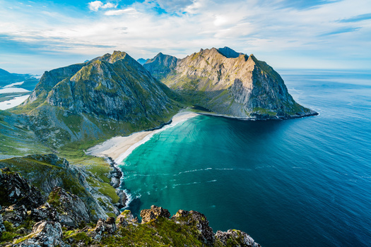
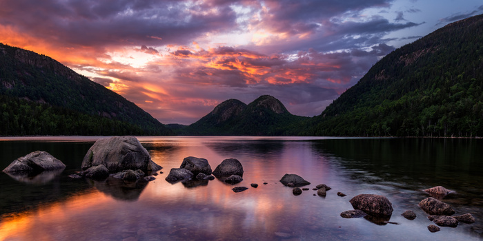
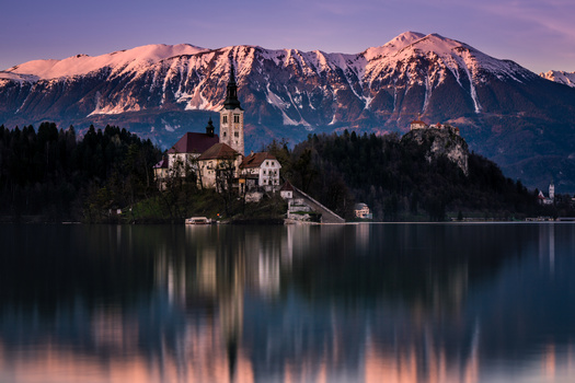
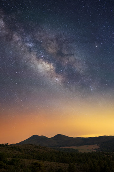
I think the saturation on the purple is way overdone on this, especially on the rocky peak in the middle