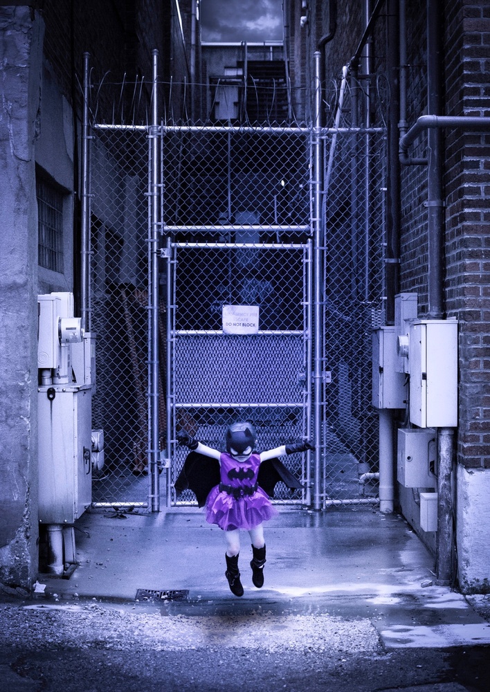
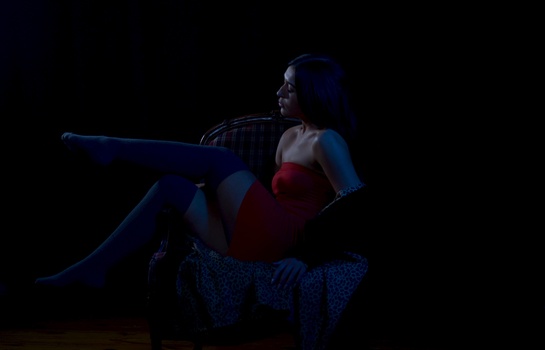
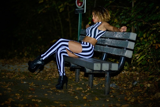
This is a daytime photo shoot, color graded to simulate a comic book style night environment.
Contest Submissions
Click on the thumbnails below to comment and rate each image.
Click here to learn about the Fstoppers rating system and what each star value means.


8 Comments
Hi guys. I’d love some constructive critisim. I’m relatively new to “professional” photography.
I think it’s worth pointing out that this is not a composite image. This alley exists in my hometown. Also, this is one image in a series that was used to create a slideshow, the intention of this image is to look like she is landing in the alley after having just left from the rooftop in the previous slide.
I very much would like your opinion on how I could have improved this image. I am particularly proud of the faint Spotlight I added on her creating a slight shadow beneath her.
I'm not a professional but I think this is a really fun image and like the concept. The coloring adds to the comic concept and if it was my shot I would probably try to add more shadow to the image.
Thank you for the feedback. Would you have made the spotlight more apperant to create those shadows?
Or do you mean darkening the image around the eadges to simulate the light falling off?
I appreciate that you have given me a direction to think about. Gaining others perspective is all I really hope to gain from entering this contest at this point in my experiance. Thank you.
The color overall is a good idea. However you might want to reduce the purple in the skin.
Also, I think there is too much light around. Especially, the white boxes on the sides are distracting. Using an oval mask to reduce the exposure could do a lot to improve that, while increasing the night & spotlight effect you are looking for (from what I understand).
(Unfortunate lack of sharpness here to. See my comment on your other picture. Because of the movement, you could not increase so much the exposure, but you could still increase a bunch it to reduce the ISO.)
Excellent critique Thank you. This was a photo shoot that I did with my daughter for her birthday. It is essentially the first real world Field test that I attempted to use my gear after first getting it. Obviously, I did not at that time, and probably still don’t, have a complete understanding of my equipment capabilities. 😉
I believe I was running in aperture priority, while taking the shot, I love the composition and I was still able to use this image in the slideshow that I created, because she is supposed to look like she just jumped off of the roof and is landing in the alley, so the motion blur on her didn’t bother me that much. But at the time that I took the photo, I think I identified that I didn’t want the motion blur so I switched to shutter speed priority which resulted in the excessively high shutter speed that you saw in the other image that you critique for me. A bit of overcorrection I think . I truly appreciate you taking the time to look at my images.
You have to think about watching your settings at the bottom of your viewfinder. It quickly become a habit when you start to do so. It will allow you to also check whether or not you can improve the ISO (make the latter accessible, see comment on other picture).
To be honest, these are nice framing for a first field test, and the edits indicate an interesting direction.
As with your other entry, much of what I would say has already been said, the skin tone seems to purple and the purple doesn't seem purple enough - I actually prefer this composition over your over photo and I'm kinda surprised this has a lower rating since it's less grainy too. All the lines of the building and fence are nice and straight and your post-processing looks good.
once again not much else I can add that other people haven't.