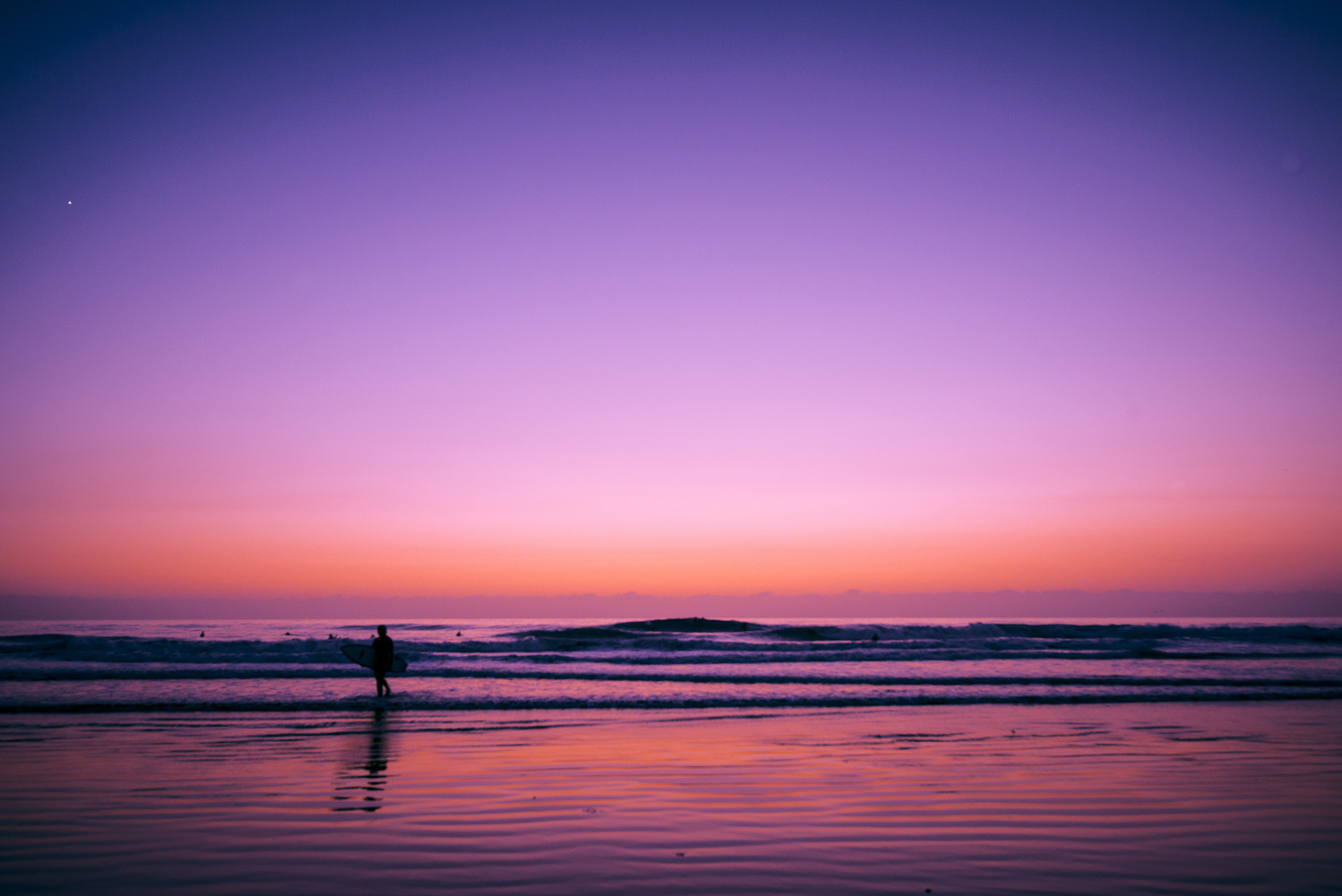
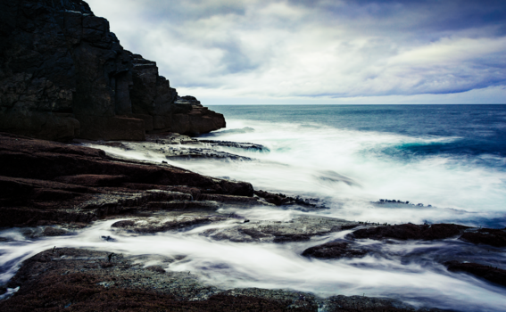
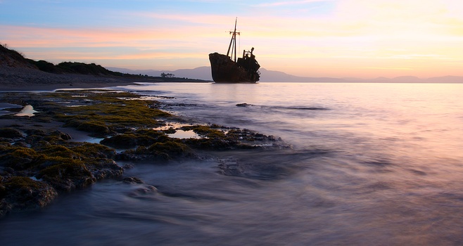
One More... Newport Beach Ca. Shot past twilight. Split toned in Lightroom
Contest Submissions
Click on the thumbnails below to comment and rate each image.
Click here to learn about the Fstoppers rating system and what each star value means.


6 Comments
one more wave that is...
At a glance, I can count five dust spots that have been removed poorly or not addressed at all. You really need to bring up the dark areas of the wave faces so the surfer on the shore contrasts better with his background. As it is, he disappears in the waves.
Thanks for taking the time to count blemishes and for your critique. I accidentally uploaded the un retouched version. To me the surfer isn't the story, so I never put too much thought into him. He occupies maybe 1% of the frame. So it is funny how you grab that. And that is an important point concerning what people see and value in any image and what you need to think about what goes in or is left out. There are other images taken in the same set.
The story is really about the colours. This shot was taken about an hour after sunset and has an exposure of a few seconds. You can even see Venus. If I wanted to get a surfer looking perfect I would do that, I would fill the frame and would have used proper lighting. I wanted to explore colour. I thought this competition was about color editing and I think this image goes with that by going into the hyper-real.
I was giving you an honest critique. If you don't want your images judged, don't enter them in a contest.
Don't be so defensive, I appreciate it and said so.
I apologize. I incorrectly assumed you were upset with the critique. Good luck in the contest!