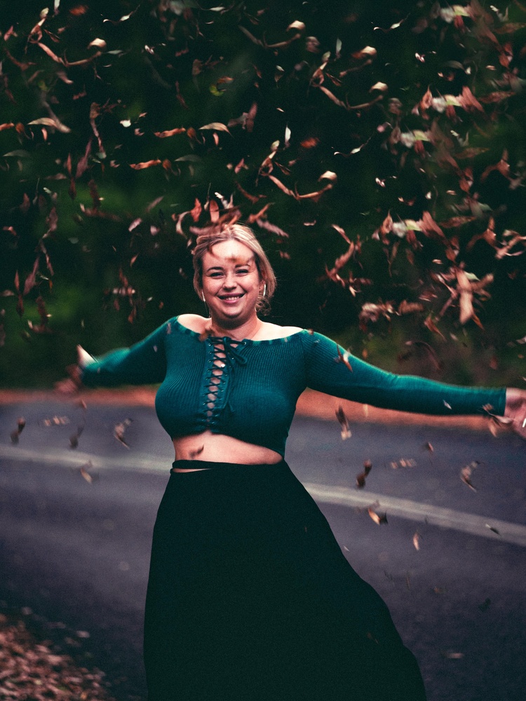
I would love some creative criticism for this photo.
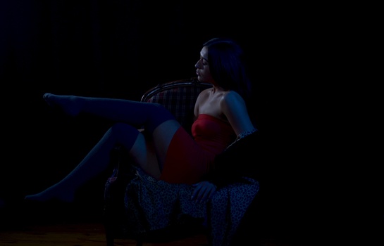
I have warmed the entire image very slightly and added orange to the highlights.
I have also changed the blue hue of her top slightly toward the teal side and tried to keep her skin tones looking as natural as possible.
I pushed the yellows slightly towards orange and the reds toward orange as well.
the blue is slightly desaturated while I have bumped the saturation of orange and green.
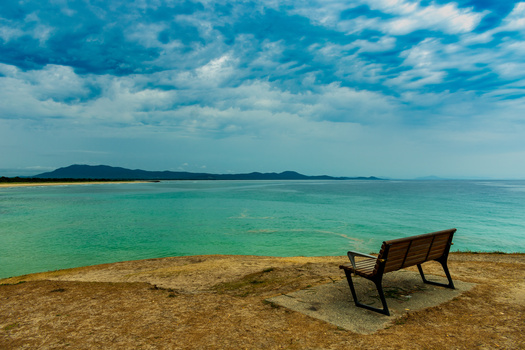
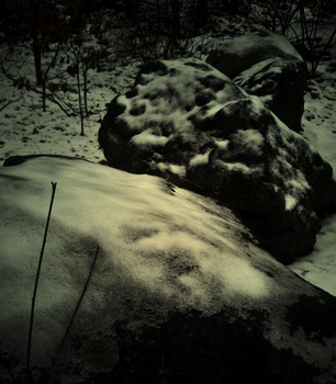
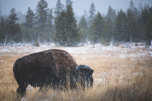
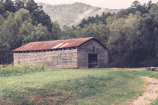
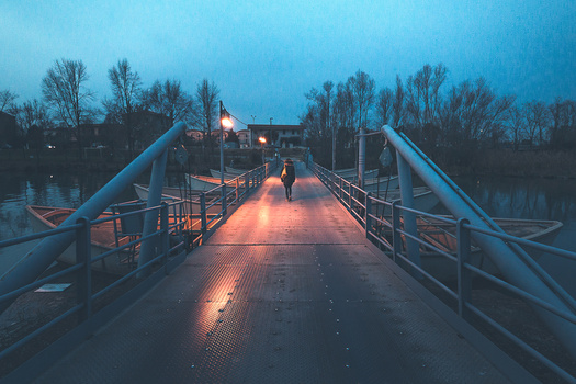
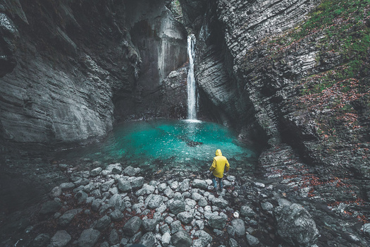
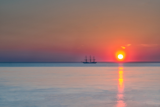
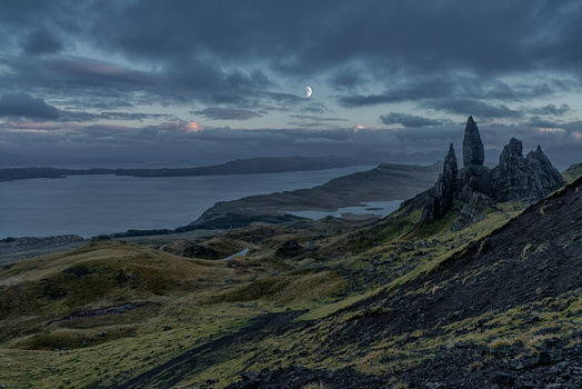
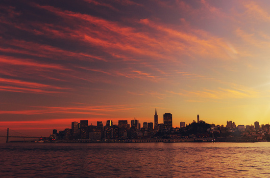
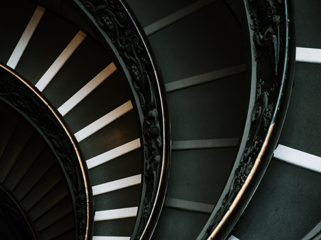
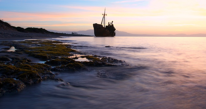
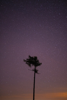
Contest Submissions
Click on the thumbnails below to comment and rate each image.
Click here to learn about the Fstoppers rating system and what each star value means.


3 Comments
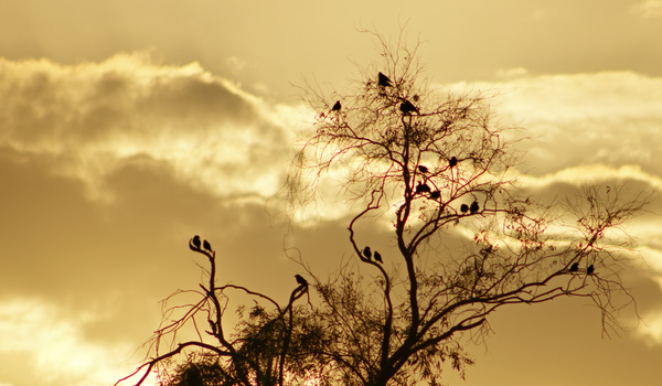
I'm seeing a lot of repeating patterns in the leaves making it pretty clear that you added a lot/most of them.
The color work is fine but I want to know why you chose this photo to start with?
Good point with the repeating patterns, I did clone a few extra leaves in.
The reason I chose this photo was because it was originally very dark and cold on the day so I felt this was a good example of changing that to a warm bright image. I suppose there’s no context without the original though. Something to think about for next time, thanks.
Use the clone stamps transform setting to very the angle and size of your cloned object next time. It will help prevent a noticeable pattern.