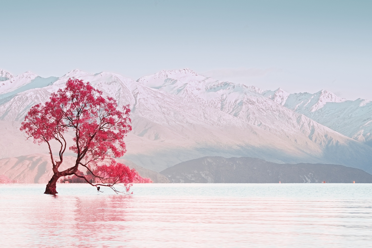
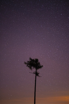
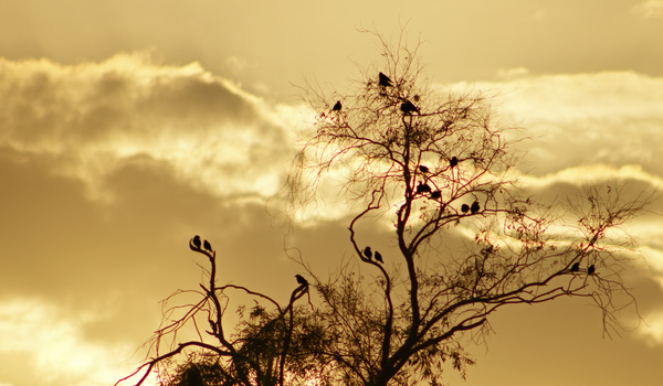
Wanaka Tree New Zealand IR
Just for fun I was toying around with the IR presets in Alien Skin. After a bunch of tweaking I really enjoyed how this came out. Not really something I'd consider a portfolio image, just a fun color grade.
Wanaka Tree New Zealand IR
Just for fun I was toying around with the IR presets in Alien Skin. After a bunch of tweaking I really enjoyed how this came out. Not really something I'd consider a portfolio image, just a fun color grade.
Click on the thumbnails below to comment and rate each image.
Click here to learn about the Fstoppers rating system and what each star value means.


16 Comments
You wouldn't consider this a portfolio image?? I think it is stunning!
Thank you! I do really like the picture, and while I don’t think it would hurt my portfolio, it wouldn’t really add to it. I’m building towards weddings, portraits, and eventually real estate for my professional portfolio. Landscapes and travel just for fun and personal portfolio.
this is great!
Thank you!
Welp, that’s just cool. I hope this makes the video critique.
Thanks. Fingers crossed they don’t shred it like the last time I submitted one. Lol
The colors are amazing!
Thank you!
Brilliant
Thank you!
5 stars! My favorite picture in the community so far! The colors are amazing! You should be selling prints, if you're not already!
Wow! Thank you so much! I have printed it on my pro-10. Looks great on luster paper. Gave it to a friend for Christmas.
I hope this makes the show because i think they will have the same critique i have
Whatcha got for me? This was just a fun play thing of a color grade, but I’d love to know how to improve it beyond the stuff I see wrong with it. For starters (to me) it doesn’t look as sharp on here as the picture actually is. I also feel I could have spent more time with the details behind the tree, but I got tired of fooling with it. Not sure if I should have cloned out the kayaker and buoys or not. I kind of like the fact that if you look closer you’re like “oh hey, a kayaker”, but I can also see how it is mildly distracting. Please, feedback is very welcome.
First of all I think the composition is amazing. The issue for me is I don't know if it's the white balance or the color grading(Would be interesting to see the raw file) but all the reddish pink in the water and snow takes away from the star of the show (the tree) I want that tree to pop more.... More contrast ..
Thank you for your input. I'm going to half agree with you. Obviously this is subjective, but to me the star of the show so to speak is the scene as a whole and the color, with the tree simply being a strong point of interest. I agree about the tree popping more. This was the last of the good morning light and the tree is in shadow, while the mountains are in direct sunlight. I did mess with trying to get it to pop more but without doing very tedious dodging on the tree it was causing haloing and clipping in my highlights, so my lazy side got the better of me and I gave up on it. Whats weird to me is on my macbook monitor the tree pops and the whole scene looks great, on the monitor I use when I edit for prints it looks the way this particular upload looks. But when printed everything is bright again because of the way I have everything calibrated. The raw file wouldn't offer much. Its just a sunrise shot with normal colors and the tree itself is slightly under exposed so as not to clip my highlights. White balance was set in camera to the scene that morning, and going off of histogram its a good exposure. I'll fool with it some more using your advice after the Critique and upload it to my Fstoppers portfolio. I'll be sure to ask for your input again after I do so. Thanks again. It is much appreciated.