
Contest Submissions
Click on the thumbnails below to comment and rate each image.
Click here to learn about the Fstoppers rating system and what each star value means.
Click on the thumbnails below to comment and rate each image.
Click here to learn about the Fstoppers rating system and what each star value means.


6 Comments
I'm thrown off by the cropping but I think that's why I like it.
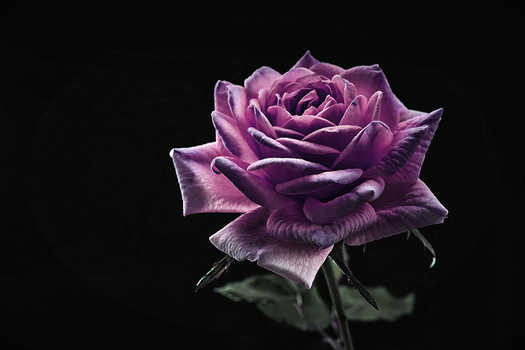
James Terry Thanks for sharing ---what do you think about the reds? are they too much?
I don't think they are to be honest. At least not on this monitor.
Thank you
The tones are interesting. But I think they affect the eyes to much, which make him look a bit sick.
Well noted, next time I will mask them.