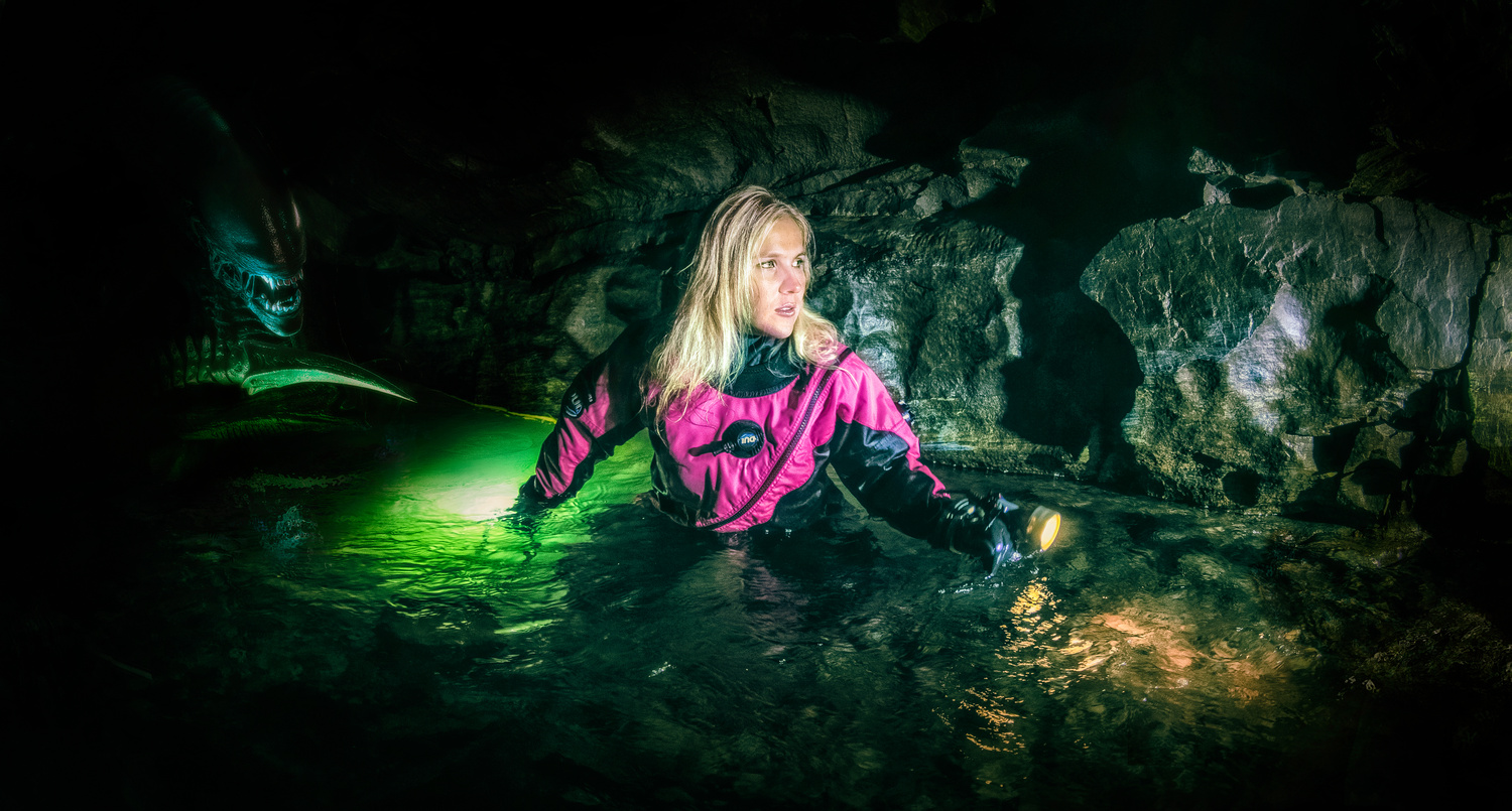
Image taken in River Cave.
Contest Submissions
Click on the thumbnails below to comment and rate each image.
Click here to learn about the Fstoppers rating system and what each star value means.
Click on the thumbnails below to comment and rate each image.
Click here to learn about the Fstoppers rating system and what each star value means.


4 Comments
As an example of graphic compositing, I guess this a pretty solid shot. As an example of horror imagery, it needs work. It's WAY too bright to be scary and the ambient light level makes me wonder why she's using not one, but two flashlights (unless the green light source belongs to the alien).
Thank you for comment. She has two lights. One in front was HID light and the second behind was LED. That gives them different color temperatures which gave me the inspiration for heavier color grading. I kept the ambient level stronger to reveal more from location where it was shot. But I agree, it takes out the scary feeling and mystery.
Did your subject know that you were going to make it look like she was in a scary situation at the time you took the photo? If so, it would have been a nice way to improve this by having her cycle through various levels of fear with her expression, then pick the one that matched the mood the best. Cool concept bud. Cool photo even without the xenomorph.
Thank you for comment. No she didn't know. I made this concept after I did some color corrections on big screen. It is nice idea, maybe to create new photo shooting with some kind of story. This expression she has now I would place in story before she really realize the situation she is.