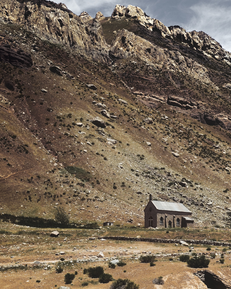
Abandoned church in the Andes mountain range.
Contest Submissions
Click on the thumbnails below to comment and rate each image.
Click here to learn about the Fstoppers rating system and what each star value means.
Click on the thumbnails below to comment and rate each image.
Click here to learn about the Fstoppers rating system and what each star value means.


9 Comments
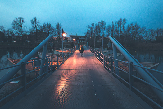
I love the tones in this, but I wish there was some foreground included in the shot. As it is, there is nothing but mid ground and background and it leaves me wanting to see more.
Thanks for your comment Phillip! I really appreciate it. The original image had some foreground but I ended up leaving it out when I cropped it for Instagram and also because its color is quite different from the rest of the place. Guess I should have kept it with a different coloring.
This is the original image
https://cloudup.com/ch5DdEld-tD
and it has some foreground, the wall of a ravine where a river runs, yellow-tinted due to different minerals.
I see what you mean. Do you have any other shots of that scene that are maybe horizontal and that include more of the yellow ravine? Might be interesting.
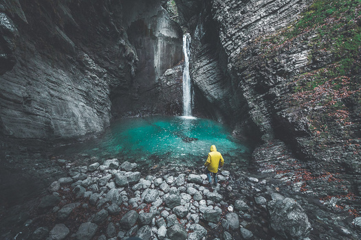
It is! The glowing yellow color of the ravine and the bridge is fantastic. The last two here in my feed and others in the highlighted story "Puente del Inca" ("Inca bridge", such is the name of this geological wonder) feature the ravine, the river, and the bridge.
https://www.instagram.com/eliorivero
It's a place in the Andes mountain range, at 2700 m a.s.l. The second last photo has a short video, plus a lot of facts about this place that is really unique.
I like your edit here far more that the one on Instagram.
I'm not sure the yellow ravine would help the photo, quite the opposite.
I don't mind no foreground, this is not mandatory, but true that the lower left seems like lacking something.
I tried to burn the vegetation, stones and wall in lower-left area, and I feel like it helps a bit: not only does it “repopulate” the area a bit, but also thanks to the reduced luminosity of the wall and stones, I feel like the look is less attracted toward this area.
Hi Paul, thank you. I agree with you that this edit is better–or at least I prefer it–than the one in IG. I posted that one with the natural color there because I wanted to keep a consistent color between the photos made in the area.
As for your suggestion, I gave it a shot and it's already a nice improvement
https://cloudup.com/ijHJdLYn3IC
So thanks for it!
Glad I could help. Tbh, I think I would not have think about it if it were my own picture on which I would have been working from scratch. I guess looking for improvements for other people is a good drive for learning through innovation. :)
Love the tones! Also followed you on instagram and saw plenty of works that I really like. Keep it up! Happy to know a fellow fuji-x user as well!
Thanks Franklin, much appreciated!