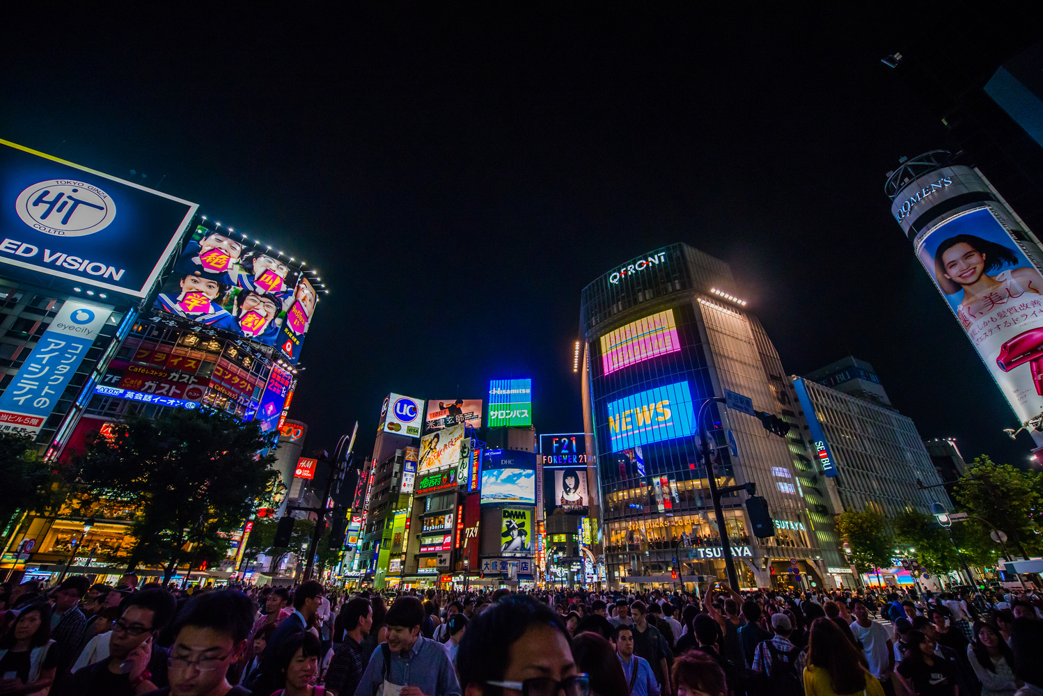
Neon feel in Tokyo (Shibuya crossing)
Contest Submissions
Click on the thumbnails below to comment and rate each image.
Click here to learn about the Fstoppers rating system and what each star value means.
Click on the thumbnails below to comment and rate each image.
Click here to learn about the Fstoppers rating system and what each star value means.


5 Comments
Too much negative space in the sky for me. And I don't like the way the face of the man in the middle has been chopped in half at the bridge of his nose. The framing makes all the people look insignificant and I'm not sure that's what you were going for.
Hey Philip, thanks for the feedback! The head is indeed an eyesore for me too. The difficulty here is that i wanted to add the people walking, but wanted to make the buildings the eyecatcher. It also was extremely busy at this time. Composition wise (the negative space) This might have been better if i did a double exposure (1 for the buildings and neon and 1 of a blue/golden hour sky if there were clouds). Due to not having time i could not get that unfortunately. I will reshoot this image next time i am in Tokyo, i will keep your feedback in mind! I might try to get a higher vantage point next time.
Oh, I'd like to see that. While you're up there, see about getting a top-down shot of just the crowd lit by all the neon signs!
Maybe a longer exposure for the people would be good. It might give you a more abstract “sea of people”, making the people less distracting as well as producing nice symbolism.
Hey Paul, thanks for the feedback! Longer shutter was not possible because i had no tripod with me.(handheld shot) As i said to Philip in the comment above, next time im going there im taking all the feedback i get here to make the photo better!