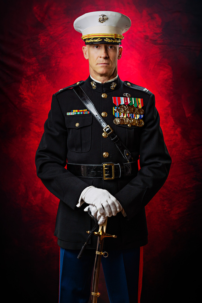
Another shot from my portrait session with my friend who's retiring from the Marine Corps. This was my favorite shot from the whole session.
As my friend was preparing for his retirement from the United States Marine Corps, he reached out to me last week to take his final portrait in uniform. It was a huge honor for me because of how much I respect him and all that he has accomplished in every aspect of his life.
Shot on a Nikon Z8 with an 85mm f1.8 Z lens. Settings were ISO 64, shutter speed 1/125, and f/4. Lighting consisted of two Godox V1 flashes (back one in a strip box, main one in an octobox), an LED strip light, and white foam board for some bounce.
Backdrop is a foldable fabric oval from Kate Backdrops.


2 Comments
The dark black uniform looks just right to me, although undoubtedly it caused some difficulty in retaining any sort of detail in the highlights of his gloves and cap. But I think there's some working room for toning down the whitest areas ever so slightly, especially in the gloves. The cap too could benefit from just a little darker highlights and brightness in the shadow. A small white halo around the edge of the cap on the right can be fixed too. The glare in the strap is somewhat distracting, and might take some work to fill that in with Photoshop, but can be done. Probably an easy task for Generative Fill though.... I don't really know. I edit with ten year old Photoshop CS5.
I think the best thing you could do to improve the photo would be to balance the color between the right and left side of his face. It looks more natural on the camera right side, but on the left side, his skin is turning a bit yellow. A sweep of the cloning brush at a 15% or so opacity (using the brighter part of his face as a source) across the right side of his nose would soften that shadow.
Ed Dress “Blues” color(s) look spot on. I could distinguish the difference of the black leather and midnight blue even with just a thumbnail view. At max zoom I can even see texture in the midnight blue and in the fine black leather details areas.