
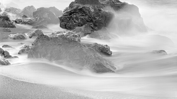
One of the most important things we can do when we are engineering our photographs is to control, or to direct, where we want the viewer’s eyes to go—what it is that we want them to see. To do that, we must use the architecture of the image to bring visual interest up in the areas that are most important and find ways to diminish what we either want to hide or at least subdue in interest.
One great disadvantage we have as visual artists, using photography as our medium of expression, is that when we make a photograph there will often be things in the background, or even in the foreground, that we don’t really want as interest-generating elements. Sometimes we can control those by simply doing some housekeeping of the scene before we make the image, or by changing the camera position slightly. Bear in mind that I come from a film background, and prior to the advent of actual good digital cameras and the genesis of digital imaging, we had to handle those issues before exposure since they could not be removed easily afterward. If we didn’t remove the litter from the image before making the exposure, the only way to take care of those things was to spend hours spotting them out on the final print using spotting dyes, whether in color or black and white. That is tedious work, and thankfully it is now much easier using Photoshop.
In that case, what are the things that allow us to direct the human eye to the place we want it to be? Here are a few: the human eye will have a tendency to migrate to that which is lightest, brightest, has the most contrast, is in sharpest focus, or that which is in the minority. That is true across the spectrum of photography, and in black-and-white work we deal primarily with those three factors. If you add the element of color, it then becomes important to understand that some colors have more visibility, in general, to the human eye. And while I am on the topic of color photography, one should also understand basic color schemes.
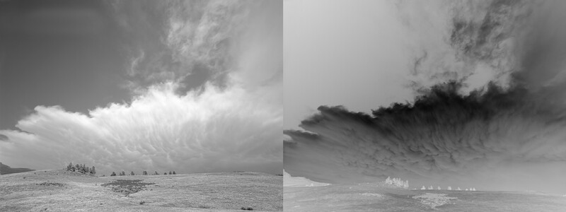
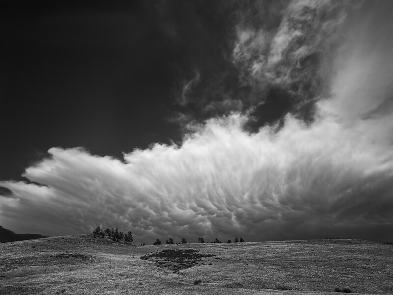
As you look at this illustration showing a scan of the original negative as well as a proof print, duplicated here as nearly as I can to the actual darkroom proof, what was done to make it more interesting and to direct the eye where I wanted it to go? First, I increased contrast overall, being careful to hold high-value tone separation and shadow detail. In digital terms, I was careful to avoid either highlight or shadow clipping. Next, I increased contrast in the part of the mammatus cloud that was in the center, where the striations are, and lowered contrast in the ground underneath the cloud. I also darkened the sky in the upper left corner, but not to black. The next step in Photoshop was to create an empty layer, set to Multiply as a blend mode, and then paint a very light gray over the corners, especially in the lower corners left and right. I was careful to keep the darkened area from intruding into the center where a lighter tone would lead the viewer’s eye into the image. The goal, of course, was to emphasize the texture of that huge storm cloud on the horizon. The intent was to direct the viewer’s eye up to the dramatic cloud.
That Which Is in the Minority Gets the Most Attention
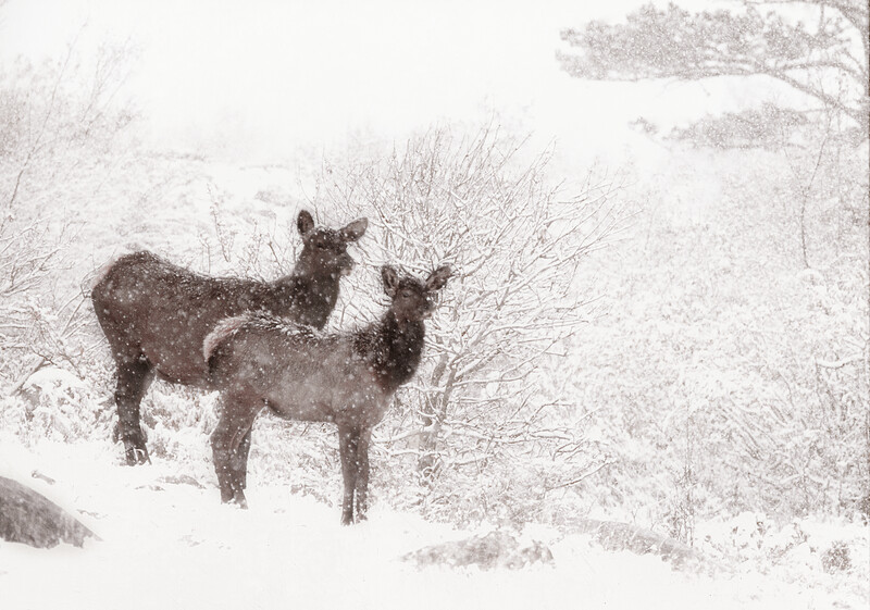
Many years ago I was with some friends in the mountains of northern Colorado. They were there to photograph elk, which were in rut so they were easy to find. While I was with them, a cow elk and her yearling calf walked out of the brush nearby. Fortunately I had a Canon F-1 nearby with a 200mm f/2.8 lens attached and loaded with Ektachrome E100S film. As you can see, though most of the field is white, your eye naturally migrates to the cow and her calf because their forms are in the minority in the frame. (By the way, there is a semi-sad story attached to this image. Right after I made the original, I moved my darkroom to another location and the original slide was lost in the move. Fortunately, I had made a small Cibachrome print of it, since I really liked it, and that survived the move. This image was made from a scan of that Cibachrome print. I would love it if the original did show up since I feel like it is in some of the clutter that invariably occurs in almost any change of location.)
Use Depth of Field to Direct Attention
Using a relatively wide-open aperture will, as most people know, help to limit depth of field. Some people refer to this as “bokeh,” not to be confused with “bouquet,” which is an arrangement of flowers. When we limit depth of field in an image, we limit its range of acceptable sharpness and, using that tool, are able to direct attention to the area where we may want it to go.
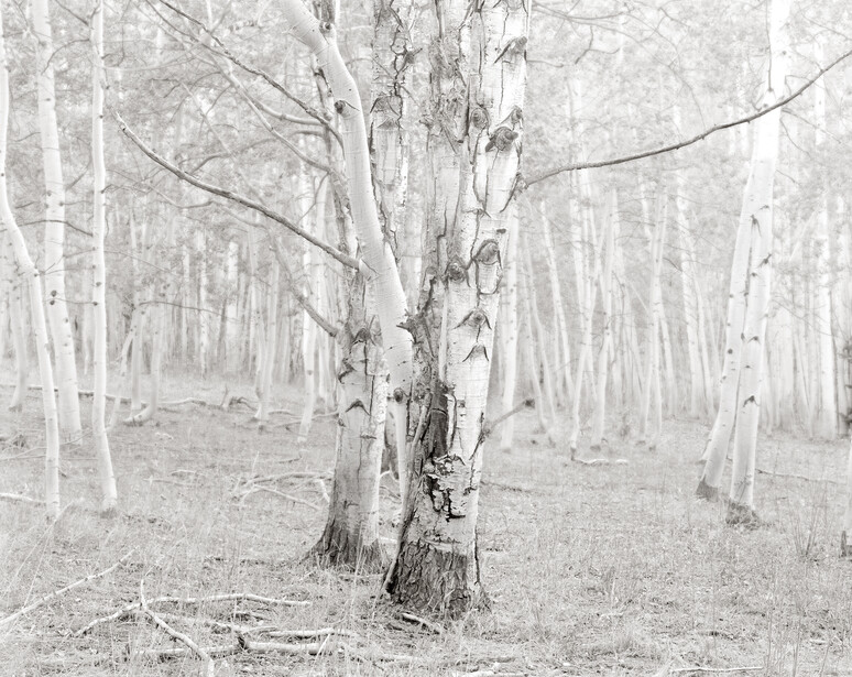
My goal in creating this image was to use limited depth of field to help isolate the aspen in the foreground from the rest of the forest. A slight mist was beginning to form, which made the task of isolating the tree somewhat easier. However, lenses on large format cameras necessarily have maximum apertures that are quite different than a full frame DSLR camera. For instance, with the lens used here the maximum aperture was f/5.6, so limiting DOF is more difficult. I used a new Photoshop tool to accomplish the task. It is called Neural and works relatively well. In the darkroom I would use a piece of netting between the lens and the image to increase blur in the background.
However we do it, in my opinion, one of our chief tasks as visual artists is to find a way to communicate the visual idea we have with viewers, whether they are gallery goers or online looking at an electronic file on a computer monitor. My hope is that I can help equip other photographers with the knowledge I have accumulated over my 40+ year career. And, God willing, I would like another forty years since I feel like I am finally getting my sea legs under me.


Join the Fstoppers community for free
-
Post comments and join in the discussions
-
Browse the site ad-free
-
Share your work and get featured in the community
-
Compete in the photo contests for fun and prizes
5 Comments
My personal tastes are often to put the subject near the edges of the frame, but I realize that most viewer's eyes will go to the subject more readily if I keep it a bit away from the edge and a little closer to the center of the frame. This is especially true for images in which the subject does not "pop" out of the background so much. So I usually shoot a few frames for myself, the way I like to see the scene, and then a few frames with the subject a bit further from the edge, for images that will be shared or marketed.
I just naturally tend to the center of the screen and I have to pay attention to remember to place it left or right of center. I do believe that center placement is very often a more powerful composition. The other thing is that when I am photographing the BIG landscape I like to place the horizon line either a lot above the center or way below center, depending on what's mot important to me in the moment, the sky and its cloud structures, or the land. It's just interesting to me to see how different people place subjects in their composition.
When a sky is completely uninteresting, like just all one tone and color, I hate reflections, because reflections tend to cause one to end up having that "horizon" line in the middle of the frame, and I hate it being in the middle as much as you do. (technically not the horizon, but the visual centerline)
I just got back from of a couple weeks in the Tetons and was frustrated because so often, I was "forced" to put a horizon line much closer to the center of the frame than I would like to, due to there being a clear reflection in the river/lake surface, and it looks awkward as hell to chop off a reflection. I don't even like the way reflections look; I would rather there be a bit of wind and a little chop on the water's surface, so I wouldn't have to bother with the damn reflection thing. But clients (I guide photographers) love to shoot reflections, so I have to bear with it, as distasteful as they are to me, personally.
I try to find a way to use the reflections to my advantage. I agree that splitting the image with a reflection makes it too normal.
Some people really, REALLY love reflections. I just don't get it. If I already see something in a photo, why do I need to see it again, upside down? Makes no sense to me, and yet people think the mirroring effect is beautiful or whatever.
The exception for me would be when the reflection is distorted because of slight disturbance of the water's surface, or the presence of ice. This can create an abstracted, surreal version of the subject, shown right below the actual true-to-life subject. Some duck photos are cool because the duck's head is reflected, but the eye will be stretched way out into an elongated oval, or the bill will be really thick, or a white spot on the head will be shown 3 or 4 or 5 times because it appears in each ripple, or parts of the plumage will appear as blurry streaks.
But a straightforward reflection brings nothing to the image that was not already there without the reflection. And there is nothing about bilateral symmetry that is beautiful in and of itself.