
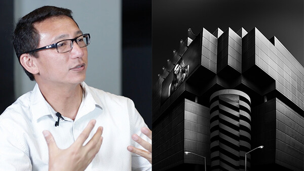
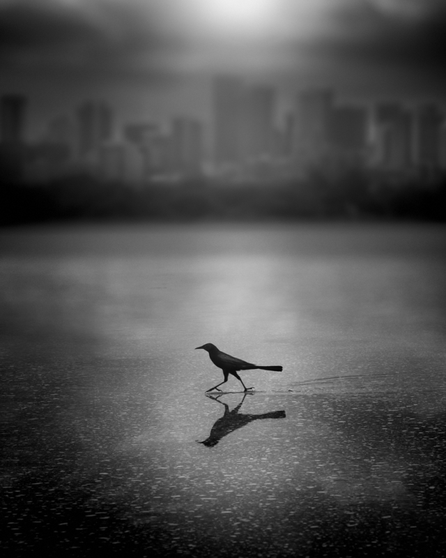
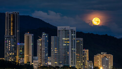
Sometimes, we admire one's work, but we may not understand the path they took or how they perceive images of their own. For a few years now, Photographer Dennis Ramos has graced the front page with his popular photos and Photos of the Day here on Fstoppers. I had the great opportunity to sit down with Ramos for an interview at Tampa Image Factory to find out what exactly his photographic journey entailed in order to become one of the best black and white fine art photographers around.
In our sit-down, Ramos shared how he actually started in color taking portraits, why he is so drawn to black and white, the thought process behind his work, and more. Check out his interview, and if you have not seen his stunning work, take a glance at his work below. For more, take a look at his Fstoppers page and website.
If you haven't already, make a profile and share your work on our Fstoppers community pages! Lee, Patrick, and all of the writers are checking out what you all are sharing. So, who knows? Maybe you'll be the next photographer we feature!


Join the Fstoppers community for free
-
Post comments and join in the discussions
-
Browse the site ad-free
-
Share your work and get featured in the community
-
Compete in the photo contests for fun and prizes
11 Comments
Love his stuff!
Dennis has killer work! Very cool
Wondeful photographs. I would love to see a "how-to" video.
Absolutely amazing photographs.
Have Fun,
Jeff
I've come across a few photographers with this style of black and white. Its absolutely incredible but can't figure out how they do it! Any know of any tutorial or video walkthru of someone post processing this style of photography?
It looks like he shoots the originals in digital, because his prints don't show any film grain.
If I were going to reverse engineer his "look" I'd use some combination of: deep red filter to darken the skies. Dodging and burning. Graduated filters. Playing with the Hue/Saturation/Luminence controls in Lightroom.
I'm sure his raw images (or film negatives) look VERY different from his fine prints. Go out some day and take some simple, graphic compositions, and then go wild on your PC ... I'm guessing you can get 70-80% of what he does.
The remaining 30-20% is why he's famous and I'm not ;-)
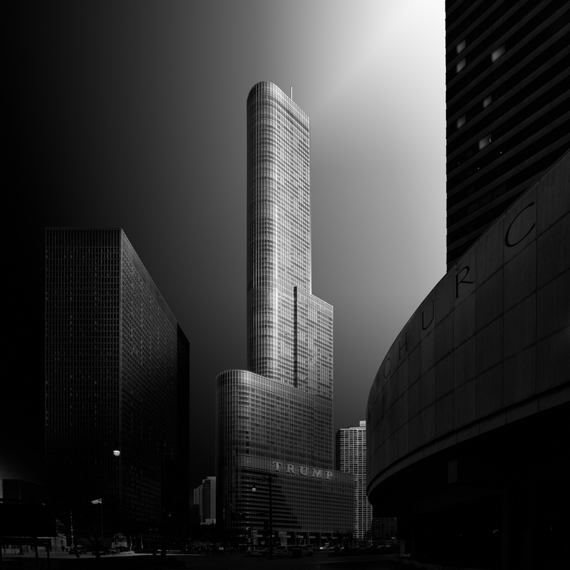
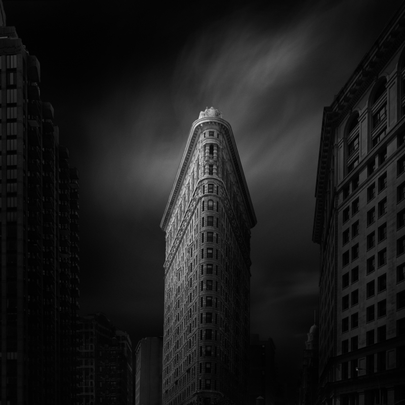
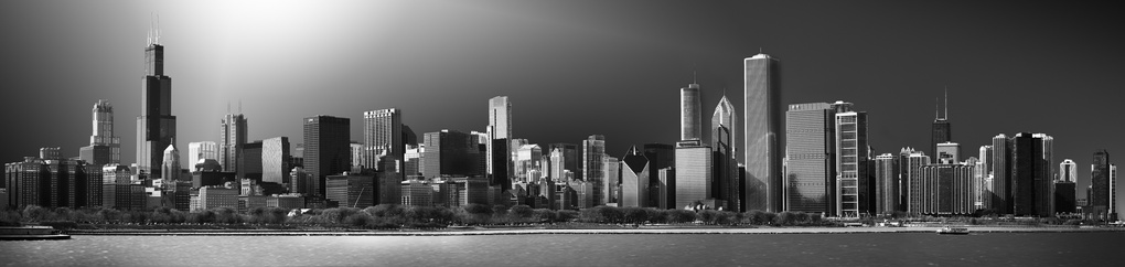
Lets look at the Flatiron building shot (since many of us probably live in or near NYC).
It looks like a night shot, but it can't be, because there are no lights in the windows. So it must've been taken in the day, and printed VERY dark. (ETA: clicking on to view full size, it says it was taken at 10:45AM)
Additionally, the clouds are motion-blurred, so he must've used a strong neutral density filter.
Additionally, the buildings to the right and left and burned in, as is the bottom of the image. (ETA: and the top corners, too) It looks like he's also lowered the contrast in the darkest areas, but I'd have to take a similar shot and play with it.
This is just spit-balling. The only way to know for sure is to actually try it.
My two-word riposte to your how-to musings: post-processing.
Joel Tjintjelaar, Anna Gospodarou has similar works. Some of my take from Joel's tutorials: http://www.anthonyromblon.com/monochrome
The process involves choosing specific parts of the image that you want to accentuate the highlights, shadows and the midtones. Actually, the process is concerned about how you will take control of the grays. the highlights and shadows are just there to show or hide any parts of the image.
Nick, awesome article man! I love finding inspiration in the unlikeliest of places. Led me to your website and I love your work! I'd you don't mind me asking where did you learn to retouch the way you do? It is a very natural looking style and I'd like to start refining my skills in portraiture a bit more. Any advice is appreciated!
Thanks Mark, appreciate it. My retouching workflow has come from trial and error over the years. I'm putting together an article series for next year to show everyone bit by bit