
August Challenge - Abstract (traditional)
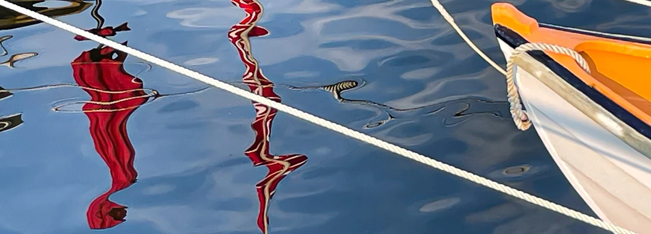
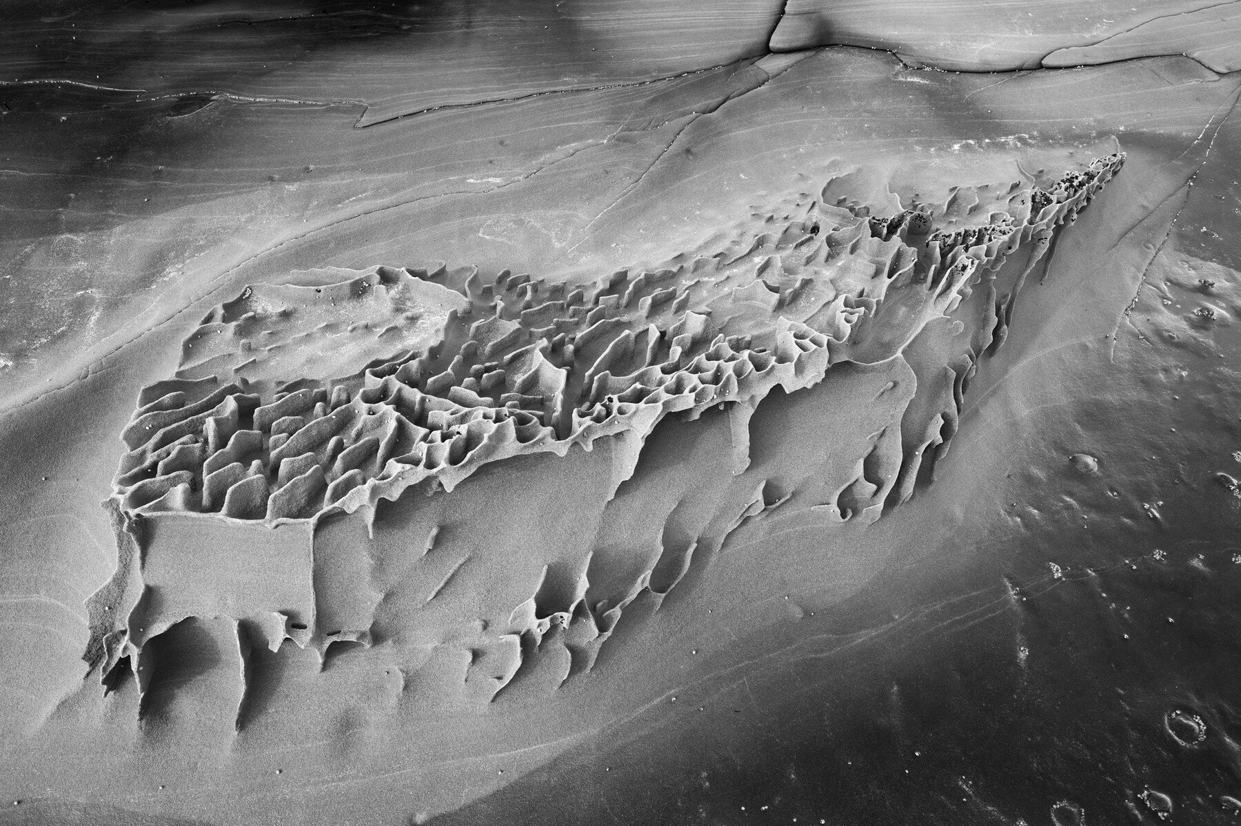
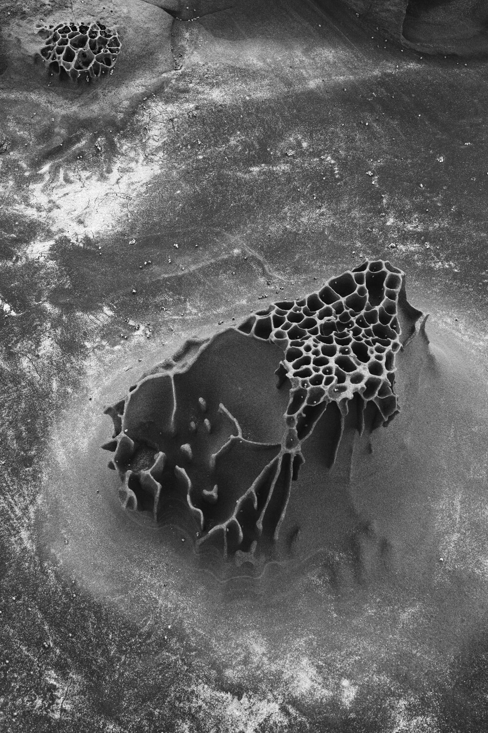
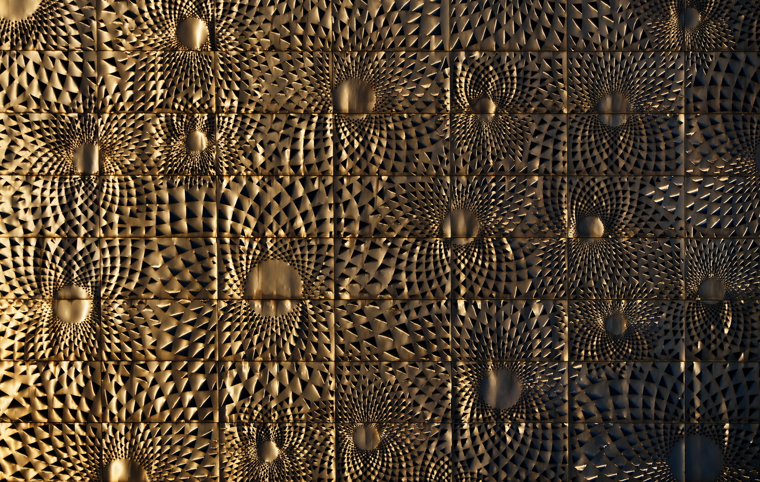
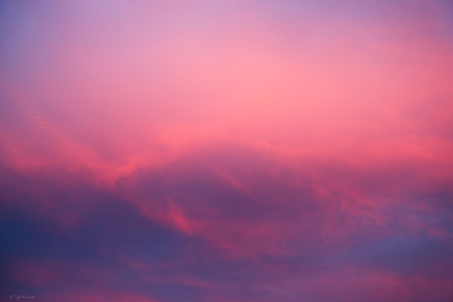
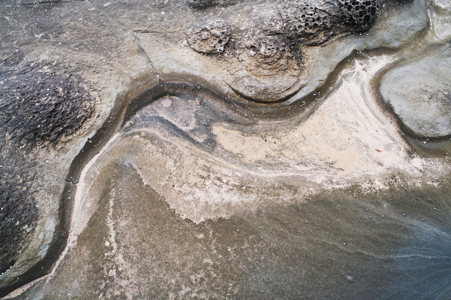
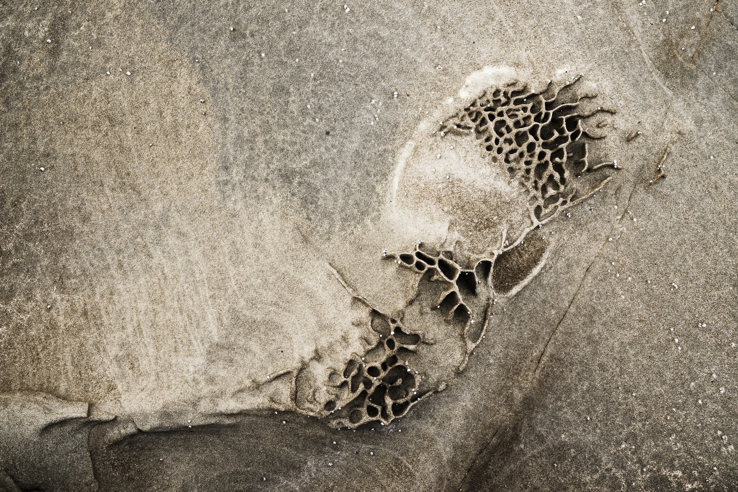
Abstraction is one of my favourite photographic approaches. I like it when it's difficult to be sure what you're looking at, and to judge the scale of whatever is portrayed, although I haven't achieved it in these images.
They are listed roughly from newest to oldest; I am gravitating to black & white, and quite uncertain where colour fits in to the scheme of things for me now. I used to be motivated by colour and find black & white sterile and depressiong, and yet most of my favourite photographers have always been mono devotees. There are times when rich colours make an image, but occasional colour doesn't seem to sit well in a predominantly mono portfolio or series - the direction I seem to be heading in.
I only realised after creating the post that they are all from just two locations - Artillery Rocks on Victoria's west coast, and an apartment balcony during the COVID lockdowns.



8 Comments
These are wonderful, Chris. The compositions are each fantastic. I love the sense of graceful motion around the steadfast landforms in #s 1, 2 5, & 6 - almost as if they have to deal with these stubborn, rigid things; so why not just dance around them (maybe they'll come around in the end - Lol). The colors of the sky are lovely, and the "eye" feels like it's drifting along with the clouds with no desire to do otherwise. Lastly the tiles are a wonderful busyness - each contained in its own space. I also appreciate the gradation of color. Nice work on these! Hope you are well!
Thanks a lot for your kind words, PG! It's interesting how abstract images can stir the imagination, a major part of their appeal for me. (Although I've enjoyed doing abstract painting in the past because no one can tell you that you've got it wrong. Try drawing a hand ...)
I'm especially grateful for your emphasis on composition, something I love about photography - it often feels like painting for cheats: all you have to do is frame up, and press the shutter release!
I hope all's well in your world as well. :-)
I like the textures and editing. I fulling agree on choosing mono for photos that scream: "I'm not depressing!"
I feel you selected you most powerful photo to display first.
#3 and #4 don't fit with the first and last two, however this isn't a portfolio but rather the theme of Abstract, in which they totally fit the topic.
I can get lost in details.
Thank you for posting.
Thanks, Dean. Yes, I agree that the first is the best. I've been visiting Artillery Rocks for some years, looking for abstract compositions in the rock formations, and over the years my style has evolved, including embracing mono. The first two are from 2024, the last two from 2016-2017.
Apologies Chris, late to the party as I haven't been available the past two weeks.
I really enjoy the textures and compositions of your Artillery Rocks series. I think the first two and the last would look great as s series on a wall (once color-matched).
Great to see you posting again my friend!
Nice work. Interesting observation about color vs black and white. I used to carry equal parts color and black and white film in my pack until Ilfochrome material was no longer available and now carry only black and white film. There is usually a digital camera nearby in case there is something that needs to be in color. My default position though has always been black and white. BTW, you mentioned to me about black and white photographers whose work you enjoyed. Check out these two photographers; Mitch Dobrowner and Clyde Butcher. Both very accomplished workers in black and white landscape work.
Thanks, Nathan. I know Dobrowner/s work. I have his portfolio "Storms". I'll check out Clyde Butcher. Thanks for the tip!
Also check out Don Kirby, he's in Santa Fe, NM and Jay Dusard.