More Posts in: Minimalism, Abstract, Experimental (and more...)
Was down in Austin for a bit on a work trip. I've always heard how beautiful the skyline is from the river.
Was a little let down by the clouds, but what can I do!
My two favourite images from my recent night time adventure in Tenerife. Foregrounds and skies were shot separately and blended in PS.
Hi all, I was looking for such a group but see that although there are many members there hasn’t been a single post. Is there interest out there in getting this group going?
Views from Atacama desert, Piedras Rojas and Valle de la Luna


6 Comments
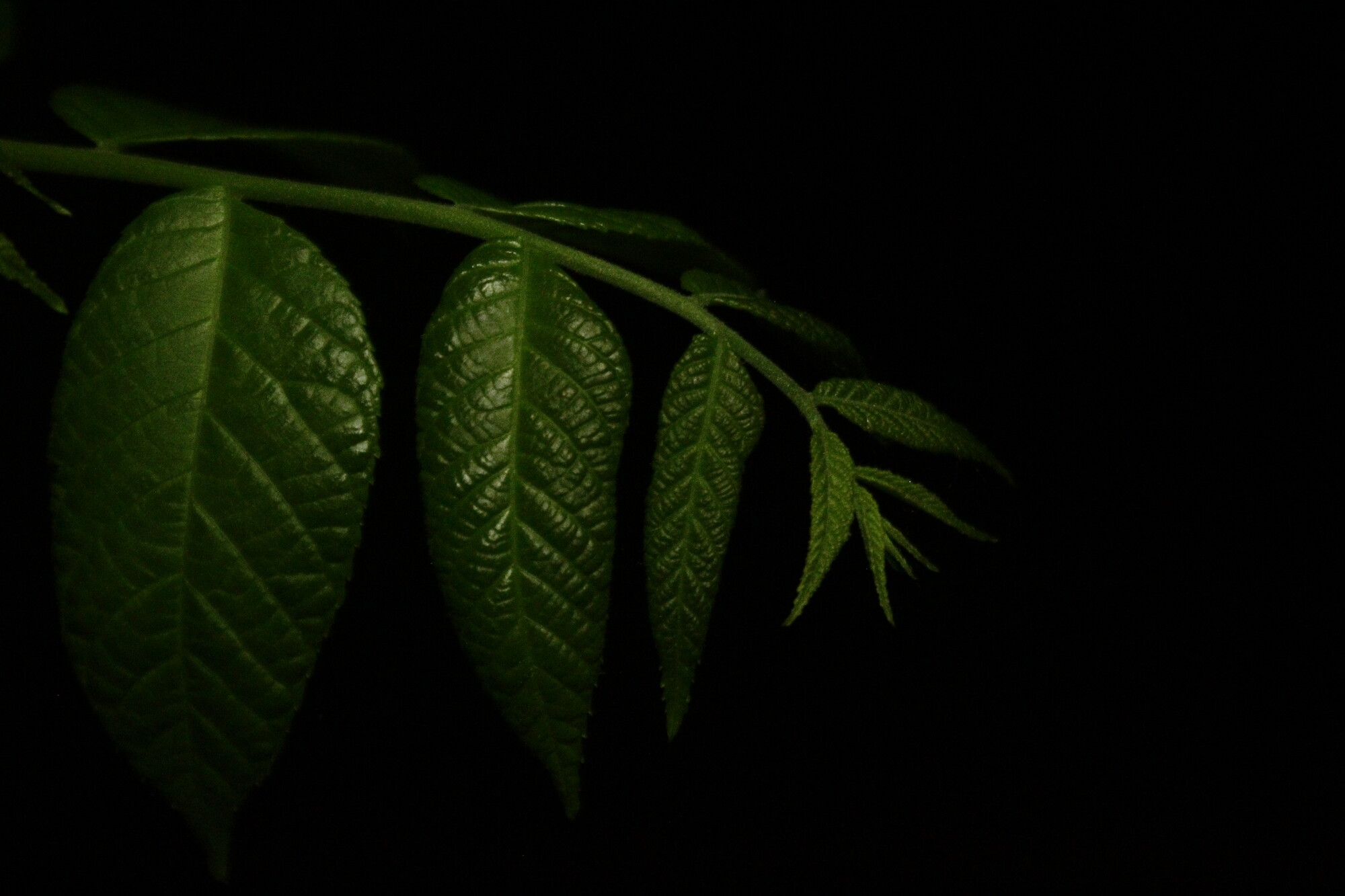
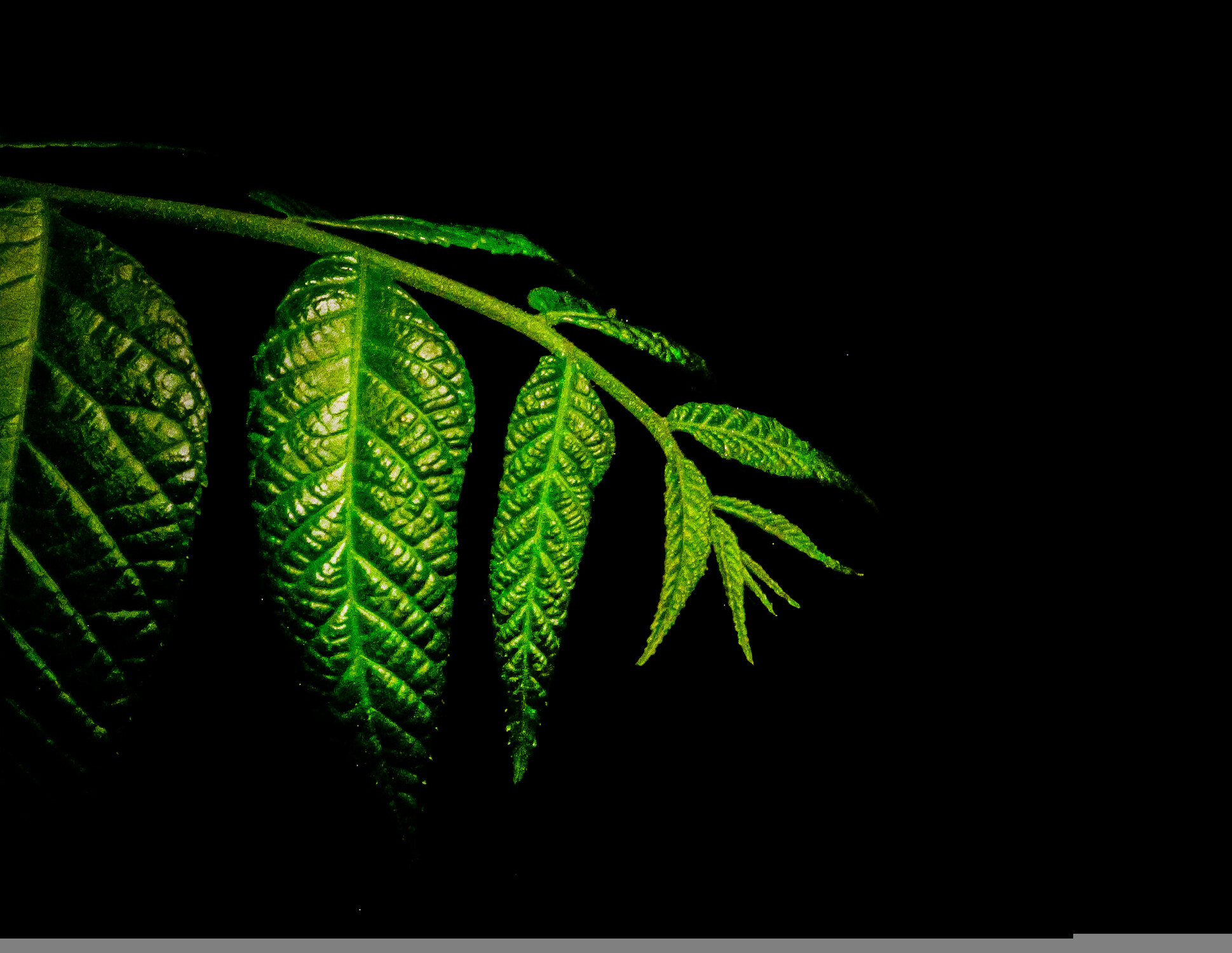
Very promising, Chloe! I assume you're "light-painting" with what we call a torch here in Australia, not electronic flash. I think you pretty much nailed it in camera! It reminds me of Ruth Carll's plant images, which start off bright, and she edits the periphery down into shadow. She has an avowed preference for moody images, which may not be your intent here, though.
If you're planning to edit the image from the get-go, you have more leeway if you "expose to the right" of the histogram, i.e. give it more exposure than here (more light, and/or higher ISO). If you try to make very dark areas much brighter, you're likely to see noise, whereas darkening bright areas carrries no such penalties. ETTR can yield an unattractive image in the first place before editing.
Personally I like the shady-glade or twilight feel here, so I'd only lighten it a little. I like the way the edges fall off into darkness. I prefer your orginal composition without cutting the leftmost leaf. I'd only clone out the leaf tips at left.
This image bears out a suspicion I have that framing up carefully leads to a better, more coherent result than taking a broader view with the intention of later cropping. That is, you stay true to a response you have to the scene you see. Many here, who crop routinely & do composite panos would disagree, I'm sure, which is fine - these are all our personal subjective responses to the world, and I'm glad we're not all the same!
Hi Chloe! Nice work isolating this branch! I think the third image here has the best exposure. I also agree with all that Chris has said and his edit is great. Keep these coming. I already see some awesome things going on with your stuff! I'm glad you are here and posting!
I looked at your picture and had a nice, long comment planned . . .
Chris beat me to it! I'll just be echoing what he said then. Good image to start with, and having it brighter in the first place could have helped. I didn't know it was called exposing to the right though, so thanks Chris for teaching me something new! I don't really like the cropped feel, and cloning out the extra leves should be no work at all. I do really like Chris's edit, and I notice that Ruth's favorite one of yours had a similar feel. Just food for thought.
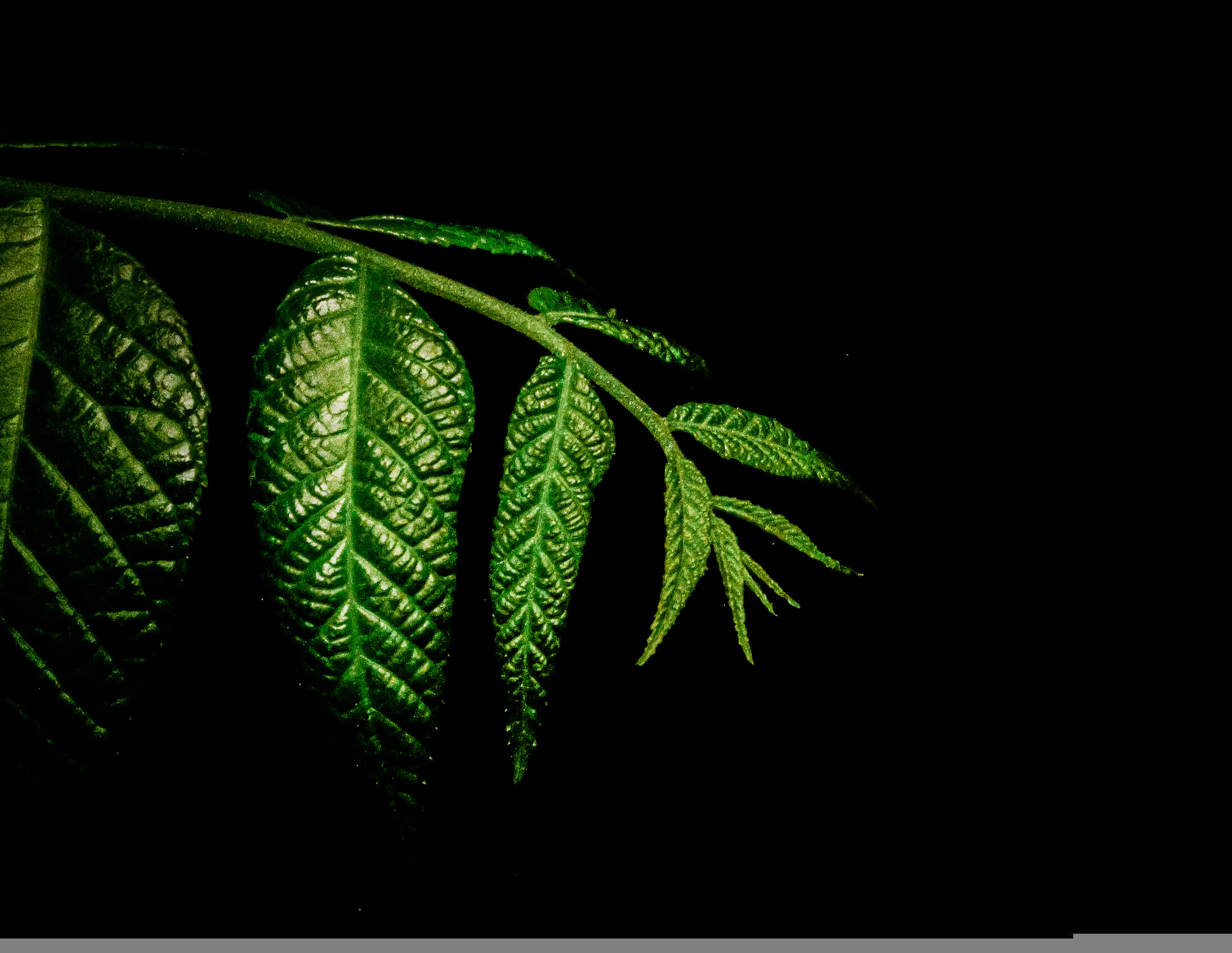
Do you not see that a bit is missing along the bottom of both edits, Matthew?
You know, I could have sworn that wasn't there earlier, but it's definitely there now. Maybe I'm not as observant as I thought.
Great job Chloe! I like the original better than the edits, but think you really have something here just needs a little tweaking. Chris's edit is great That's what I would aim for.