
waterfall of Ray-Pic
Color automn

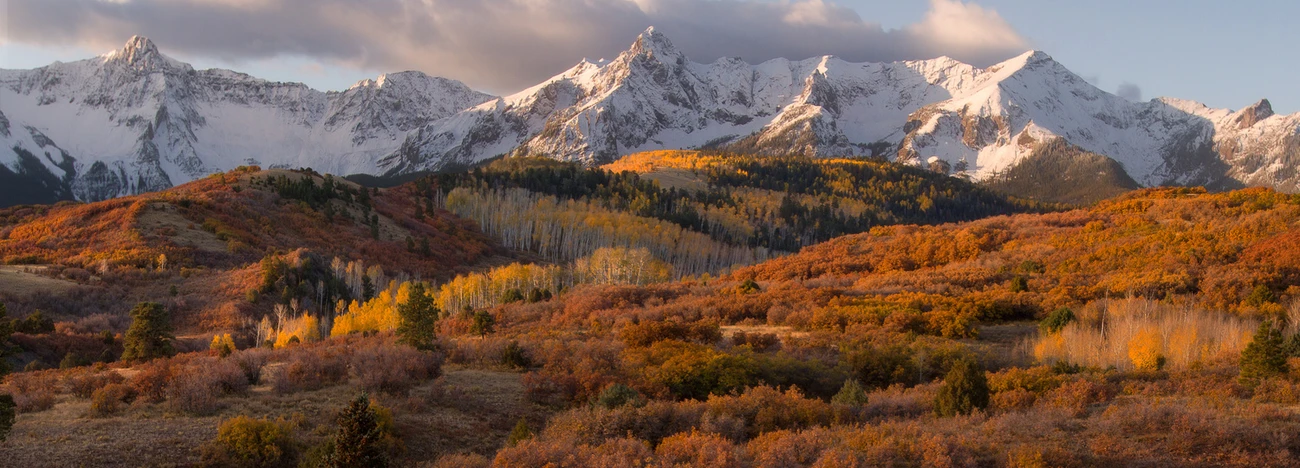
Color automn

Can I not post photos in the groups I belong too or only via the portfolio which has stayed stuck on the same allowance for weeks.

A couple of old photos taken while the Amtrak was stopped - somewhere in Colorado, I think?
(And yes, I like that the vertical leans!)

I've photographed Ady a few times now. We get better each time as a team. This image was a fave from our latest session. I hope you like it to.


Just a heads up for anyone that may be interested (and as things are slow in the group.....).
I've photographed Ady a few times now. We get better each time as a team. This image was a fave from our latest session. I hope you like it to.

6 Comments
Absolutely stunning. Well done!
Hey David, just to offer a differing perspective/taste the image has good bones but is over-saturated for my liking. Not that it is wrong, I expect many to have a similar taste to your own.
Just for my own amusement I tweaked more to my own taste (using very limited tools I currently have at my disposal.....).
Hi Alan,
I wanted ans préfér an image wih more contrast to emphasize colors, red for the végétation and black for basaltic rock. Most of all, that was a very rainy day. It explains my choice which would have been very different in another forecast context.
Sounds good David- glad you have your own vision for this.
The saturation along with the fine composition make this a very enjoyable view.
I love the intensity of the leaves. However, one thing I'd try is to keep the red out of some of the rocks and water, to prevent it from looking muddy. (ie in the foreground)
Overall, beautiful scene and very nice framing.