
These are six of the most common mistakes I see photographers make in their editing regardless of skill level. This part will cover how heavy your edit should be, controlling your saturation, and fixing halos in your images.
I've written about a lot of different editing techniques over the years but never discussed what you should avoid in your editing workflow. This is due mostly to me being hesitant to ever advise someone on what is "right" or "wrong" when it comes to their artistic style and editing choices. Everything here is my personal opinion, but I think it's especially important within the context of this particular article. What I prefer could be wildly different than what you prefer for your style.
I encourage anyone who reads this to approach the suggestions with an open mind and remember that you're allowed to do whatever you want with your art. My goal is to try to suggest things that stand out to me as being bad editing practices.
Gentle Editing
Trying to stand out in a sea of beautiful images isn't easy, and the biggest mistake I see in editing is pushing edits too far, whether it is too much saturation, contrast, sharpening, or any adjustment you can make in editing. This happens, especially when you're first starting to edit your images because you want our work to stand out. MKBHD does a blind camera test every year with phones from the respective period, and on average, the brighter, more saturated images win year after year.
I've personally experienced this when posting my work on social media. On average, the brighter and more saturated images I've created do better than my muted or subtle images. It makes sense in today's world, as we are all vying for attention, and images that stand out have a higher chance to get someone to stop scrolling and interact. This doesn't mean you can't produce eye-catching work, it's more about pushing images so much they don't look believable anymore.
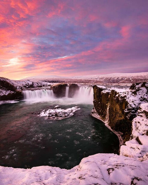
Here's an image from early on in my work, circa 2016. Today, it's hard for me to even look at, but I worked hard on this image only a few years ago. Now, it feels too vibrant, overly contrasty, has too much clarity, and is just not as natural as I'd like it. If I were to edit this again, which is something I have done for other images, I'd approach things with a lighter hand. I wouldn't push those clouds to be as dark or the colors to be nearly as vibrant.
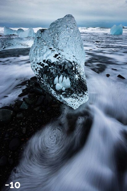
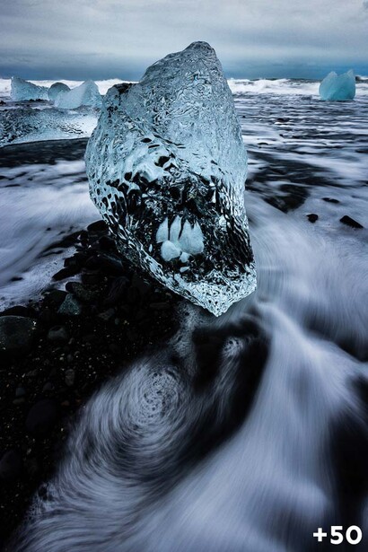
Sometimes, you'll encounter an image that wants to be pushed in certain ways. Take the above photo as an example: the left image is with my original clarity set to -10, and on the right, the clarity is set to +50. To me, both of these work, and it's up to me to decide which one I prefer for my work. The important thing is asking yourself: "can I tell I pushed the sliders that far? Does it look natural?"
The big takeaway from this is: do an edit and then bring a few sliders back a notch. If adding +20 clarity looks good to you, try making it only +10. Don't hesitate to experiment, but just remind yourself that more is not always better.
Saturation Control
One reason saturation tends to get out of control is that it can change drastically without you ever editing the actual saturation or vibrance attributes. Adding contrast, adjusting the tone curve, shifting the white balance, clarity, dehaze, or even local adjustments can affect the saturation of your image.
The best thing you can do to help with this is simply stepping away from your computer and letting your eyes rest. This could be for 10 minutes or a few days. Sometimes, I sit on edits for months when something doesn't look quite right. I did exactly this in the above photo. I distinctly remember doing the edit and thinking nothing of it. Yet, when I came back a few days later, I asked myself, "what on earth was I thinking?" It's quite clear I overdid it and left the sky looking a bit too pushed.
Fixing this is easy, of course. Start with the saturation sliders in the HSL panel to adjust your specific colors. In my case, I tend to decrease the blue saturation in most of my edits because things like dehaze add blue into the image. The last adjustment you want to make is the global saturation slider, and even after doing that, you might want to step away from your image again. This is something I do constantly, doing a quick edit and coming back to see what my fresh eyes see. It is something you should do for many factors of your edit.
Haloing
This is a common issue I see when people are trying local adjustments or masks for the first time. Typically, the term "haloing" refers to a glow on the area of your image where you blended between two different exposures. In this case, I'm using it to describe similar effects, but it's essentially anywhere someone applies a local adjustment that's too obvious.
Above is an example of applying a local adjustment and making it too obvious. I intended to apply it so that the little island stands out more in the center of the image, but in doing so, I've pushed the adjustment too much, and you can see a "halo" where the adjustment is. This can also happen when you're luminosity masking or dodging and burning when you push an area too much.
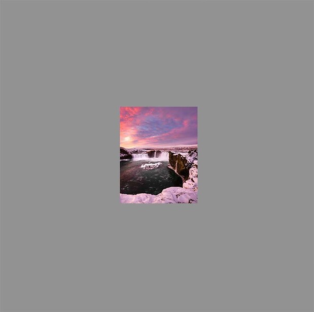
One way to check your edits is the same as before, which is to step away from your image and reset your eyes, but even that might not be enough. I've found the best way to check for halos is to zoom out until your image is essentially the size of a thumbnail. It's much easier to see these types of errors when you zoom out of your image. If you're editing smaller spots, you might only need to partially zoom out to start to see your adjustments. To zoom out in Lightroom: while holding shift, your cursor should change to a magnifying glass and then drag your cursor to the left of the screen. You can also zoom out on the navigator panel located on the left-hand side.
To prevent this, follow the steps of the first topic and simply reduce the effects you apply. Instead of bringing up the exposure by half a stop, try bringing up just the whites of your local adjustment, which may give you a more natural brightening effect. You can also increase the size of your adjustment as well. This is something you'll have to learn over time and will change edit to edit. The most important thing is just knowing what to look for and always zooming out of your image before publishing.
That's it for part one. Be on the lookout for part two, which will cover white balance, your histogram, and cropping correctly.

6 Comments
Some good advice here. Didn't watch the video, like text and images instead.
It's interesting to look back on earlier edits and see how your taste and skill have both changed.
Also good to revisit edits as the tools have improved. As a Lightroom user, I've had images that were unusable with the first process version come alive with the current process version.
As an aside, I find that once you know about dodging and "haloing," it's almost impossible not to see it in old newspaper photos from analog days - usually sports shots where a player's face was in shadow and the photo desk needed to deliver on a deadline.
Vibrant is not a photography term, it's a design term - it's like saying something is "rich".
Really? Does it really matter where the term originated?
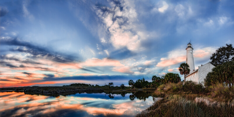
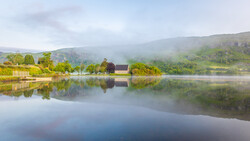
Interesting video making some valid points. However before we start sliding those sliders should we not stop and have a think about the composition? For example in the first image of that lovely old church is the landscape feature on the left not too much of a distraction? Do the dark tones and strong shape not fight for attention. Could that be fixed with a simple crop? Should the final colour balance of an image not be selected to suit the mood of the image rather than any online audience? Judging an image by the number of likes it gets is a poor indicator of the worth of an image.
Well done video…