Bird photos shot in dappled shade are some of the hardest to edit well. The exposure is tricky, green foliage casts color onto everything, and the subject can easily get lost in a busy frame.
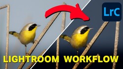
Coming to you from Gareth Evans of Park Cameras, this detailed Lightroom Classic tutorial walks through the full edit of a robin-in-the-woods shot captured on the Nikon Z 70-200mm f/2.8 VR S. The image has a lot going for it: shallow depth of field, branches framing the bird, and actual sunlight falling directly on the robin mid-song. But the green cast from surrounding foliage and the tricky exposure mean the raw file needs real work before it looks as good as it felt in the field. The edit starts simply, with a crop to push the robin larger in the frame, a white balance shift toward warmth, and basic tone adjustments including pulling highlights down and bumping clarity and texture. Vibrance gets a lift here instead of saturation, which is the right call when you want to recover colors that feel flat without pushing skin tones or already-saturated hues too far.
Where things get genuinely interesting is the masking work. Rather than applying a standard vignette and calling it done, a series of linear gradients are used to shape the light directionally, darkening the bottom, left, and top of the frame while building a simulated shaft of light coming in from the top right. Negative dehaze is applied inside that mask to sell the effect, giving the image a feeling of actual sunlight spilling across the robin. A radial gradient brightens the bird itself, and a separate inverted radial adds a final vignette layer. The result is a significant shift in mood from the original file, one that feels earned rather than forced.
The color work is equally considered. A small push toward magenta in the global white balance helps counter the green cast from the foliage without flattening the lush background. From there, the HSL panel gets careful attention: orange is shifted slightly warmer, yellow is nudged to keep the branches from going too cool, and green is moved just barely toward teal to keep the background feeling natural. The blue channel in the saturation panel is pulled down slightly. None of these moves are dramatic on their own, but stacked together, they give the final image a coherence the raw file simply doesn't have. The before-and-after at the end of the edit is worth pausing on because the transformation is more significant than the individual steps suggest. Check out the video above for the full breakdown, including the exact mask adjustments and the moment-by-moment decisions that shape the final look of the image.

1 Comment
I`m always surprised to see photographers still using LRC instead of LC. LC offer most of LRC features today without the hassle of files and catalogue management. Also, LC offer much more device support when in transit. Since I moved to LC I will never go back.