In a world oversaturated with colorful images showcasing the latest trends in color editing effects and presets, I’m seeing a quiet and growing resurgence of black and white photography. Why is that? I believe it’s a mix of nostalgic, emotional, and creative reasons. Some of us are seeking to create images with more meaning and purpose. Let’s dive in and discuss.
A Desire for an Analog Look
Many younger photographers are picking up affordable vintage cameras, and many older photographers are dusting off their old film cameras. It’s not surprising then there’s been a huge revival for shooting black and white film, which has that nostalgic tactile look we’ve seen in the photographs created by some of the photography greats of yesteryear. Black and white film's enduring aesthetic transcends specific eras or color and fashion trends. This timelessness gives the story a lasting aesthetic, making it relatable across generations.
And maybe black and white film being much cheaper than color film is playing a part in this.
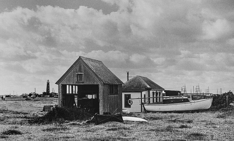
Black and white analog photography creates an imperfect, timeless look.
A Photography Rebellion
For digital shooters, there’s a desire to adopt a simpler and more thoughtful approach in a visual world that is constantly bombarded with hyper-saturated photos, overloading social media feeds. I believe turning to black and white is a reaction against that, a rebellion if you like. Black and white photos feel intentional and timeless. They stand out against all the colorful, busy, trendy photos we see—most of which have been shot for the effect of the color grade or lens characteristics, rather than an attempt to communicate something meaningful.
Color can sometimes be a distraction, pulling the viewer's attention away from the intended subject or message. By removing color, black and white photography distills the image to its essence, ensuring the viewer focuses on what truly matters to the story.
Storytelling
Black and white simplifies the visual information in our frame, distilling the image to its core message. By forcing the viewer to look beyond the superficial and engage with the core elements of the scene, black and white photography becomes a potent medium for creating impactful, meaningful, emotive, and thought-provoking stories.
We can slow down and make photographs with intention and purpose when we seek to create something meaningful. Intention is the most important consideration for great photography.
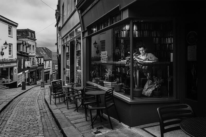
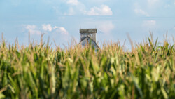
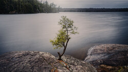
A monochrome image has the ability to make the most ordinary scenes dramatic and timeless. For many of us this is a godsend, as we often only have easy access to ordinary scenes around where we live. There’s definitely a strong desire to elevate the mundane, and look for beauty and story in the ordinary. Black and white is perfect for this, and it's certainly helped get me out the door and go for a walk in my neighborhood. Something color fails at that miserably.
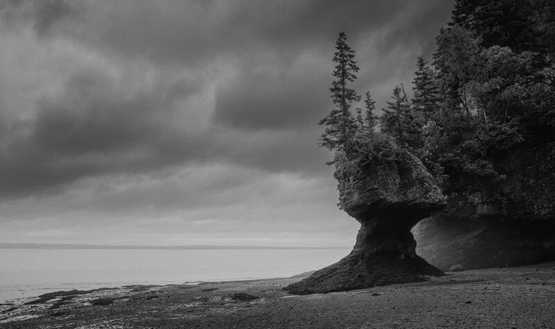
Soft tones create a moody and melancholic atmosphere.
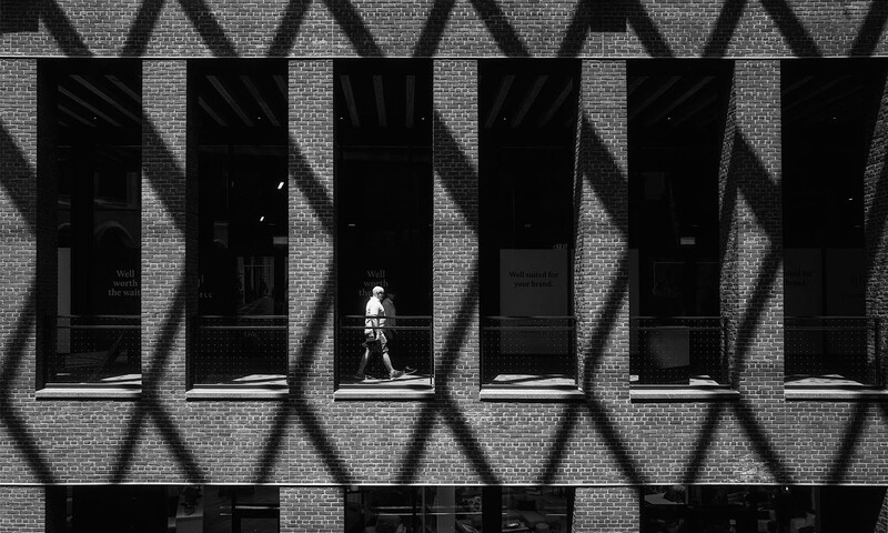
Fewer tones and more contrast create a strong graphic image.
Photography Should Be About Making Viewers Feel Something
So much photography shared online by influencer-types is about nothing more than showcasing a product. This is usually because they’re trying to sell you that product.
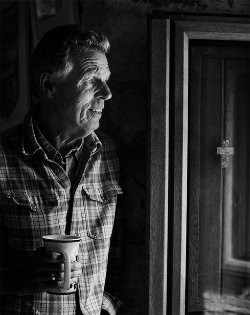
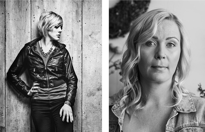
But great photography—particularly black and white photography—is about connecting with your audience and having them feel something. A monochrome image does this the best. By cutting out distracting color, it allows us to focus on expression, mood, light, shapes, and textures. A great black and white photo strips an image down to its emotional core. This can be both powerful and refreshing.
Canadian photojournalist Ted Grant once said, "When you photograph people in color, you photograph their clothes; but when you photograph them in black and white, you photograph their souls."
Color in this photo would not add anything. It would more likely be an unnecessary distraction.
3 Things To Pay Attention To
1. See In Monochrome
You need to start seeing in black and white, and get used to looking for light and shade, and ignoring color. To do this with a digital camera, simply switch your in-camera color profile to monochrome. This makes your EVF black and white, which is a huge advantage over those pursuing black and white film photography with an optical viewfinder! The image you capture in monochrome mode still captures your photo in color, so you’ll still need to make it black and white during editing.
2. See The Light
Great photography is all about great light and simple, strong compositions. Black and white forces you to really focus on light and composition, because there are no distractions from color to get in the way. You’ll be surprised at how much color was affecting what you got used to seeing, and how much you relied on it to carry a good photo.
Along with intention, lighting is essential for great photography, but gets forgotten about when there's a lot of color in the frame. With no color, lighting is all we have to work with, which makes us work a little harder. This results in us becoming better photographers.
Contrast becomes your visual language in black and white photography. Harsh contrast versus soft contrast can completely change the feel of a portrait.
3. Embrace Contrast
In black and white photography, contrast is everything. We have contrast of light, and contrast of shape, form, and textures also.
You’ll quickly realize that you need to use contrast intentionally. You’ll soon appreciate and notice where light falls and how strong light creates graphic compositions, and how soft light creates more atmosphere with a wider range of tones. Contrast becomes your visual engagement.
We can use stark contrast to create strong graphic drama, or soft muted tones for a nostalgic and calm vibe. Only having tones to use as a tool to effectively control the mood and atmosphere opens up huge creative potential. The interplay of shadows and highlights becomes a powerful tool for sculpting scenes and adding depth to the narrative.
The amount of contrast and tones you use affects textures, including things like skin tones. Portraiture is a good example of this. We can use a wide tonal range to pick up skin texture and detail, or we can take a high contrast approach.
Black and White Photography Makes Us Better Photographers
Seeing the world in tonal values takes practice, but with some practice, your black-and-white results will improve dramatically. You’ll open up an entirely new world of photography. Most importantly, throwing away the color crutch and working with the simplicity of black and white forces you to work a little harder with intention, story, tones, contrast, and lighting. Giving these things more thought ultimately will result in you becoming a better photographer.
I have been a B/W photographer for 52 years and never use the Monochrome feature on my camera. Why? I don't want an algorithm to choose the relative lightness or darkness of the individual colors before they trsnslate into the relative B/W tones of my image. Instead, i photogrsph in color and convert to B/W in Photoshop, using the sliders to individually control the lightness or darkness of specific tones. The results are much more interesting and visually compelling. Using this method, I can control how dark or light I want the skies to be, and which colors I want to bring forward and which to push back. Algorithms turn scenes into flat, boring grays. I don't want that meh look for my photos.
I'm very similar to you in terms of my B&W workflow. I certainly shoot in colour RAW, although recently have started using a B&W profile in camera just to see through the EVF/LCD in B&W. Yes, the colour sliders in software are a real benefit to shaping the tones in B&W.
I guess you could say the in-camera 'algorithm' (B&W preset) works in the same way as choosing a particular B&W film like film photographers do.
If you select the monochrome setting in your camera and shoot raw, it still shoots in colour and you have control over the sliders. The point of this is to eliminate colour and help you see in black and white while composing your photo. It makes things much easier.
I understand why there is a ongoing revival of analog cameras and B&W film, it is literally the slow down process of anticipation and waiting for the processing outcome, similar to trying to win the Jackpot at a lottery...can also be very addictive. For me, choosing my camera setting when outside walking the streets or through the countryside is based upon my mood at the time. If it is gray and rainy, the monochrome setting is a must, yet when walking into nature, it has to be vivid color setting.
Cheers and all the best...
Matthias
I grew up shooting B&W and never really learned to "see" in color. So my shots can look better when converted to B&W since I tend to "see" shapes and textures rather than colors. But I shoot in color and convert in PS since I have complete control over the final image, much more so than I ever did in a darkroom.
I grew up shooting black and white film and developing and printing in my home darkroom. In the early days of digital, black and white was pretty terrible. Technology has caught up so now I shoot in digital RAW with the camera set to B&W. This gives me a starting point in Lightroom, usually needing further adjustments. But now I can easily enhance the black & white image in ways that weren't possible in a wet darkroom.
The more rich saturated color, the better. So began my serious journey in photography with a DSLR in 2003. I initially did not like black and white images. But in 2013, after having purchased a Nikon D800E, I was offered a job to photograph the town of Snowmass Village in Colorado, at night, for one of my commercial printing customers.... and they wanted it in black and white. "Are you sure," I asked? To make a long story short, it was like a light switch turning on... I loved the images in black and white. And I've never looked at photography the same way since. So many of the hideous colors (late winter and early spring in the mountain resorts are called mud season for a reason) turned into luscious tones. Shooting at night with city lights, the image naturally provided a huge amount of contrast, and my newly acquired D800 could retain shadow details that I had never been able to render in a print before. And once your heart feels strongly about something, it attracts more opportunities and work of that nature. After completing the Snowmass project, a client called commissioning a series of Denver images, in black and white.
Here's where my progression of favoring black and white instead of color has become hard to explain... While certain colors are naturally pleasing to my eye, they can become rather ugly and irritating in a photograph. Blue is a good example. I don't think much about the shade of blue when looking at the sky, but quite often in print, it looks wrong, or triggers a little discomfort in some way. In black and white though, so many of those distressing questions of "which shade of blue, or green or red looks right," simply vanish. Everything becomes simpler... even the Blue Angels. Black and white has a calming effect. Of course, some images are too busy with harsh contrast scattered around too many different places in the image to work in black and white, but if it doesn't look right in black and white, there's a good chance it doesn't work very well in color either. I don't think I'm searching for an analog look, nor do I think I'm necessarily looking at this from a nostalgic point of view... although at 71, prone to that sort of disposition. I still prefer crisp detail and minimal noise or grain, and a warm white cotton-fiber paper for making prints. Printing is an absolute must-do for completing the photograph.
Every year i produce a calendar as a gift to friends and family. This year i did it all in black and white. They all lover it and I had a great deal of fun doing it. I find that i am more creative with black and white than i was i color. I think this year i will do more with black and white.


9 Comments
I have been a B/W photographer for 52 years and never use the Monochrome feature on my camera. Why? I don't want an algorithm to choose the relative lightness or darkness of the individual colors before they trsnslate into the relative B/W tones of my image. Instead, i photogrsph in color and convert to B/W in Photoshop, using the sliders to individually control the lightness or darkness of specific tones. The results are much more interesting and visually compelling. Using this method, I can control how dark or light I want the skies to be, and which colors I want to bring forward and which to push back. Algorithms turn scenes into flat, boring grays. I don't want that meh look for my photos.
I'm very similar to you in terms of my B&W workflow. I certainly shoot in colour RAW, although recently have started using a B&W profile in camera just to see through the EVF/LCD in B&W. Yes, the colour sliders in software are a real benefit to shaping the tones in B&W.
I guess you could say the in-camera 'algorithm' (B&W preset) works in the same way as choosing a particular B&W film like film photographers do.
If you select the monochrome setting in your camera and shoot raw, it still shoots in colour and you have control over the sliders. The point of this is to eliminate colour and help you see in black and white while composing your photo. It makes things much easier.
I understand why there is a ongoing revival of analog cameras and B&W film, it is literally the slow down process of anticipation and waiting for the processing outcome, similar to trying to win the Jackpot at a lottery...can also be very addictive. For me, choosing my camera setting when outside walking the streets or through the countryside is based upon my mood at the time. If it is gray and rainy, the monochrome setting is a must, yet when walking into nature, it has to be vivid color setting.
Cheers and all the best...
Matthias
What metric are you using to say that there is an uptick in black and white photography?
I grew up shooting B&W and never really learned to "see" in color. So my shots can look better when converted to B&W since I tend to "see" shapes and textures rather than colors. But I shoot in color and convert in PS since I have complete control over the final image, much more so than I ever did in a darkroom.
I grew up shooting black and white film and developing and printing in my home darkroom. In the early days of digital, black and white was pretty terrible. Technology has caught up so now I shoot in digital RAW with the camera set to B&W. This gives me a starting point in Lightroom, usually needing further adjustments. But now I can easily enhance the black & white image in ways that weren't possible in a wet darkroom.
The more rich saturated color, the better. So began my serious journey in photography with a DSLR in 2003. I initially did not like black and white images. But in 2013, after having purchased a Nikon D800E, I was offered a job to photograph the town of Snowmass Village in Colorado, at night, for one of my commercial printing customers.... and they wanted it in black and white. "Are you sure," I asked? To make a long story short, it was like a light switch turning on... I loved the images in black and white. And I've never looked at photography the same way since. So many of the hideous colors (late winter and early spring in the mountain resorts are called mud season for a reason) turned into luscious tones. Shooting at night with city lights, the image naturally provided a huge amount of contrast, and my newly acquired D800 could retain shadow details that I had never been able to render in a print before. And once your heart feels strongly about something, it attracts more opportunities and work of that nature. After completing the Snowmass project, a client called commissioning a series of Denver images, in black and white.
Here's where my progression of favoring black and white instead of color has become hard to explain... While certain colors are naturally pleasing to my eye, they can become rather ugly and irritating in a photograph. Blue is a good example. I don't think much about the shade of blue when looking at the sky, but quite often in print, it looks wrong, or triggers a little discomfort in some way. In black and white though, so many of those distressing questions of "which shade of blue, or green or red looks right," simply vanish. Everything becomes simpler... even the Blue Angels. Black and white has a calming effect. Of course, some images are too busy with harsh contrast scattered around too many different places in the image to work in black and white, but if it doesn't look right in black and white, there's a good chance it doesn't work very well in color either. I don't think I'm searching for an analog look, nor do I think I'm necessarily looking at this from a nostalgic point of view... although at 71, prone to that sort of disposition. I still prefer crisp detail and minimal noise or grain, and a warm white cotton-fiber paper for making prints. Printing is an absolute must-do for completing the photograph.
Every year i produce a calendar as a gift to friends and family. This year i did it all in black and white. They all lover it and I had a great deal of fun doing it. I find that i am more creative with black and white than i was i color. I think this year i will do more with black and white.