
For many, wildlife photography is all about natural colors and objective realism. The light, composition, and behavior captured should do all the talking. And for the most part, I agree — for that other tiny little bit, though, I beg to differ. Please allow me to elaborate in more ways than one.
It's Not the Size of the Lens That Counts, It's How You Use it
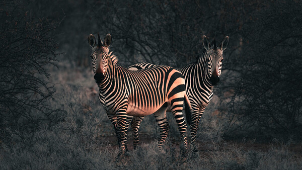
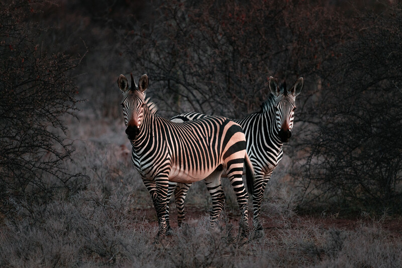
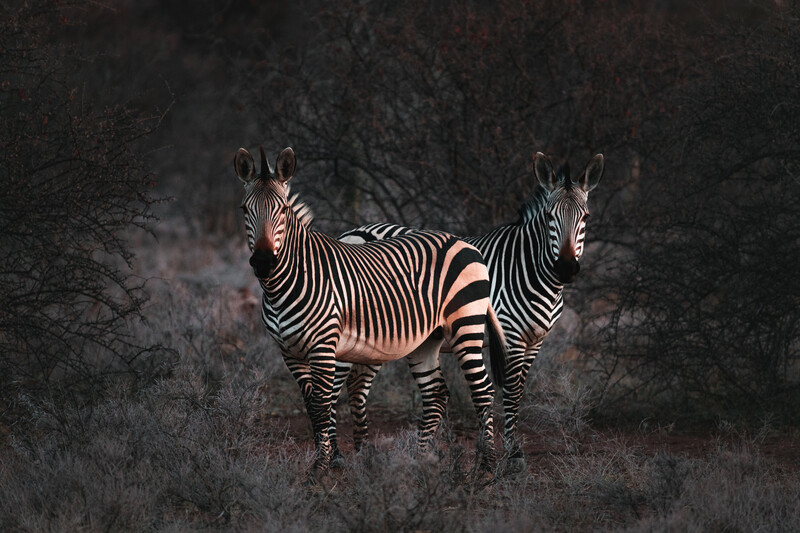
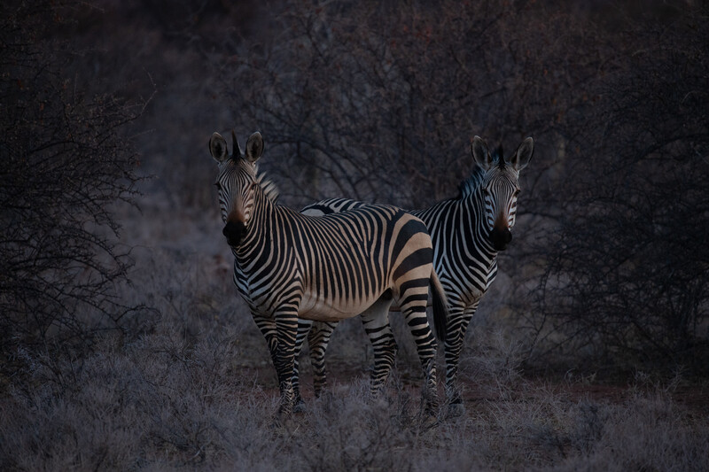
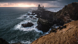
I shoot most of my wildlife images with the Sigma 150-600mm Sport. At 600mm, the widest aperture is f/6.3 — not amazing, but when you consider the range and the price point, few others come close. So, to compensate, I need to bump up that ISO. For static subjects like the zebras in this shot, one can afford to slow down the shutter speed if stability isn't an issue. In general, if you're shooting handheld, doubling the number for the shutter speed in relation to the focal length is the accepted guideline. The Sigma's optical stabilization is fantastic, however, so I could have a shutter speed half the recommended setting, and it would still be sharp. Thankfully, for this shot, I was able to balance the hefty lens with my elbow and knee, so I was able to get the shutter speed down to 1/250th. Even at 600mm, the shot still turned out sharp — well, as sharp as can be expected at ISO 1,250. Yes, ISO 1,250 is high, and the Canon 6D Mark II isn't exactly a low-light beast.
Some photographers wouldn't even bother taking the shot at these light levels. Clarity of detail is paramount for a lot of wildlife photographers, and it's understandable. Each species has unique fur, scales, skin, or feathers, so exaggerating these features should be one of your main goals when photographing animals. For me, however, there is a quality which trumps all that: emotion.
Now, I don't mean to get all soppy on you, but as a visual storyteller, my main goal is to get the viewer to connect with the subject, so if I feel that there's a certain "moment," I don't care how I capture it. Obviously, there's a limit: a giraffe starts looking like a lanky leopard at ISO 16,000, but for all intents and purposes, a zebra is a zebra at ISO 1,250. It may ba a slightly soft zebra from a 90s TV show, but If it's a nice scene or moment, I'm taking the shot.
The Edit
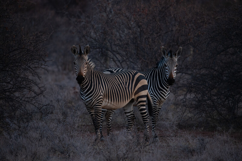
I knew that I had a bit of work to do in post, as the image was about two stops underexposed. The back of the camera screen is always a little flattering, so it's important to check the histogram to get an accurate representation of the shot.
Base Exposure and Temperature
I loved the soft, post-sunset glow highlighting the animals. The dark frames of the the shrubs either side and behind the zebras made them stand out even more. I wanted to emphasize this, so I increased the highlights while also bringing the shadows up to reveal more detail. I could have just raised the exposure, but I like to mess around with the highlights, shadows, whites, and blacks first. After a little back and forth, I settled on a base exposure. Next came the temperature. I had my camera on auto white balance, so the image came out a little cold. I liked the coldness of the surroundings, but I wanted to warm up everything first. After warming it up, I took the blue hue completely off of the animals by selectively reducing blue saturation. I'll add more coolness to the surroundings while I'm doing the overall color grading.
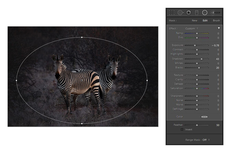
Make Them Pop With A Radial Filter
I wanted to isolate the zebras even further without making the edges too dark, so I used one of my favorite tools in Lightroom for wildlife editing: the Radial Filter. I use this instead of the vignette effect, because I find Lightroom's vignette function a little heavy-handed for my liking. Lightroom's feather and range masking options for all its tools are great for getting a more subtle effect, but I felt that I didn't need to use them here.
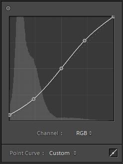
Curves
I would suggest that (at least) because of the lack of detail in this image, it certainly won't win any awards. In order to get a good score from a judge at a competition, detail and sharpness are adjudicated in their own sections (depending on the specific competition criteria), so if you want to score high, submitted images need to be of an extremely high standard. Why bother with this image if that's the case? All I can say is that I just like it.
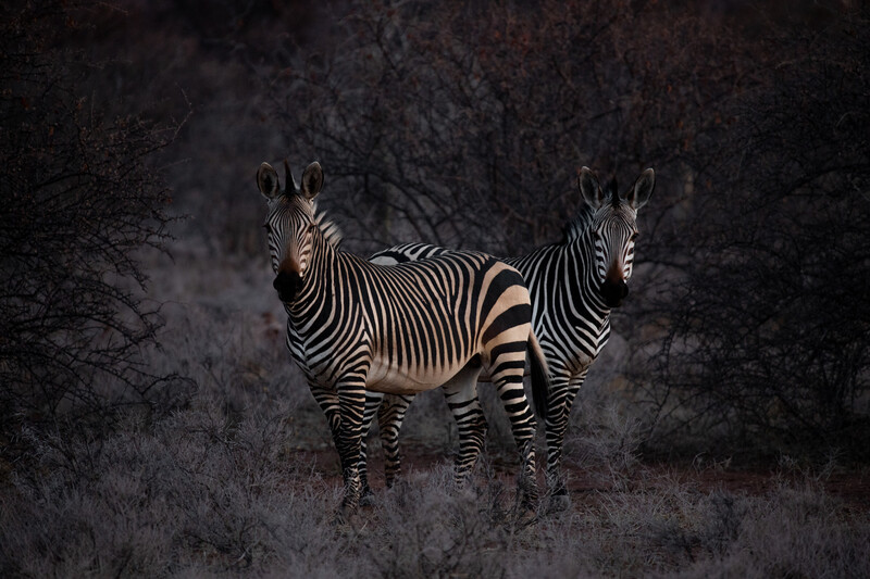
So, the image lacks detail, but I want to post it to social media or use it for my portfolio. What do I do? It's a sneaky tactic that many seasoned editors will see through. I raised the black point to create a slightly faded look, and I introduced some more contrast by creating a slight S curve.
And here's a before/after:
It's subtle, but effective. Almost like I meant to capture a slightly old looking image, eh?
Getting Creative With Color
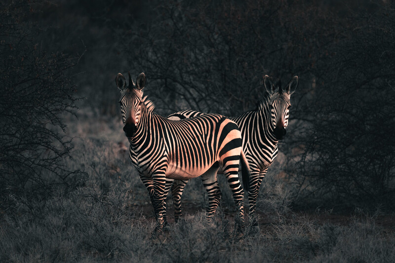
From here, I started to experiment a little. It's not easy to tell from the raw image, but the zebra in the front was covered in a light layer of orange dust because of the dry and windy weather. I wanted to emphasize that while also cooling down the surroundings in order to get some nice color contrasts to complement the contrast in luminosity between the animals and the background/foreground. There are numerous ways to do this, but the lazy way is my go-to: split toning. Yes, amber and teal is done to death, but I just wanted a tiny bit.
The actual values for my adjustments aren't important, as every image will require different tweaking to get a similar result, but it's helpful to have an idea of what I was doing if you're new to Lightroom.
After split toning, I went wild with color calibration. There's no exact science to how I approached this, I'm afraid: I started moving sliders until I got what I wanted. I really liked the slight green/aqua tint that was introduced with the split-toning. I think it complemented the red/orange of the dust on the front zebra, so I wanted to see where I could go with it. Shifting red primary to the left really exaggerated this, which I liked. Moving green primary to the right took some yellow out of the animal's hide, but more importantly, it took a yellow tint out of the shrubs and trees. Shifting the blue primary to the left again exaggerated this red/green look I started leaning towards, but I felt it was too nuclear-looking. so I decreased the saturation a good bit. I then dragged the shadows tint towards green in order get rid of more purple. If you now look at the Color Saturation panel, it's easy to see how I approached color with this image. Most of those adjustments are doing very little, however. Blue, magenta, and purple I found too distracting, so I all but killed them. The red on the zebra was far too saturated after all my tinkering and contrast adjustments, so I toned it down.
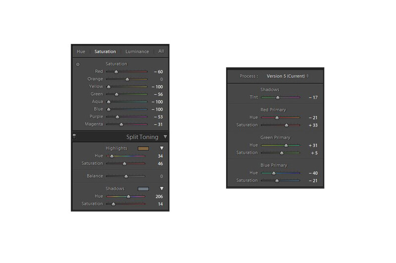
The most important result of these color adjustments is to further simplify the image. If you look at the last before and after slider, you should notice a lot of subtle blues and purples in the shadows. My aim is to always isolate my subjects as much as possible, and contrast of light is not the only method. It's easy to go too far with creative color adjustments, especially with this type of photography, so a light touch is needed.
Final Adjustments
I added a bit of Dehaze and Clarity to make it pop a bit more. Then I made some final contrast adjustments, sharpness, and noise reduction after I remembered to turn check off "Remove Chromatic Aberration" and "Enable Profile Corrections." You'll notice that I masked the sharpness quite a bit. This was to completely remove some nasty grain from the out-of-focus background. Not ideal, but there was little detail in the animals' coat to work with. The sharpness is now only affecting the areas of high contrast. I didn't go too far with noise reduction, because it will completely destroy what little detail is there; I need to live with a bit of grain, which is fine in this instance, because it's a dark image.
Final before and after image:
Final Thoughts
I may revisit this to tweak a few things, but for the moment, I'm happy. It's always helpful to walk away from an image after an initial edit and come back to it with fresh eyes. If I were do something extra, it would be to add a slight Orton effect to the highlights and do all the sharpening and noise reduction in Photoshop.
Would you do something different with this image? Would you have even bothered to take a shot like this at ISO 1,250? Please let us know in the comments below.
Join the Fstoppers community for free
-
Post comments and join in the discussions
-
Browse the site ad-free
-
Share your work and get featured in the community
-
Compete in the photo contests for fun and prizes
30 Comments
Thank you. I'm from the analogue age and still do most my work with film but I do use digital as well. I would like to be more proficient at photo-editing via Photoshop, Lightroom, etc. Not that I can't do it...it's that I could be so much better with proper guidance. Thank you for this article.
You're very welcome, Timothy. However, reading through the other comments, it appears that I may have gone too far for most people. Each to their own, but they make valid points.
I wouldn't assume that the comments here are indicative as a whole. Remember, they're mostly other photographers. I imagine that your average "civilian" would prefer your processed version.
I'd be willing to go out on a limb and say that your processed version isn't wildly different than what you saw with your eyes at the moment. Perhaps closer than what the SOOC file is.
But only you know that since you were there :)
Don't worry about 'other people'. Why did you write the article. That's all you need to concern yourself with.
I'm not sure if the edited one is better. It seems too overprocessed. I prefer the sooc picture
For many wildlife photo competitions the steps taken in the processing of this image would preclude it from entry. I prefer the original and it’s a pretty good shot that has a real haunting quality. I really don’t see the point in the final over processed image if the point was to produce a wildlife mage, it’s ended up being a parody of the original.
The point is that nowadays, you don't score many likes on social media with a sooc image. You need to overprocess it like this to attract viewers. Editing skills and knowing what works on social media has become more important than taking a good shot with the appropriate gear.
Thanks for the feedback, Eric. It may be that I was pandering (subconsciously) to the social media crowd with this edit, as Rayann Elzein mentioned. Some images are hit and miss. This is clearly a miss for most. I still like it, though, but I take your point.
Mike, I also think this is a great shot! :-)
As I said I like the shot, but think the processing, for a wildlife image, doesn’t really work. I do think what social media has to say is pretty irrelevant.. it’s the danger of going for likes and using that as some kind of yardstick.
To answer the final question. I would have loved to have take that shot......it’s a good shot. The only thing I would have done was opened up shadows, set white and black points and nudged up the exposure. I don’t see anything wrong with it being a tad underexposed, while I see a lot wrong with it when the radial filter is used like a pink gelled spotlight. Now don’t get me wrong I use photoshop as much as the next person and consider the spot healing brush and content aware fill as my best friends.......but I’m not a wildlife photographer.
The radial filter is not affecting the color at all. It was my messing with split toning and Color Calibration that did all that.
For me the original is much much better than the edited...
I have to concur with the general observations that your final image appears "cooked" and the garish over processing distracts from the power of the image. You were on the right track with your basic tone and color edit and then adding a curves adjustment might have been warranted. Perhaps some strategic dodge and burn would have provided some print worthy enhancement?
As an aside, your OOC image is more in line with how a "cat" might view the image with the blue gray tones and distance blur (see: https://www.livescience.com/40460-images-cat-versus-human-vision.html)
To your question regarding shooting at ISO 1250, for WL/Sports I shoot at higher ISO's fairly routinely and still produce lovely results.
Thanks Adam. I will probably revisit this in time and carry out some dodging and burning, without all my weird color toning.
And thanks for sharing that article. Interesting read.
I absolutely love the picture after "basic contrast and temperature adjustments". Wonderful natural shot.
I appears you're not the only one, Elke! I'm off to go lick my wounds. :)
When the community, or forum members point out a "mistake" or "flaw" with the article writers'/authors' photograph or post-processing habit, huge amount of them don't take it well. But you sir, you are a gentleman. Keep up the good work! :)
Its a cool shot and nice processing. I do find the zebras behind to be attracting too much attention because of light and its horizontal stripes.
Ha ha! Thanks Francisco. I hadn't noticed, but now that you mention it, I can't help but focus on it.
Yeah it just has that optical illusion vibe to it. Dropping the light on the behind and increasing it on the zebras heads might solve the problem.
I always enjoy reading/watching how others process their shots and what their train of thought is through the process. Equally interesting is reading other people's reaction and suggestions. As someone who counts themselves on the beginning part of the photo editing learning curve, it's all good knowledge. I like the final image and I also appreciate that it illustrates what is possible to do to a image taken under those conditions
Thank you very much, Ben. I do hope you got something useful out of it, even if it's what not to do! :)
Don't listen to all these "experts" on here Mike. I like the final image as well.
If he posts an image and tells the process, why do not listen to other's opinions? Everyone here says that he took a great shot which could be much better with a different approach in postproduction
And he clearly disagrees. Or this article wouldn't have been written in the first place. And besides some of the comments on here are ridiculous per usual. As one person has said: "garish over processing" it's complete non-sense. There is nothing "garish" about this. And who the hell cares how a cat would see this image? It seems that most on here would have done next to nothing in post on this. And be left with something that's just ok. Where as his approach has turned something that was just ok into something that is much better. I'm also willing to bet the processed image is closer to what he actually saw, in real life, than the OOC image. And again this is just my opinion and I'm not saying he should listen to me either. I like the processed image. I think it's much better than the original, and that's why I said not to listen to all these people on here. The final image is great no matter what these people say!
Personally, though I don't have a problem with the final result, I think I prefer the image as presented after the curves adjustments. At this point, a tiny bit of split toning might be good; say 47 ish in the highlights and 195 ish in the shadows. But it's all just personal taste.
The final image is nice.
Hi Mike, I must agree with most : The first edit is great, the second is too much.
My feeling on that is : you must define what you want to do with the edit : Enhance, or pop out.
Both are good, but work better with different subjects : Fashion and instagram, or nature and print.
I also think that the purple tone on the background was very nice : it recalls of the night, and it works very well with the orange zebras. The green has nothing to do there imo, and the contrast is too harsh and not natural looking. Careful not to go too far, the first edit was good.
Excellent capture nevertheless, and your editing tips are very interesting to read, thank you for these !
If you 'erred' Mike, it was in showing the SOOC shot. It was created digitally, & it was processed digitally. It's your image to present as you want it. I like it.
I like the second and the third "after" in your sequences above. What's most important is what you like in a picture for you. I use apps like Gurushots to get a sense of what other normal people vs photographers like, and to inspire my craft, but at the end of the day I take photographs for my wife and myself. Some of my top liked photos on Gurushots are soft shots taken with an old Samsung S7!