
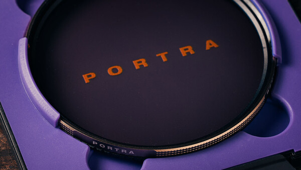
About six months ago, PolarPro sent me their new Portra filter. On their website it states, "Inspired by the look and feel of Portra 400 film… the Portra Filter blends color tone, diffusion, and glare reduction into one optical filter for a finished look." Hmm, sorry, it looks nothing like Portra 400 film. And I hadn't even put the filter on my camera at this point. I simply looked at the sample photos on their website, and thought about all the photos I've shot on Portra film.
The internet seems to be divided about it too, with a lot of criticism about the marketing behind this filter. I held back from writing about it when this all kicked off, although I did still take it on a few trips—including a few days in Spain and the southeast coast of England.
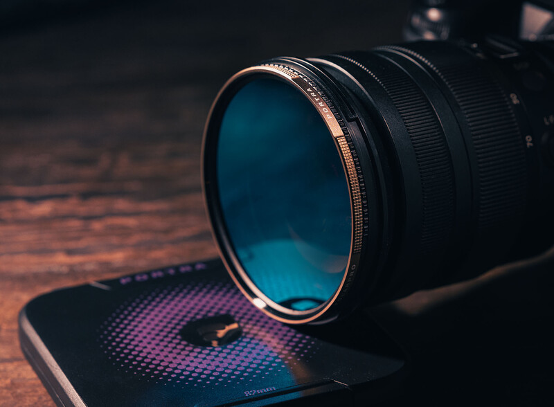
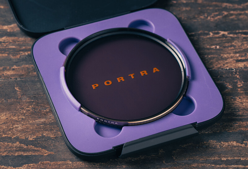
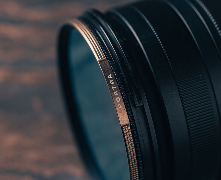
The PolarPro Portra filter "delivers a soft, organic Portra style look and feel straight out of camera. The glass combines a custom color tone, white mist diffusion, and chroma polarizer, which creates warm highlights, natural skin tones, and controls unwanted glare." Let's break that down.
White Mist
Modern lenses are so clinically sharp, and create photos with an obvious digital edge to them. Nothing like older lenses from the film days. So a white mist diffusion is very useful to take off that digital edge. I've been using mist filters on all my modern lenses for many years, like many people use a UV filter. It's always on. But why a white mist? The standard black mist contains black particles that help soften highlights, yet preserve deeper shadow areas. A white mist, being made up of white particles, scatters light across the image, softening highlight areas yet also lightening darker shade areas too. The theory is a white mist creates more of a lighter, dreamy look than a black mist does because the white particles do a better job of scattering light. Having used both, I must say the reality is you don't always see that difference for many daytime photos—sunny or otherwise. It's when you're shooting into bright light that a mist filter starts earning its keep, and the different characteristics of black, white, and gold diffusion can be seen.
Chroma Polarizer
This is the feature I'm not quite sure about. I don't see how it contributes to a Portra look because Portra film itself doesn't eliminate glare. Portra film is loved for its lack of contrast and light pastel colors (when overexposed), yet a polarizer adds contrast and makes colors punchier. For skies, in particular, you're going to deepen those blues, yet Portra film renders blue skies softly, often more aqua in color, and less saturated. So I'm confused as to why it was added.
Warm Tint
This feature really warms up your photos, and there's been criticism about the inability to work with files with such a strong warm cast. I've not found that. I conducted some tests, shooting a scene with the filter, and without. I did this with auto white balance set, and again with a custom Kelvin setting of 5,500 K. If you're shooting in raw, shooting with either white balance option, you can easily knock back the warm tones the filter creates.
Although Portra film can give us a slightly warm look, it doesn't affect the entire image, only warmer colors like yellows, oranges, and reds. Any warmth present in Portra 400 is not nearly as strong as the warm tint this filter creates. I don't have a problem with that.
A Portra Experiment
On my recent trip to England's southeast coast, I had a Nikon Z6III with the Portra filter, and also a Nikon EL2 film camera loaded with Portra 400. I used the same vintage manual focus Nikon AI-S 50mm f/1.8 lens on both cameras for this experiment.
The first photo is shot on Portra film.
The second photo is shot on a digital camera with no filter.
The third photo is shot on a digital camera with PolarPro's Portra filter.
The fourth photo is shot on a digital camera with no filter, and I've edited the file to mimic what I imagine is a "film look."
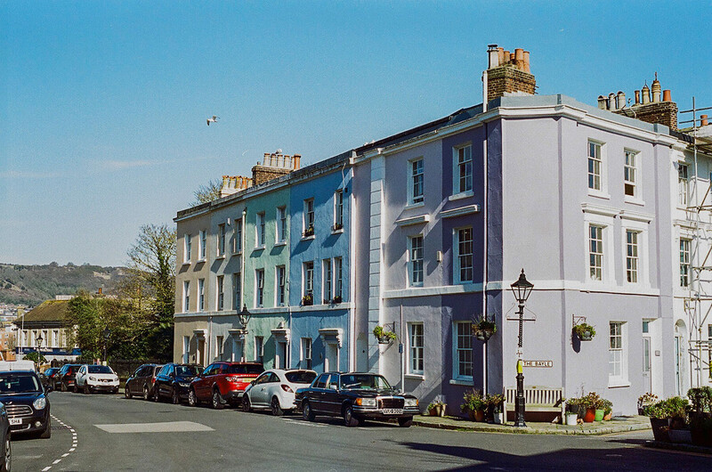
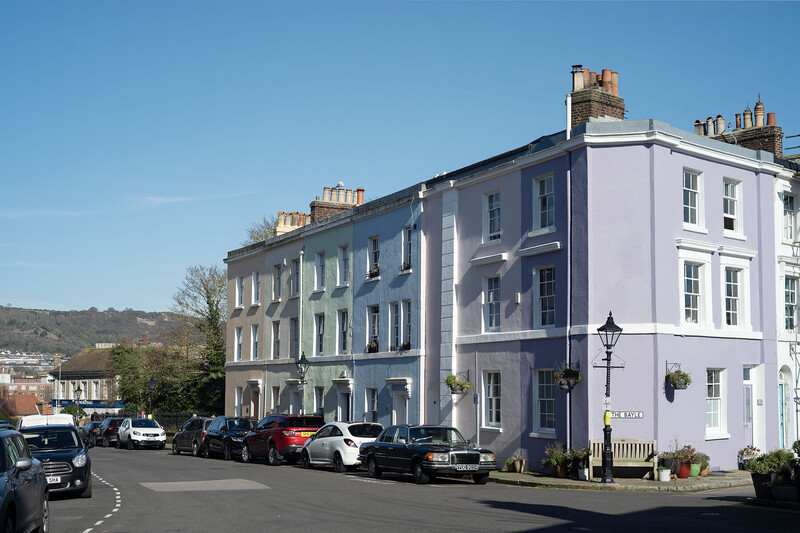
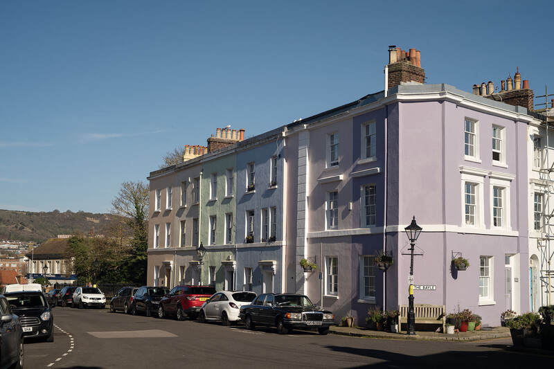
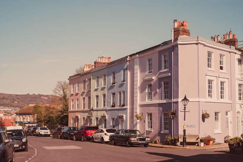
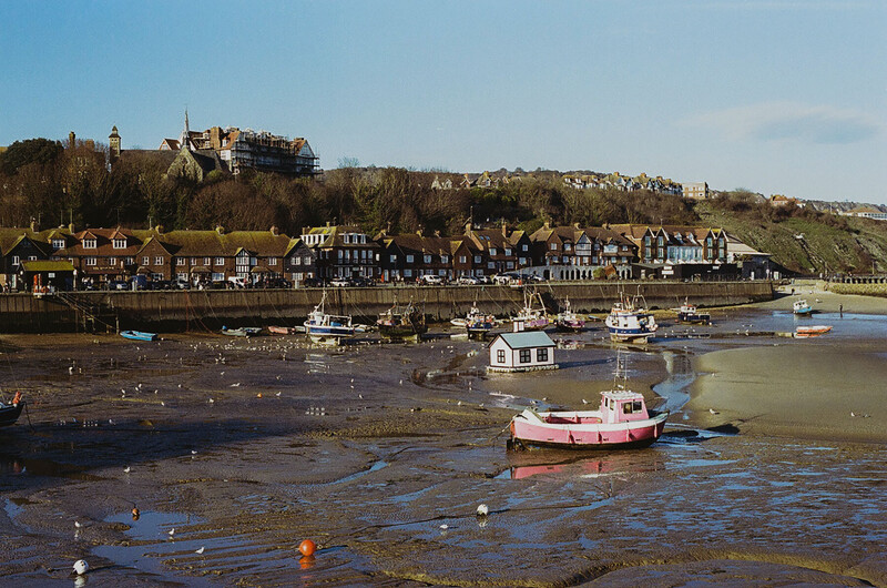
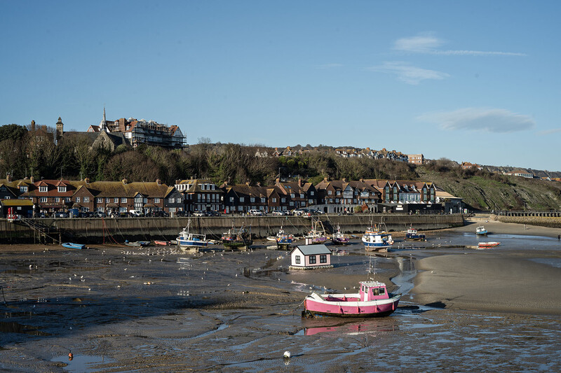
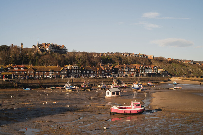
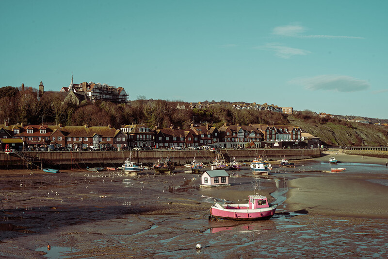
Is there an actual definitive Portra look? My conclusion is I don't believe there is, not in this digital age. The results depend not only on how you expose the film, but on the scanner used, and the scanner settings. And also what the photographer did with the file in the editing stage on the computer.
My Take on the Portra Trend
The trend to use a film stock for travel photos in particular—that was primarily designed for flattering portraits and weddings—lies with influencers who like to take photos, and want to be seen as super-cool for using a film camera. Portra is designed to render skin tones naturally and beautifully. Influencers like to look beautiful! And then there's the fact that Portra is a very forgiving film stock. You don't need to be too experienced a photographer to use it. You can buy that trendy M6 and make a complete hash of things, greatly overexposing Portra by many stops. The results will still look good. It's one of the most forgiving film stocks out there as far as exposure latitude goes. Clearly most influencers do overexpose it, judging from all the light pastel photos we see in the social media feeds. As you saw above, the photos I shot on Portra 400 don't look anything like the romanticized Portra look we hear often about, probably because I didn't overexpose my photos.
As a result of this trend, evidently every YouTube photographer has jumped on the bandwagon and created their own Portra preset for you to buy. And PolarPro thought they should make a Portra filter.
Back to PolarPro's Portra Filter
Why would you want to buy this filter? Let's take a look at some of the pros and cons being bandied around the interwebs.
The Pros
It saves time. It's praised for cutting down editing time, if you like the specific look it gives you. At the very least, it gives you a good film-like foundation to work from in editing.
Great for harsh light. Many photographers say it tames bright midday lighting, and softens things in a nice warm manner. The highlight roll-off is certainly impressive.
The Cons
It doesn't look like Portra film. Many say you can't replicate a film look resulting from a complex chemical process on celluloid film, with a piece of glass and digital sensor.
There is an argument that if you're going to create a film look digitally, you don't need a filter anyway; you can do it in post.
My Conclusion
I like creating a film look digitally. I believe to do this, you are best off using a vintage lens, but it's not always possible or practical to do so. In which case, a mist filter on a clinically sharp modern lens is essential.
I've been using the PolarPro Portra filter for over six months at this point, and I have to say I really like it. I tend to keep it on my lenses more often than not. It's great for travel and lifestyle photography. The white mist is essential, the chroma polarizer, although not contributing to a Portra look, is incredibly useful to have when glare needs to be controlled. And the warm tint, well, I like the look, and as I shoot raw, I can ease it right back in post. I tend to like travel photos on the warm side, so it's a personal choice here.
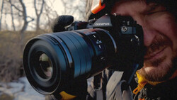
It's true, using it doesn't recreate the Portra film look, despite what moustachy man says on PolarPro's YouTube marketing video about "emulating the Portra 400 film look." I think they realized this narrative was a little too optimistic, so now the PolarPro website states that it's "inspired" by the Portra film look.
Despite all this, the three things that make up the Portra filter result in a filter that I really like. If you just want a diffused look, PolarPro make a CineGold filter, which is a mist with gold particles. Only the really bright areas of direct light are warmed up for a very pleasing look (I have one; it's a great filter). Alternatively, they recently released a Goldstache filter, which is like the CineGold, but with a polarizer added. This is the closest alternative to the Portra filter, and allows you to add your warm tinting in post instead of in-camera.
The PolarPro Portra filter doesn't quite deliver what it promises it might, but they've made a really nice filter, regardless. I rate it 8.5/10.



Join the Fstoppers community for free
-
Post comments and join in the discussions
-
Browse the site ad-free
-
Share your work and get featured in the community
-
Compete in the photo contests for fun and prizes
No comments yet