Color grading can take your landscape images from good to great. This video tutorial walks through how to use Photoshop's Color Balance feature to enhance highlights, midtones, and shadows, creating depth and contrast in a natural and subtle way.
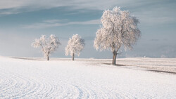
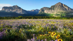
Coming to you from Christian Möhrle - The Phlog Photography, this insightful video demonstrates the use of the Color Balance adjustment layer to achieve a balanced look. Möhrle begins by explaining that while many start color grading in the Camera Raw editor, switching to Photoshop offers more control and precision. The video outlines a step-by-step process of balancing warm and cool tones using the adjustment layer. This technique is especially useful for landscape shots, where highlights benefit from added warmth, and shadows gain depth through cooler hues.
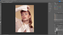
Möhrle starts by selecting a base image and making initial tweaks in the Camera Raw editor. He adjusts exposure, contrast, and color balance to get a solid foundation. Then, he uses masking tools to target specific areas, like the sky and water. This enables precise control over brightness, contrast, and temperature adjustments, which sets the stage for the Color Balance work. This approach helps maintain sharpness and clarity across the image.
In Photoshop, Möhrle moves to the Color Balance adjustment layer, where he tackles highlights first. By shifting the red and yellow sliders slightly, he introduces subtle warmth to the brightest parts of the image. He keeps changes minimal to avoid overpowering the scene. Next, he turns to midtones, where he balances out the warmth with a hint of cool blue, adding contrast between the warmer highlights and cooler midtones. Lastly, he focuses on the shadows, using the cyan and blue sliders to give the darker areas a cooler tone, further enhancing the image’s depth.
One key takeaway from the video is understanding when to use the Color Balance layer versus the raw editor’s split-toning. While they seem similar, the Color Balance layer affects hues differently, making it a good option for refining color even after split-toning. This technique allows you to stack color adjustments for a more nuanced result. Möhrle also touches on using the Hue/Saturation adjustment layer to reduce unwanted color casts, such as an overly strong blue in the shadows, without affecting the overall color balance.
Another notable part of Möhrle’s workflow is his use of selective masking. By targeting specific areas, like the sky or water, he adjusts colors and exposure levels without impacting the rest of the image. This helps maintain contrast and visual interest, guiding the viewer’s eye to the desired focal points. The video emphasizes the importance of subtlety—small adjustments can significantly improve the final look without overwhelming the image. Check out the video above for the full rundown from Möhrle.


Join the Fstoppers community for free
-
Post comments and join in the discussions
-
Browse the site ad-free
-
Share your work and get featured in the community
-
Compete in the photo contests for fun and prizes
1 Comment
Just a thought but is the word ‘stunning’ not the most overused word in photography? Stunning photographs in reality are few and far between. Is thinking that a few tweaks in photoshop can transform a mediocre image into a stunning one not a teeny bit far fetched? In saying that the video is pretty decent and explains pretty useful techniques but the headline!