Luminosity masks sound technical, but they’re built on a simple idea: selecting parts of your image based on brightness. If you want cleaner skies, richer highlights, and deeper shadows without muddy results, this approach changes how you edit.
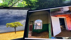
Coming to you from Andrea Livieri, this straightforward video breaks down luminosity masks without turning them into a science project. Livieri starts with a familiar problem in Lightroom. You select the sky, pull down exposure, and at first it looks better. Then you zoom in. The clouds lose separation. The darker areas get pushed too far. The whole sky flattens out. You made one big selection, and everything inside it moved together.
That’s the limitation. Lightroom often treats a selection like a bucket. Every tone inside that bucket shifts by the same amount. Luminosity masks in Photoshop work differently. Instead of one uniform adjustment, each pixel responds according to its brightness. Think of it less like a bucket and more like a slope. Brighter pixels are affected more. Darker pixels are protected automatically. You don’t have to micromanage every edge to keep transitions smooth.
Livieri shows the manual method first so you understand what’s happening. In Photoshop, you go to the Channels panel, Command-click or Control-click the RGB channel, and load a selection based on brightness. Add a Curves adjustment layer, and that selection becomes a mask. The mask looks like a black and white version of the image, but it’s not a separate photo. It’s a map. White reveals the adjustment. Black hides it. Gray applies it partially.
You see this clearly when he darkens the image with a strong curve. With a white mask, the effect shows everywhere. Paint black on the mask, and the effect disappears in those areas. Paint white again, and it returns. That’s the core rule: white reveals, black conceals. No mystery. Just control over where and how strongly an adjustment applies.
He also covers a technique called “masking the mask.” You create your luminosity mask and adjustment layer as usual. Then you place that layer into a group and add a black mask to the group. That hides the effect completely. From there, you paint white on the group mask with a low-opacity brush to reveal the adjustment only where you want it. The luminosity mask controls how the tones blend. The group mask controls location. You separate strength from placement.
There’s also a side-by-side comparison with Lightroom’s luminance range tool. Both can target brightness, but the results differ. In Lightroom, tones within the selected range tend to shift more evenly, which can introduce artifacts or flatten detail. In Photoshop, the transition feels more gradual. Highlights taper off naturally. Edges stay clean. You see the contrast in the sky example. Watch the video to see the full walkthrough and the side-by-side comparison in action, then apply the method to your own files.

Join the Fstoppers community for free
-
Post comments and join in the discussions
-
Browse the site ad-free
-
Share your work and get featured in the community
-
Compete in the photo contests for fun and prizes
No comments yet