
Have you ever seen those bold modern ads that just force you to stop and look? One got me this week. I was driving, and a billboard had a colossal burger, most likely shot with the 16-35mm lens, and a bold, canary yellow background with that primary McDonalds red. "I need that burger! Wait... I'm a gluten-free vegan!" I tipped my hat to the photographer and kept driving.
Color can be a very useful tool in your photographer's toolbox to stop the scroll and get people's attention on your work. Here are three tips that will help you grow in your mastery of color use.
1. Choose Your Main Color and Supporting Colors Strategically
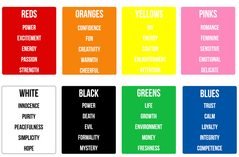
Colors have an impact, not just in the way that they can grab your attention, but in their significance and their references. There’s a whole field of color psychology. Some sort of awareness of the psychology of color is important. It will help deliver the message you are articulating.
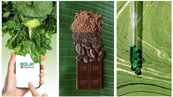
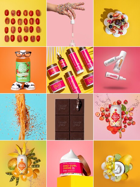
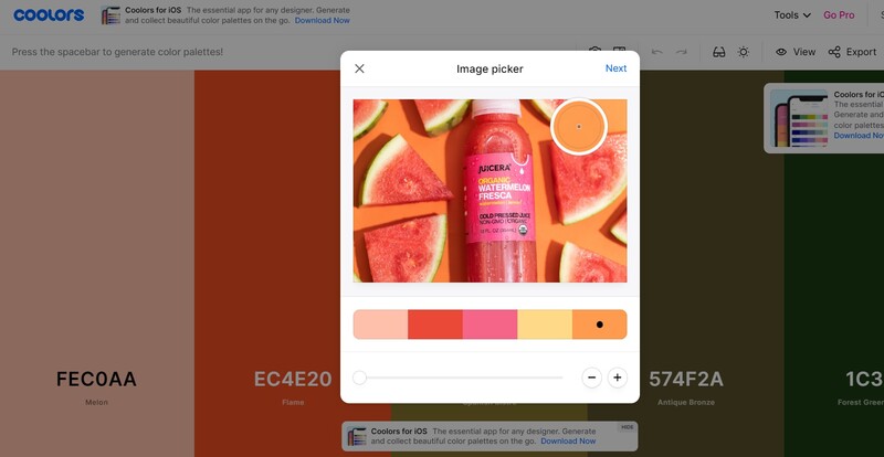
If you don’t feel naturally gifted with color, Coolors can be a fantastic resource for you. You can upload an image (for example, the product you’re photographing or the dress the model will be wearing) and use the generator to build palettes around that. The site also has hundreds of pre-generated palettes for you to browse.
This is one of many resources, but the main point is to be intentional about your color. Decide what your palette will be before going into your shoot and be intentional about your color use.
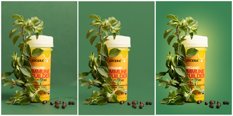
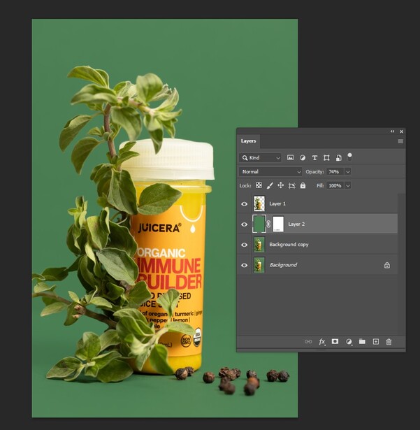
2. To Modernize Your Color, Make It Flat
I used to drool over the Dr. Jart images and wonder how they got their colors so vibrant and matte-looking. I’m not sure how they achieve the look, but for my work, I found an easy way to get that flat, bold, and modern look: add a low opacity color layer.
3. You Can Select and Change Specific Colors
On occasion, I want to work on just one color. Sometimes, clients give me a hex code that I need to adhere to for their brand identity. Other times, the prop I want to use is the wrong color, so I need to switch the color of it in post. This video by Phlearn can show you how to do that. It’s easier than you might have assumed.
Color can be a very powerful tool in your work. I hope these tips help. As you work on your upcoming pieces, tag Fstoppers and myself on Instagram (handles below) and show us your color gains. Have you had a favorite "aha!" discovery when it comes to color? Share it in the comments below.


Join the Fstoppers community for free
-
Post comments and join in the discussions
-
Browse the site ad-free
-
Share your work and get featured in the community
-
Compete in the photo contests for fun and prizes
No comments yet