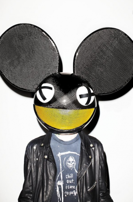
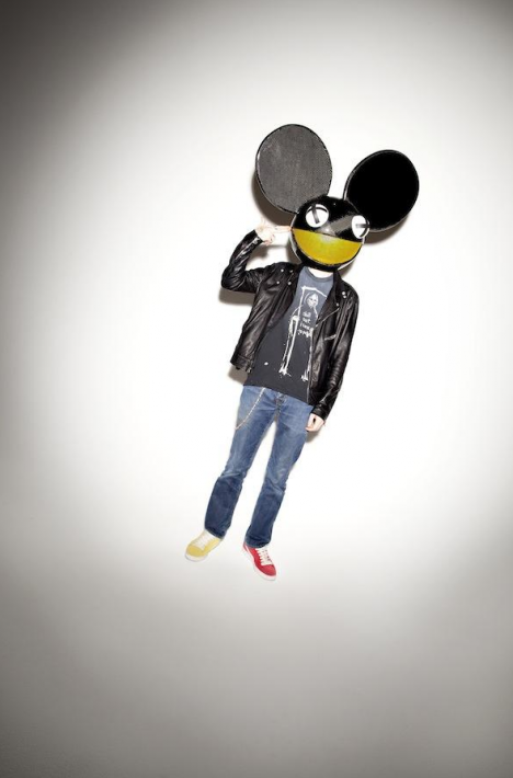
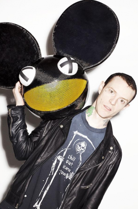
Photographer Kenneth Cappello is known for his celebrity portraiture, his advertising work for Nike and Puma as well as his flashy editorial work for Nylon, GQ, Fader and Vibe. Cappello shot musician/DJ DeadMau5 this past month for Vibe Magazine, and, lucky for us, also shot a little BTSV to give us a peek at his process.
His approach with lighting in this shoot is consistant with the rest of his portfolio- a combination of expertly lit portraits with more in-your-face, direct flash images. He uses Canon gear and Profoto lights on basic white and black sweeps. As they say, less is more, more or less.
Images used with permission.


Not really "Behind the Scene" though :/
Did you watch the video? You can definitely see how some of these shots were lit. Looking at the photos you can tell the position of the light, but the video helps us know exactly what modifiers are used, etc.
Yes, its really important to know the exact way how to light a scene so it looks like on camera flash! its amasin!
I get that some of these look like on camera flash, but this guy is doing something right and getting good clients. There is something we can learn from him.
is it just me or the shots look kind of amateur?
I agree!
I disagree.
It's just you!
he's using that terry Richardson style. the snapshot style
Pretty slick set up. Just getting into flash myself it does help to see that the direct flash setup and stark shadows is still a solid solution to a simple studio portrait. Thanks for sharing Nick!
Really fstoppers? ......
Why not?
.... :/
Not really a fan of the end result. I don't dig this particular style. The only one I really like is the first shot on black gradient background, but still it's reaching.
This dude is getting paid... whether you think its awesome or not. He is using simple techniques and getting sweet clients.
Exactly! It's so hilarious to me how so many photographers stand in judgement to other photographers. There's various lighting techniques, some intentionally breaking "photography laws" with interesting results. We're not all going to like everything everyone shoots but it doesn't mean you have stand as "The Righteous Photography Judge" denouncing everything you don't like! SMH.
Thing is this guy had probably so many people that had so many idea's of what they wanted the shot to look like. Art director, the DJ, the DJ's producers(I'm sure), ect. So to sit here and say its amateur isn't really a fair statement. Like someone said he got paid to do a shot for a pretty high profile client.
Your right we should at lest give a nice constructive crit on why. 1) the helmet has a texture that wraps to light and while the x is cool the burn out in the middle is horrible and should be diffused down. the x should be properly placed with helmet and not just wherever. 2) the harsh light and shadows on the white bg make me think hipster with new camera. (high pass clothes and wash out face is not a good idea) 3) the mans face in the one photo, what the hell is he doing talking, licking his lips, rolling on E? 4) This is the most motionless I have ever seen in a Dj.
Except the first one which has kinda cool shadow and lighting fell off the subject; the rest looked like taken by a huge huge Pop Up flash instead of the tiny installed on the camera.