
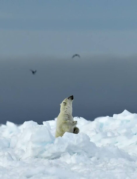
Before you click the shutter, you likely think about shutter speed and aperture. You likely think about what you want the image to look like. But, do you imagine it displayed? When you shoot, do you take the time to think about what the finished product will be?
In preparing my last article on the green aspects of Hahnemühle's new Natural Line of Papers, I had the opportunity to talk with photographic luminaries Lynn Johnson, Michelle Valberg, and master printer Tom Underiner of PixelRiver.
As with my last article about Hahnemühle, this article reflects my interest in both Johnson and Valberg’s work and its connection to green products. I did not receive anything from Hahnemühle to put this article together.
As I spoke with each of Johnson, Valberg, and Underiner, it became more and more clear to me that photographers all too often think only of the image file and not about its final display. Too much expose to the right and teal shadows, not enough rag or smooth, framed or naked.
Personally, I found it interesting that Hahnemühle’s commitment to quality encouraged two of the best photographers shooting today to revaluate and elevate their creative choices. Both Johnson and Valberg expressed a similar sentiment: Hahnemühle’s commitment to their craft makes me more committed to mine.
An Exposure Polygon?
Digital capture may have changed things recently, but the giants of photography’s past usually considered what their images would look like as a final piece of art. Penn thought about platinum’s affect on his contrast. Adams developed the zone system thinking about his papers’ depth of blacks. So, even if it sounds a bit too contrarian, shouldn’t we, as photographers, be thinking about paper as part of an exposure square, an exposure pentagon?
In Search of a Paper
Johnson’s and Valberg’s printing journeys started in drastically different places, but tracked a very similar route. Johnson, working with NatGeo, Life, and SI, rarely takes photos with the intention to print. Many of her images have ended up as art prints, but, as she phrases it, she shot for the page, not the wall. Printing wasn’t her goal. On the other hand, Valberg shot quite a bit for the wall. With Canada’s Global Affairs as a client, Valberg’s prints can be found in Canadian embassies around the World. When Johnson decided to stage the traveling The Van Gogh Affect exhibit and when Valberg’s favorite rag paper was discontinued, both embarked on a search for something new.
In Steps Hahnemühle
Looking for something with impact for her show, Johnson’s printer, Tom Underiner, a long-time user of Hahnemühle’s products, suggested she look at the new Natural Line. Valberg, searching for something with texture to replicate her choice of rag, reached out to Hahnemühle and was turned on to the same Natural Line.
Paper as a Choice
Faced with having to think about paper, both Johnson and Valberg began to realize that if you’re going to display your work, the choice of paper is just as important as aperture or shutter speed.
Johnson’s Journey
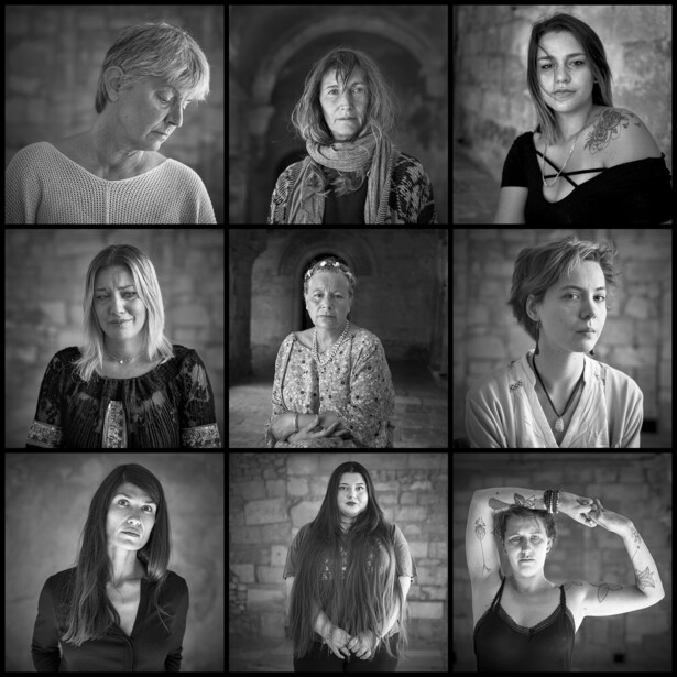
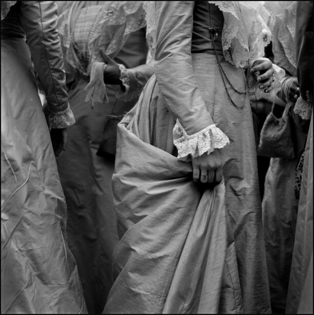
Johnson’s portion of the Van Gogh exhibit focuses in part on the Saint-Paul Sanatorium in Saint-Rémy. This is the facility where Van Gogh was a patient just before he moved to the village of Auvers-sur-Oise, where he died. The sanatorium is still an active psychiatric facility for women. The women at the facility use art to help heal their identities. Johnson is very much interested in a photographic examination of how creativity is used to heal or create identity in the face of trauma.
Having worked on developing the idea behind the Van Gogh show for years, Johnson’s images are shot on a variety of cameras. She’s used a classic Hasselblad, a Holga, and a variety of 35mm cameras. As planning for the show moved towards printing, she started to ponder about the act of displaying itself.
When Johnson initially found out that the prints would be framed behind glass, she found herself thinking about how she wanted people to experience her work.
I started to think about how I wanted people to experience the work, this classic black and white.
Johnson decided that she would like to see a more democratic approach to her work. We talked about how photography was initially a bit of a rebellion against the painting masters who had their images hung in massive frames behind glass, and today, protected by several levels of security. Photography was supposed to be accessible to all. To Johnson, putting it back behind glass defeated the purpose.
Deciding the images would be hung without glass, Johnson decided that a textured paper would create more of a sensual experience for the gallery-goers. The Van Gogh exhibit even lets gallery-goers touch her prints. Thinking further about the project itself and the admiration she has for the women who make up the majority of her subjects, she wanted to respect their artistic process from the beginning of her own process through to its end. This pushed Johnson even deeper into thinking about the final product and its ultimate display.
Working closely with Underiner, Johnson decided to experiment with Hahnemühle’s new Natural Line. In the end, Johnson decided to use the new bamboo paper for the softer portraits, hemp for the older images, and agave for the journalistic images.
Working with these new papers and seeing the life that Hahnemühle has given to her work, Johnson explained that Hahnemühle has turned on a new creative engine within her, a new depth to her process.
With a new project on the go, Johnson now finds herself thinking about the aesthetics of the paper when she is creating her images.
[The paper] opened up a new world, a new depth to my process.
Valberg’s Journey
Having spent a significant amount of energy on developing her process for fine-art prints, Valberg was disappointed when her favorite rag paper was discontinued. Because of the high demand for Valberg’s images, she couldn’t afford to settle. In an effort to keep the quality of her prints high, Valberg chose to stick with Hahnemühle. Valberg’s deep dive led her to experimenting with Hahnemühle’s new Natural Line.
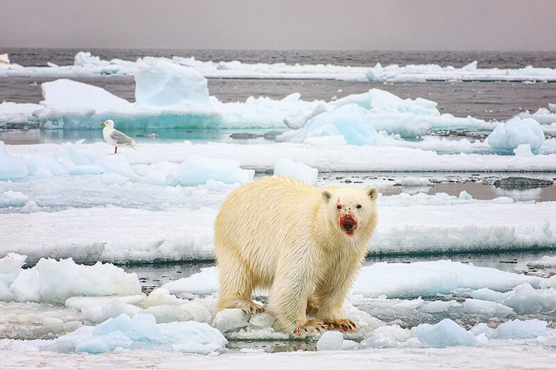
Because Valberg’s career has seen her spend a significant amount of time in Canada’s North, she was searching for a bright paper with a slight texture. Having found the bamboo paper a bit too warm, she gravitated towards the hemp and agave.
Valberg was also drawn to the Natural Line because of Hahnemühle’s green commitment. Having spent so much time photographing the wilds around the planet, this sustainable approach fits with her general philosophy. As Valberg succinctly puts it:
It just fits my profile. It’s the future. We’re all looking for it... it’s in the right direction.
According to Valberg, from a workflow and printing perspective, the Natural Line uses similar profiles and processes for printing. This has allowed Valberg to move to a green solution with a very seamless transition.
It’s very much still a Hahnemühle paper.
Does the type of paper or the way you display your work affect how you shoot?
Next time, I’ll share insights from master printer Tom Underiner and one of Hahnemühle’s technical wizards, Travis McConnaghy.
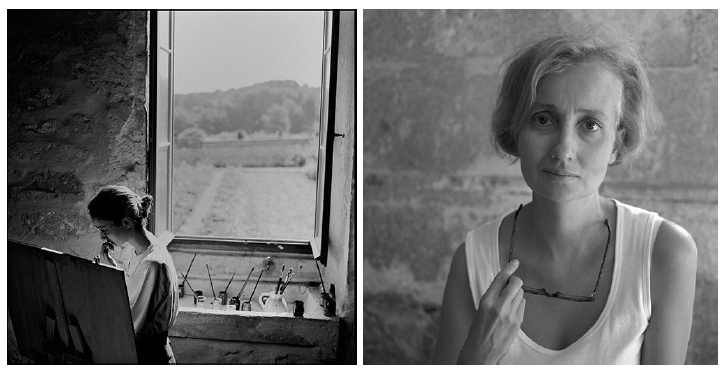
Images provided courtesy of Lynn Johnson and Michelle Valberg, as noted in the captions.


Join the Fstoppers community for free
-
Post comments and join in the discussions
-
Browse the site ad-free
-
Share your work and get featured in the community
-
Compete in the photo contests for fun and prizes
15 Comments
Still new to photography, thinking about the finished print and which paper the image will be printed on did not actually come to mind until recently. I purchased a sample pack from White Wall, and this helped open my eyes. The pack also includes tips on what photos work best with the particular paper. And their (5) Hahnemuhle papers are gorgeous and perfect for fine art prints.
Now while shooting, the finished print does come to play in the field. This also, I believe, tends to help going into post.
Great in depth article, thanks for sharing.
Thanks Brian. I completely agree that thinking about paper as part of post is CRITICAL.
I think, thoose are 2 very different moments to consider. The first one is the capture of light, the data, and then what we do with this data.
Case 1, I knew wat I was doing:
I mean, I've photographed used burgers wrapping papers (I don't develop the whys here...) and I knew the way I wanted to show them in an exhibition. It was on rodhoid and I wanted to use the curly nature of the plastic sheets to make them stand up by themselves.
I wanted photographs to mimic Xray photography too
Scale of the final print was 1:1
I ended "shooting" them by transparency, being carefull to make pure white around the burgers papers so thoose areas to "print" transparent on rodhoid
Case 2, I dind't know what I will do next
I photographed abandonned clothes at a famous music festival here in France ((I don't develop the whys here...).
The goal was to "make data", to capture accurately the material, but I didn't know exactly what to do of this data beforehand.
When I had to think about the exhibition, I visited the room and building to understand what they where doing there, and I tryed to "create" an experiment for the public specially in this context.
Print were finally hung from the roof like ghosts in a octogonal shape, floatting in the center black painted walled room.
Prints were A0 size (1,2mx0,8m) on 90g/m2 paper, hung by posters plastic clips and fishing strings.
For more classic work, I rely on Hahnemühle Photo Rag Bright White 310g paper which is neutral, accurate...
That sounds quite interesting. Care to share images of your images?
Thanks for your interest, I don't have good photographs from the different instalations but you can see some on my works on my website : https://www.monsieurnede.fr
Below some tests I made before exhibitions...
Thanks for sharing. Very creative. You'll love my next article on the considerations of printing while thinking about hanging.
can't wait to read you!
I've followed Ms. Valberg's work and she is quite talented. While viewing her images is always a pleasure, the article seemed to be more of an ad for Hahnemuhle papers rather than providing any printing workflow insights.
I was more intending to discuss the artistic considerations of shooting while thinking about the final product more than printing workflow.
Would you like to see an article on printing workflow?
Aim for the best technical exposure you can and worry about the rest later. Technical stuff first, aesthetics later.
I don't disagree with your comment, but, I think having a final product in mind can help with certain commissions or ideas.
Indeed. Having some sort of pre-visualized result in mind is good, but paper choice is not something that factors in here.
I shoot only film and only print silver gelatin (sorry, vegans). Paper is extremely important but not when I take the photo. I think about paper after I look at the negative and when I’m post processing in the darkroom. If I shot digitally, I doubt I would consider paper as I was shooting either but probably as I was also post processing in lightroom/photoshop. Thinking about too much as I shoot could might change how I shoot and potentially for the worse.
Film is more of a hobby for me. Do you develop your own, or just print your own?
The list of things you can think about while shooting is almost endless. Some of it becomes muscle memory (sort of) while some of it stays part of the consciousness.
I develop the film (black and white) myself and print the negatives.
When I’m shooting, I try to only think about light and composition. Once my negative is developed and I’m holding it in the darkroom, I think about how I want it to be printed and start considering dodging, burning, contrast filters, the type of paper, etc.