
Color plays a large role in the way we view an image. It can convey emotion, evoke a response, and set the mood. Understanding the basics behind how to use color in your images will assist in creating your signature look. Color can play a role in all the senses making sure your viewers feel the story behind the capture.
Color timing is a term used in film processing and it involves changing the duration of exposure processes during development. In the digital age it has become known as color grading. Creating a signature look can be accomplished using different aspects of the color grading system. Understanding why and where the colors are being pushed will create the impact in the final image.
First there is a difference between color correction and color grading. Color correction, as the name suggests, corrects the image to have an all over fluid quality. It is correcting the colors in such a way as exposure or saturation as a whole. In color grading, the colors become more extreme and have more of an impact. In theory, there is nothing right or wrong when color grading because it is geared more towards the artist's preferences. Color grading manipulates the color channels in a way to convey a range of emotions or a certain look.
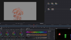
Color grading work has the ability to either work the entire image or to isolate a specific range of hues, saturation, or luminosity in a more local fashion. The advancement in the digital era has not only allowed for color adjustments to be considerably shorter in the process, but also the ability to mask portions of the image.
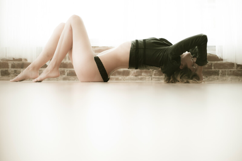
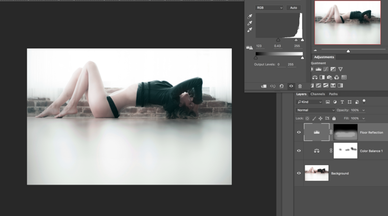
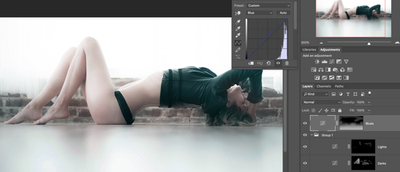
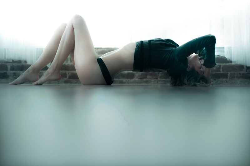
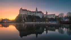
This process is a great way to achieve a look that can change an image from bright and airy to moody and emotional. Keep in mind that the cooler colors are blues, cyans, and greens while the warmer colors move into magenta, red, and yellow. For example an image can take on the blockbuster look by moving the cool colors into shadows and warm colors into the highlights. I prefer the cooler more haunting colors in my underwater and boudoir images so I create the color cast by pushing cool colors into the highlights and the shadows as well. The flooring in my studio takes on a orange hue with the boards creating a distraction from the subject. This is not the ideal final look I want to present my clients with during the reveal session.
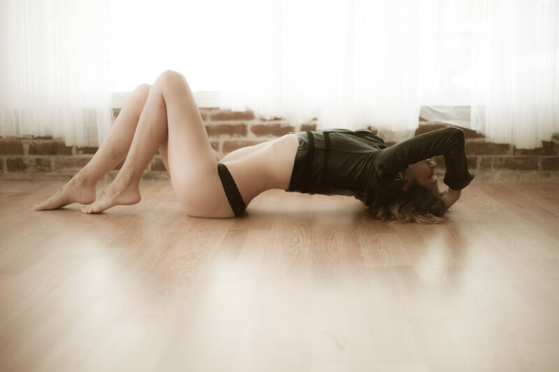
In order to combat the focus of the floor, I lay flush (see my previous article on posing for more tips on this level). Now that my focus is back on the subject, the coloring fun begins.
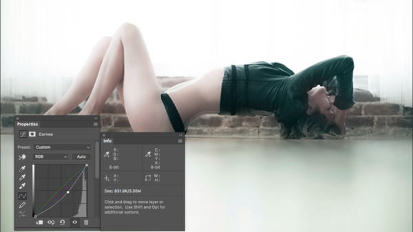
Applying a color balance and pushing the cooler colors in the shadows can create a more favorable skin tone for my look. However, it is applying it to the image as a whole so care needs to be taken in order to mask out the face in order to bring it back.
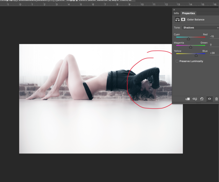
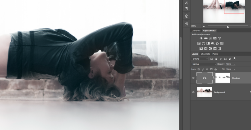
Next the floor gets a little makeover in order to give a slight reflective surface. Applying a levels layer inverted mask allows control on the local level. First the entire floor gets a low opacity brush. The areas underneath the body are pushed a bit more afterward. Using a tablet for this sort of work is recommended so the pressure can be controlled.
There is a lot of control in the curves layers utilizing each color channel rather than as a whole. It is preferable in many cases to invert the layer in order to paint back on where the color is needed.
Color grading can be a fun process as you learn what appeals to you and your clientele. Shifting the emotions just by the warm or cool use of each color will bring to light your signature look. Not every image in this session will receive the same cooler and moodier treatment, but I always add a few to changes things up a bit.


Join the Fstoppers community for free
-
Post comments and join in the discussions
-
Browse the site ad-free
-
Share your work and get featured in the community
-
Compete in the photo contests for fun and prizes
8 Comments
Personal choice but I prefer the original slightly warmer image :)
Before is a lot better.
Everyone for the before photo raise your paws...
Remember this is about changing the mood of the image. While many prefer the natural skin tones, this was about how to change the feeling of the image simply by manipulating colors.
The process is a little too "quick and dirty" and there are much more effective methods for color grading that will yield more professional results.
Just curious, why use video terminology in place of photographic jargon for color correction? BTW, I too like the warmer image.
Someone correct me if i'm wrong but I've known Color Correction to be correcting the RAW to maybe how it looked in person, or in the case of video, matching the color of two shots. Grading, comes after correction, and is more of the artists expression on the mood they'd like to create.
I would agree with these broad definitions of the terms Hunter.
Which, Michael, is why the article is titled Color Grading...and Jennifer used the example for creating a different mood. It's no secret that many people prefer the "mood" of the warmer/original image...but that doesn't discount the legitimacy of the mood that is created with the cooler color toning of the 'after' image.
While there is so much overlap between stills and motion capture these days, I still prefer my jargon to be specific to the medium. Photographers used to call this "toning" I believe. Calling it Color Grading is just a new (old to video) term that photographers are throwing around.
So in summary:
Color Correction = Adjusting the capture to look true to what the scene looked like. Adjusting for tints and temperature. Generally global settings.
Color Grading = Applying a mood to the image by manipulating color beyond the 'real' scene. Often applied separately to highlight/midtone/shadow regions.