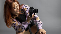
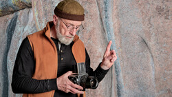
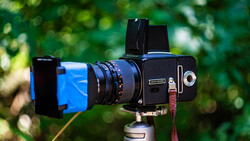
The challenge: 30 images in 5 days for an international tool company. New York based advertising, fashion, and fine art photographer, João Carlos was the man chosen by Lisbon agency Ivity Brand Corp. to accomplish the mission. A Hasselblad Masters winner with clients like Nike, MTV, Avon and Sandisk, it was clear Carlos had the vision and expertise to turn the agency’s mood boards into an incredible campaign for their client.
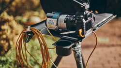
But how did he do it in such a short time? Fortunately he’s created a story-like BTS post including the original mood boards, lighting diagrams and this very entertaining video documenting the entire process.
Related Articles
Join the Fstoppers community for free
-
Post comments and join in the discussions
-
Browse the site ad-free
-
Share your work and get featured in the community
-
Compete in the photo contests for fun and prizes
13 Comments
is this an hasselblad marts? are you serious? O_O
Okay WTF did I just watch?
This is bad on so many levels.
The set-up is amazing, but honestly I feel that the over-use of the low-angle shot don't look great but, more than that, on the backstage video you can see how playful is the model ! She seems to have a more than lovely smile ... but on the selected pictures she only wearing the "neutral fashion face" witch is sad because it's just break the mood ...
it's a lot of energy, a lot of people involved, a incredible gear used ... for a result that i found not as high as it deserve.
poor use of a 40,000 camera..
The client may want some of their budget back so they can get someone less talented :-)
Don't be negative guys, they are working so hard XD
Really disappointing work. Some of the lighting is (just) OK, but the general mood looks wrong. Samten Norbu is absolutely right about the model. Playful, yet underused.
I'm trying to guess who the target audience is. It certainly wasn't me.
Terrible. I have no idea who the target audience is, and why would Red Riding Hood be the character chosen for tools and machinery. The target audience is clearly men, but I think something like this should have called for a masculine character. You want your target audience to feel like they can be THAT guy in the photos. When they see red riding hood, confusion will take place. Terrible concept.
As far as gear is concerned, I could have saved the client a ton of money and would have done the same with a rebel and speedlights. It just feels like he didn't use the dynamic range of a MF camera to its ability. A waste of money. I just hope the client was truly satisfied.
I have to assume the photographer did exactly what the agency/art director wanted. It's not always up to the photographer (in most cases actually) to decide how the final images are going to look. It's an unexpected concept and execution, which is why I chose to post it.
I agree on that and I hope (for the client and photographer) that is the case.
The series of photos don't have a cohiesive editing to them. Looks like they used different techniques. One has a grungier feel while others have the fade look. I agree with the other comments. Results not very impressive. It may be the result of the Art director's direction, in that case feel bad for the photographer (unless he got paid very well, in that case, oh well at least you got paid to shoot crappy photos)