Hello, I'm Steven Meyer-Rassow. I was contacted by Wise Ink creative publishing, who wanted a photographically based cover image for an upcoming fantasy title by A.M. Justice. The following is the process of photography and design that went into the creation of the final cover.
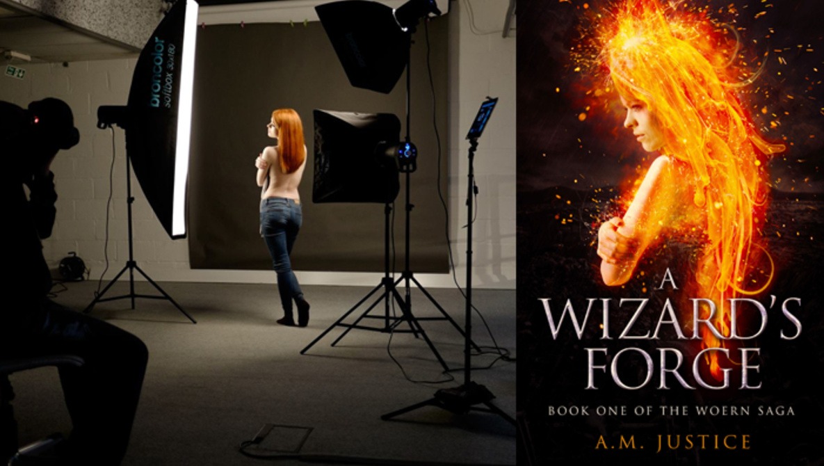
The brief was to bring the book's protagonist, Vic, a female wizard, to life for the cover. In the book, which is the first in a series, Vic is forged into life through both external and internal events, and the author and publisher were keen to use this idea of forging and bringing to life as the visual vehicle for the cover composition. We all agreed Vic should be poured into life somewhat similarly to molten metal or lava pouring out of a furnace and creating a fiery weapon, which is effectively what she turns herself into over the course of the story. After sending out an online casting call, we chose our model, Michelle.

BTS photo (courtesy of Simon Ellingworth).

A shortlist of images, all straight from camera, were sent to the author and publisher for review; this ended up being the chosen image of Michelle to be worked up.

Cutout and basic image correction
The first job was to do a detailed cutout of Michelle, along with editing out the towel she was holding for the shoot. Bearing in mind the overall look and feel of the cover, I also processed the photo to have a much warmer feel.

Explosion effects
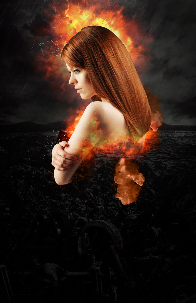
I started by adding an explosion effect behind and underneath the model to start giving the idea of a fiery figure emerging. The explosion effect was created using custom brushes in Photoshop, along with some stock images.
Background scene
The next step was to integrate a scene into the background. Given that the final image was to be predominantly a fiery figure, I was keen to keep the background dark and desaturated to aid overall contrast.
Building the lava-hair effect
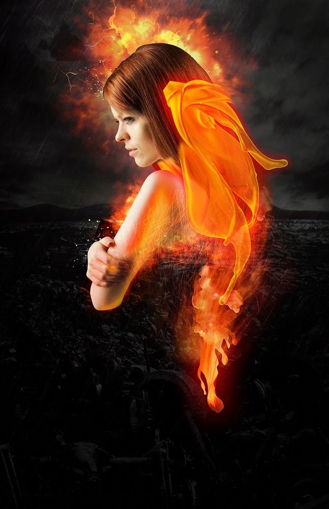
This was the real challenge with this cover: to create a fiery, molten, lava-like dripping hair effect. After some initial experimenting in Photoshop with a couple of techniques, I decided to create the hair by using a set of stock images of paint being thrown. I converted the images to custom brushes in Photoshop to be able to then paint onto a custom layer style that would give the overall effect of fire/lava:


The finished hair effect
The individual bits of molten hair were carefully arranged and blended together via layer blending styles and masks in Photoshop. The liquefy tool was used to drape the effect over the models shoulder and back.
Elemental effects added
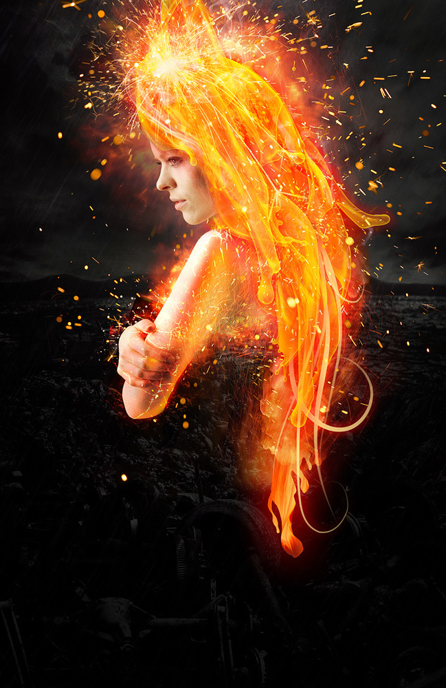
Additional elemental effects were added in the way of sparks, smoke, and glows to help bring the composition to life.
Final tweaks
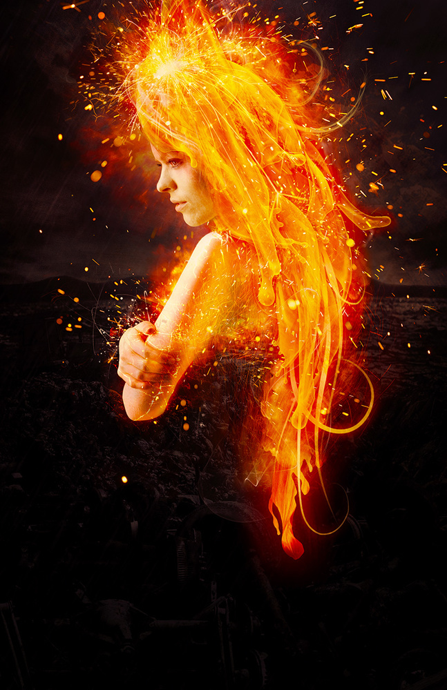
Final tweaks to the image included levels, curves, and saturation adjustment layers.

Typography added for final book cover composition
Title, series name, and author name were added to our composition to complete the final book cover, and that’s a wrap! A Wizard’s Forge, by A.M. Justice, is ready to come out in September 2016.


Very cool!
Thanks for showing the process
Really interesting. Thanks for sharing!
Nice work! Great work on the flow and layering.
Interesting article. I love to see this kind of How To information.
Have Fun,
Jeff
Thank you for sharing your process.
awesome!!! I'm 14 and writing a book now, I'm trying (notice 'trying' :) ) to design a book cover now, can you please tell me what font the title is!?