Growing up on comic books and graphic novels I have always been a fan of anything illustrated. When I started taking photos and creating art, I wanted my images to have a similar feel.
I would study specific techniques that would bring me closer to the style I wanted. Eventually, over time I managed to evolve my photography into a very painterly and illustrated influenced style. I always get asked how I create this look, what technique do I use. It is not one technique but several techniques together. A few years back I was commissioned to create a series of images for an alternative magazine. I will use these as a reference.

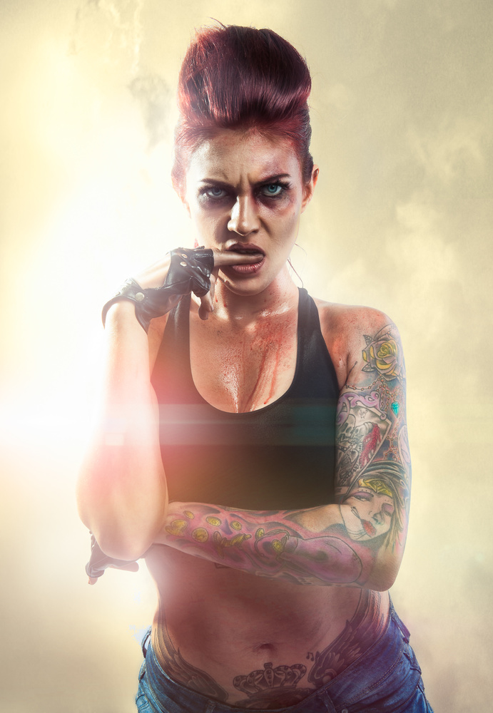
The first thing I would say is that the illustrated look seems to work best on conceptual or hyper-real images. Yes, you can achieve it on any image, but it does not mean it should be applied to every image. With this series of images, the characters were hyper-real, GTA, caricatures of two runaway convicts. They are covered in scars and bruises in outlandish outfits. There is no realism here, but comic book sleaze. The subjects themselves lend favorably to the illustrated style because it even further detached them from reality.

The next ingredient to the magic sauce is color. Generally illustrated comics and graphic novels have bold, bright and saturated colors. I know this is not the case across the board, but in general, this is what our brain connects with an illustration. So be sure to up the saturation in eyes, clothes, and hair. Be mindful of color patterns, e.g use complementary colors. For example, I changed the model's eye color to match her hair. And the colors in the image were chosen specifically from a color wheel as they work together in harmony.

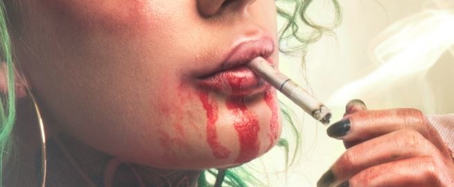
The next and what I believe to be the most important part of the process is dodge and burn. I have already covered dodge and burn in a previous article. But you want to spend a lot of time dodge and burning the image. You want to create form and pull out details from the image. I usually do one pass creating depth, so darkening shadows and brightening highlights. I then go over again and pull out the details by tracing over them and burning them. For example, on the lips, I went in and burned around the lips, even in the little cracks of the lip and the cracks of the fingers holding the cigarette. You need to do this to the whole image. Yes, its time consuming but the final result is great. Sometimes I even burn in my details or go over lines because it just adds to the illustrative feel, illustration is usually sketched leaving rough lines or width inconsistencies.

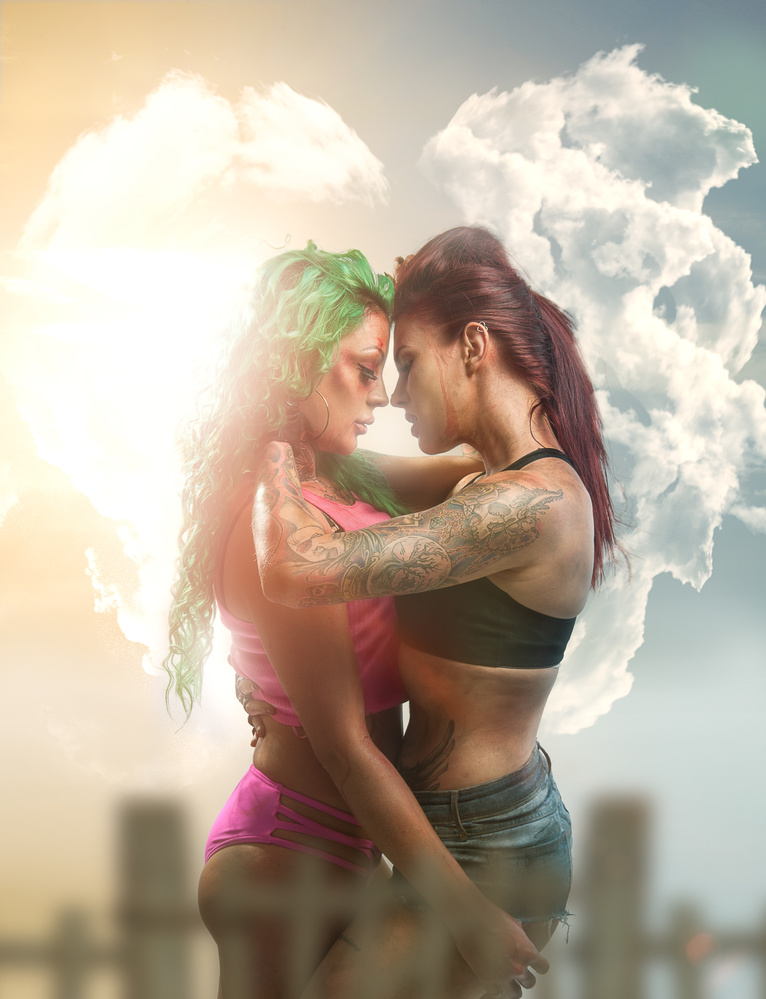
Finally, add some stylistic flair to create a hyper-real feel. Illustrations are mostly based in an unreal world. Add light leaks or lens flares. Warp little elements of your surroundings, or enlarge or shrink everyday elements to give the viewer a sense that what they are seeing is a little off. In this image, for example, I used the clouds to represent the emotion between the two dangerous star crossed lovers.

And last of all experiment and have fun with it. The illustrated style is bold and dynamic. It catches the eye and turns heads, so use it correctly.


Thank you for not just explaining how, but why.
Thank you.