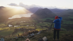
Stacking a polarizing filter with an ND filter on a wide angle lens creates serious vignetting issues, and that's exactly where this long exposure edit begins. Knowing how to work through that kind of technical constraint while still landing on a warm, airy, high-key result is a skill worth building.
Coming to you from Christian Möhrle - The Phlog Photography, this detailed video walks through a complete Lightroom edit on a long exposure landscape shot, starting with a crop to eliminate the heavy vignetting from the polarizing filter and ND filter stack. Möhrle then uses Lightroom's generative AI removal tool to clean up distracting elements in the water before touching a single tone slider. One of the early decisions that shapes the entire edit is switching the profile from Adobe Landscape to Adobe Standard, which reduces contrast from the start and gives the image the soft base it needs for the airy treatment he's going for. He brings down highlights and whites deliberately to pull color back into the bright areas rather than letting them blow out to white.
The masking section is where things get more surgical. Möhrle uses a linear gradient over the foreground to pull down saturation and temperature, which might look odd at first but is a deliberate setup for the color grading pass that comes later. He also uses a color range mask to isolate and fix some problematic blue tones in the upper right corner of the sky, then balances the sky's exposure between the left and right sides using separate linear gradients. A radial gradient over the central tree adds just enough contrast to make it stand out without overdoing it.
The tone curve work is worth paying close attention to. In the red channel, Möhrle pulls the highlight point to the left to push warm tones into the bright areas of the image. In the blue channel, he drops the highlight point down to introduce yellow tones rather than blue. He also works through the color mixer to shift yellows toward orange, nudge blues toward cyan, and bring up yellow saturation. Then in the color grading panel, he layers warmth into the global, highlights, and midtone wheels. The final step he calls "Candy Crush colors" involves the calibration tab, where dropping the blue primary hue and raising its saturation creates a rich, pleasing color shift he uses consistently across his work. Sharpening wraps it all up with a low radius, high detail, masked approach that protects the smoother areas of the image. Check out the video above for the full breakdown from Möhrle, including the exact values he uses at each step.


Join the Fstoppers community for free
-
Post comments and join in the discussions
-
Browse the site ad-free
-
Share your work and get featured in the community
-
Compete in the photo contests for fun and prizes
No comments yet