

Color correction and grading are probably amongst the most difficult parts of a retouching workflow. What seems to make it difficult in Photoshop is usually the understanding of the different tools available, such as curves and levels. However, there are a couple of tricks that can make it much easier, color palettes and fill layers being some of them.
Meaning of Colors
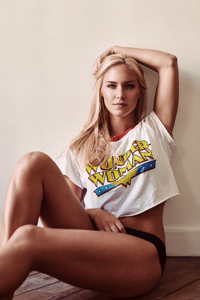
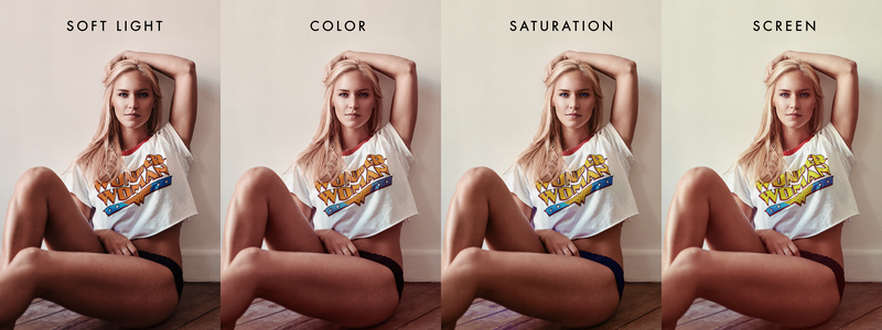
Any proper coloring of an image starts by a good choice of colors. Understanding the meaning and connotation of colors is crucial when we want to create a successful picture. A simple mistake in the choice of your colors and you are going to set an entirely different mood for your picture. Knowing what emotion, feeling, or vibe you want to give your view will pretty much define your toning and coloring. For example, when I created the image below, I wanted something flirty and sexy, where the viewer could feel like he was with the model, almost like a stolen picture of his girlfriend. However, changing its grading will change the mood radically:

Having both next to each other might give you the impression of having pushed both color gradings too far. But try to stay on one of the pictures for a few seconds and your eyes will adapt.
To create these two different versions, I used a very useful tool that makes coloring much easier — not easy, though. It'll just make it easier and more accessible. It's called Paletton. It was previously known as Color Scheme Designer, which some retouchers still prefer. Try both for yourself and see which one you like best. Paletton, like its name implies, will create color palettes for you. In simple words, a color palette is a set of colors that will go well together. But let's see how we can use them to make our pictures look better while simplifying our work.
Creating a Palette
The first thing you have to decide is the mood you want to give to your image. This is what will dictate your color palette in most cases. For some genres of photography, it might also be decided upon the content of the image (clothing, object, etc.).
For the image used above, let's say I want to have an image that is warm (yellow/orange/red) to give a cozy and welcoming feeling. Let's go a step further; if I wanted to give an intimate feeling as if it were her boyfriend photographing her against the wall, I would use colors that are often thought of as the colors of love: red and pink.
With that in mind and knowing my color wheel, I will want to have my primary color set to red, as it is between pink and orange.
As I have some red in the picture (collar of the t-shirt), I am going to use it to have a final color grading that is as harmonious as possible with the colors my image already has. Using Photoshop's color picker, I get a reading of the hexadecimal color value (#b03a3a), copy it, and go to Paletton.

In "Base RGB", I paste my hexadecimal value. This is where Paletton will do the hard job for me: creating a palette based upon my color choice. At first, it creates a monochromatic palette, which in our case could work. But I could go a step further and use a palette with adjacent colors that would include pink and orange; you'll understand why in a minute.
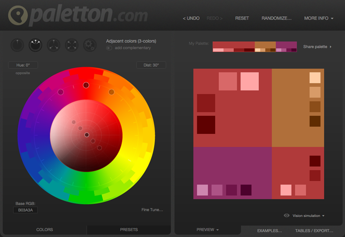
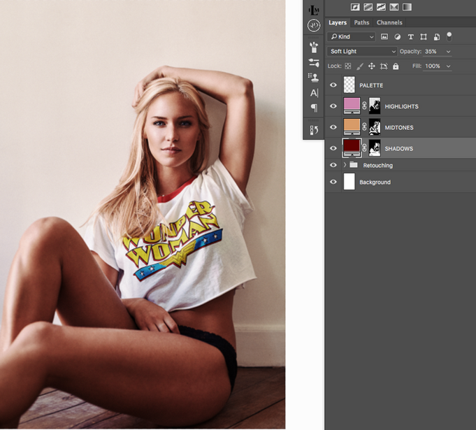
Now that I have my palette, I can go back to Photoshop and use the different colors to give my image the desired mood. But right before switching to Photoshop, I'm going to import the palette. There are a couple of ways to do this. In Paletton, you can either hover over each color to get the hexadecimal values or go to the "Tables/Export" tab (bottom right) to get a color swatch of your choice (Photoshop Swatch or PNG). If you use Photoshop and not Affinity or Gimp, the ACO palette is most likely the best choice of export. In my case, it didn't work with my Photoshop version, so I used the PNG that I put on blank layers on top of all the others. Having it on top leaves the possibility of using the color picker to select quickly a color whenever I need.

Luminosity Mask For Color Grading
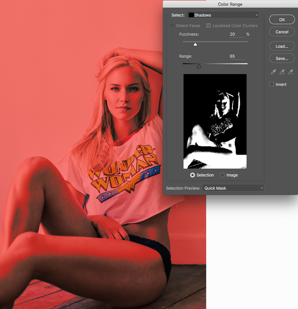
Usually, the darker tones have more saturation than the lighter ones. So, to make the red more important, I am going to place it in the darker tones. Darker tones can be selected using the "Select > Color Range" tool and then selecting "Shadows" in the "Select" drop-down list. Be sure to adjust the fuzziness slider to avoid any harsh transition.
With the selection active, let's create a color fill layer ("Layer > New Fill Layer > Solid Color") and use the "Soft Light" blending mode. When asked for the color, I simply place the red I initially decided to use, but in a darker tone to keep a good amount of contrast.
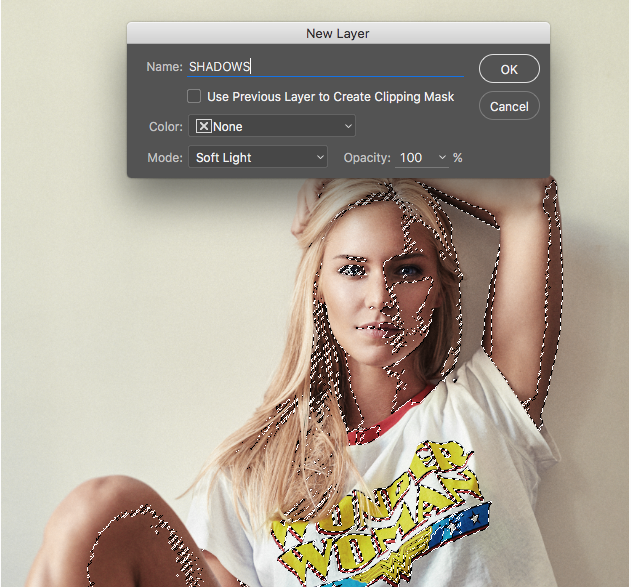

With my layer created, I can now adjust its opacity until it suits my taste. Playing with the blending mode can also be a great idea. In most cases, "Soft Light" is an excellent choice, but not all the time. For example, if I wish to make the shadows lighter, but still red, I could use the "Screen" blending mode. Color can also be a great option if we do not want to alter the current luminosity of the image.
Once my primary color is correctly adjusted, I will start adding the two others the same way (don't forget to change the luminosity selection to create the mask). For this particular image, I want to keep a natural look, so orange seems like a perfect choice for mid-tones, as it will cover skin tones. The pink is also a good choice for the highlights as it will neutralize the slight green tint they have.
And there we go. It might seem a bit overwhelming at first, but it's quite easy to get a grasp of this technique. You can even refine it by using better luminosity masks with panels such as Lumenzia, by playing around with the blending modes, or by creating color palettes to suit your style.
I will create a couple of complementary articles in the following weeks to help you understand the meaning and use of each color, how blending modes can affect your layers, what kind of palette will work best in what cases, and better ways to create luminosity masks. So, be sure to stay tuned if you want to learn more about color grading your images.


Join the Fstoppers community for free
-
Post comments and join in the discussions
-
Browse the site ad-free
-
Share your work and get featured in the community
-
Compete in the photo contests for fun and prizes
26 Comments
Very informative and useful. Good read.
thank you.
Great!! Thanks, very useful and good infos!
Loved seeing an article about this! Kuler is a great PS extension for this too if that helps anyone.
I use both, Paletton and Kuler. Kuler is a great option when working offline but whenever I'm connected and can access Paletton, I use it. The fact that it gives 5 different variations for each color is awesome. I also find it more intuitive than Kuler :) But only a matter of taste, both will yield a very similar result.
Thanks for the great read Quentin. Have you tried using the Adobe Color Wheel? https://color.adobe.com/create/color-wheel/
If so, what do you think in comparison to Paletton?
Adobe's color wheel website is actually the same as Kuler. Kuler is just easier to use for Photoshop users as it is a panel :) So same thought as above, Paletton gives you 5 different variations for each color (easier when toning or trying to balance out an image) and the "fine tuning" tab makes it very easy to create a palette that matches what you desire (pastel, greyish, etc.).
Only thing I wish is that Paletton was available as a panel/plugin for Photoshop. It would become simply perfect!
Excellent! Will give it a shot soon :)
"Having both next to each other might give you the impression of having pushed both color gradings too far." This is so an issue I have all the time. Turn a layer or full folder on and off and I think "ack, that's too big of a change..." I need to learn to let it settle in my head.
This is a common issue amongst retouchers/photographers. The best thing is to take regular breaks and to keep things organized to be able to adjust every change you made if needed :)
(i put my comment to a wrong place :-) )
Thanks for the post Quentin. Just wanted to say that in my opinion, you have been posting the best and most useful articles on Fstoppers for the last while. Keep it up!
Thank you Derek, it means a lot :)
I think the same. I always looking forward a new article from you! ;-) And usually read them a couple of times..:-) Please do more articles about color correction also! I mean for example how to use the gradient map for correcting colors! :-)
Thanks
Awesome. I love tutorials like this. Some might say you have oversimplified color grading. But I say you have helped people get started which is usually what I am looking for. I will play around with this for hours now and learn lots more. Thanks for taking the time to share this.
Great post, love this kind of information
Thanks!!
Thank you so much. It is extremely useful!
Thank you Quentin! This is a really good article. Looking forward to read the next ones of the series.
This was really helpful! Thank you so much.
Excellent tutorial! Thank you for posting this. I just put it to use in a recent session and I'm really happy with the results.
I do have a software related question though. I have Photoshop CS4 and when I went to Color Range and selected highlights, midtones, and shadows the fuzziness and range sliders were disabled. The fuzziness slider only works on sampled colors and the range slider does not work at all. Did anyone else have this problem?
I've never encountered or even seen this issue before. In a couple of articles I had in mind for this series, one will touch on the different ways to create luminosity masks. Perhaps the other techniques will work better on CS4 :)
How did you come up with 5F0101? I looks like to get that you moved the shades in the Paletton is that right? Good article.
I used the darkest shade offered by Paletton for my initial color (I circled it in green on the image) ;)
Hi! Do a video on this!.. :)