
Whether you're just starting out or are a professional photographer, knowing how to properly use a tone curve is one of the most important editing techniques you can learn. In this video and article I'll show you everything you need to get started in less than 5 minutes.
Firstly, I highly encourage you to watch the video as it explains a wealth of information quite quickly and a lot more fluidly than I can show in text. If you're a text based learner and want to follow along that way, that's okay too! I'll be using the same examples I used in the video within this article so you could even do both.
It's already given away in the title but to me the tone curve is the best tool you should learn when you're starting out in editing. If you could apply multiple tone curves in Lightroom (like you can in Photoshop) you could potentially edit your entire photo just using the same tool. It can adjust your exposure, add contrast, manipulate color, even fix white balance issues if you absolutely had too. It really does it all, but to start out simple, we're going to use it in it's most basic form in our first example to add contrast.
The Basics
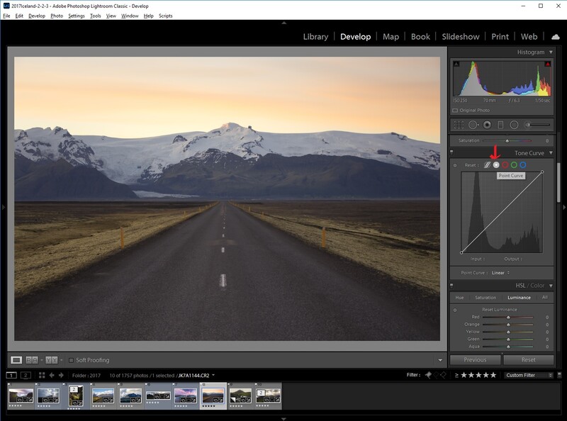
First thing you'll want to do is find an image you want to edit, I hope you have one of those! Open it in Lightroom and scroll down to the tone curve and select the point curve button. That will show you a slightly more advanced version of the tone curve and certainly the one you should be learning.
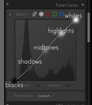
The most common use of a tone curve is to simply add contrast into an image. Above you'll see a tone curve I have added 5 points to and marked what each point represents in terms of how each of them manipulates light value. You can add points simply by clicking anywhere in grid and you can remove points by double clicking them. Just like the basic corrections in Lightroom, the tone curve can adjust blacks, shadows, midtones, highlights, and whites. One thing you'll hear over and over again when learning to edit is to add contrast by adding an "S" curve which is simply just bringing down the shadows and brightening the highlights in your image using these points on a curve. This is the most typical application when using the tone curve.
Adding a Look
Now that you have a basic understanding of the tone curve, what else can it do? This is really where things start to get interesting and you can start developing a look by just using the tone curve.
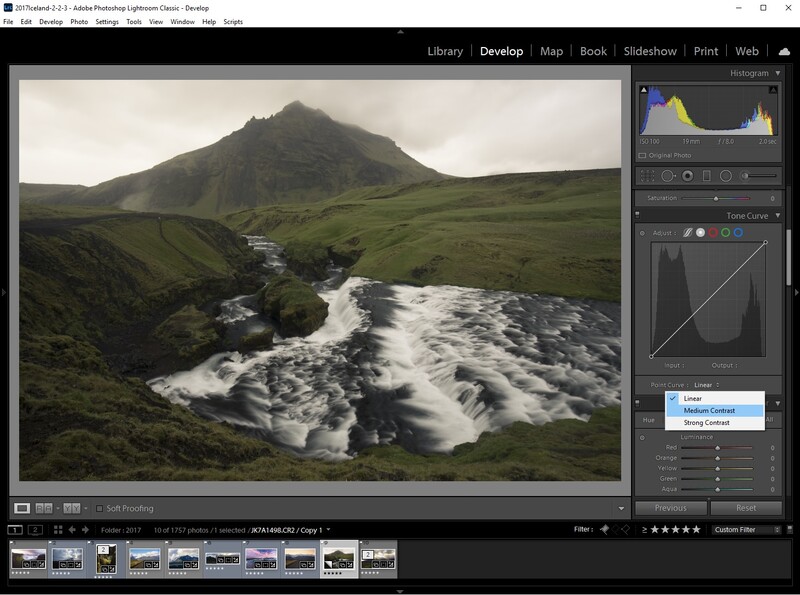
Let's open another image, one more suited for this example. All I'm going to do is add a basic "S" curve by selecting the medium contrast setting already built into Lightroom.
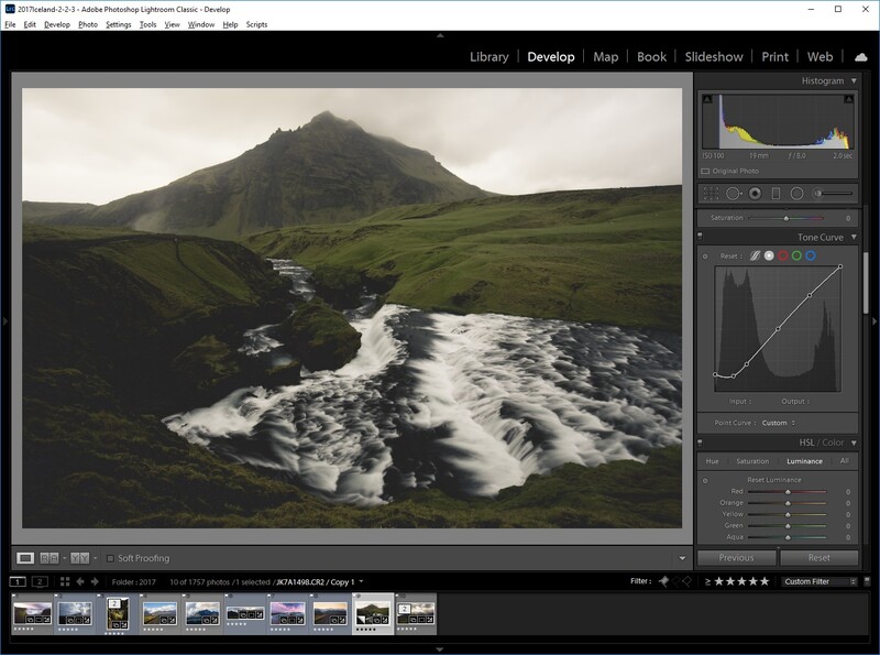
Next I'm simply going to raise up the black levels up, the dot located all the way in the bottom left, which will effectively mean my image doesn't have any true black values anymore and gives the entire image a somewhat faded film look which is used by many photographers out there. This might seem overly simple but learning the concept to think outside the box with points is important and it leads us to our last image.
Manipulating Color
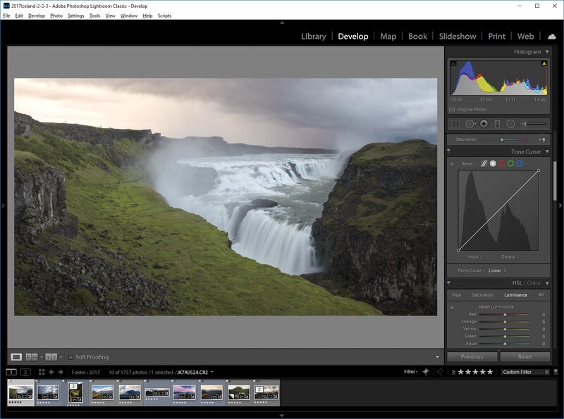
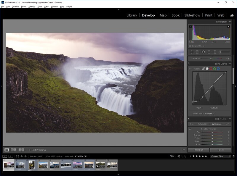
Building upon what you've learned we can now use the tone curve to it's full potential by changing color values to give us an even more stylized look or simply fixing issues you might have in an image. For this I'll be using an image that has a hint of other colors in it just to show how powerful using this can be.
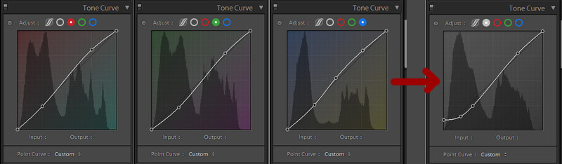
For this we are going to manipulate each color's curve separately. To do this just select the red, green, or blue channel above and add an "S" curve in each or whichever one you'd like to manipulate. Take careful note here that my curves are done with intention to be slightly different thus changing color values in things like the shadows or highlights. For example notice in my green curve that I bring down the shadows far more here than I do in my red channel and that's because I want my shadow tones to have a red tone. Also make sure you add any final contrast last because each "S" curve you make within a specific color inherently changes light values thus adding or removing contrast.
Conclusion
As I say in the video, I think one of the best ways you can teach yourself the tone curve is simply by taking your own images and playing around with them. Find a photographer you like and try to match their style only using the tone curve. If you've ever bought a preset pack or used a filter the majority of them are essentially editing just like we did above to add a look or mood to an image. If you didn't touch anything else in Lightroom besides the basic edit section and the Tone curve you can produce an image ready for your social feeds quite quickly. If you want to add a bit more manipulation you could do something simple like this as well!
One of the other benefits of learning the tone curve through Lightroom is something I hinted at earlier in my post. Even though Lightroom only allowed one tone curve to be manipulated, once you get into more advanced editing techniques such as using Photoshop, you can add as many tone curves as you want and even adjust how they might apply to certain areas of an image. That means you can use it to adjust your exposure, shadows, highlights, it even slices, dices, and chops! Okay it might not do the last three but it really is extremely powerful and something every photographer should try to know inside and out.
I'd love to hear you you think down below and I hope for those of you reading who might be completely new to editing this was easy to digest and for those who might be a seasoned editor that you learned a new tool for your editing toolbox. Thanks for reading or watching!


Join the Fstoppers community for free
-
Post comments and join in the discussions
-
Browse the site ad-free
-
Share your work and get featured in the community
-
Compete in the photo contests for fun and prizes
13 Comments
Well done Alex!
Thank you Derek!
Funny to see a picture from Gullfoss when I was just there a few hours ago.
You trying to rub it in our faces huh? MEANWHILE I can't even fly! Hehehe :)
Thanks, Alex, well worth watching.
Thanks Mark!
Appreciate the written tutorial. Wish more authors would do that.
You're quite welcome! I try to write up helpful stuff for every video I post.
Why I got the feeling that the "before" look better than the "after"?! may be the nail in the nose to blame?
It's not a photo I'd put in my portfolio with that edit either, so I don't blame you. It was just a great photo to use for an example and also one that, to me, is more accessible to people. Using photos with insane light, crazy stacked or blended isn't accessible to as many people and I wanted to keep it simple.
Nice work! I've been using tone curves for my contrast adjustment for quite some time now. Better than the global contrast adjustment.
More control is always good, especially when it doesn't require much extra effort.
I believe darktable allows you to apply multiple curves.