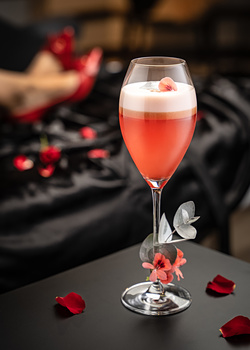
Contest Submissions
Click on the thumbnails below to comment and rate each image.
Click here to learn about the Fstoppers rating system and what each star value means.
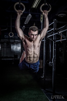
Click on the thumbnails below to comment and rate each image.
Click here to learn about the Fstoppers rating system and what each star value means.


3 Comments
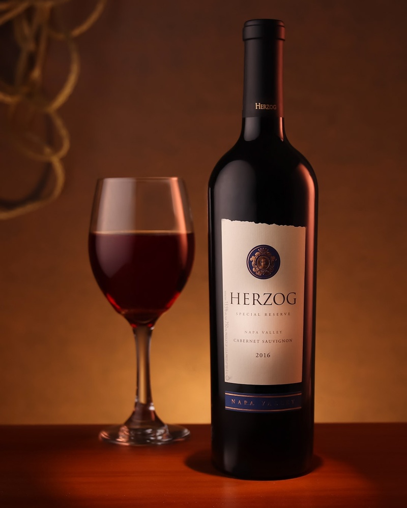
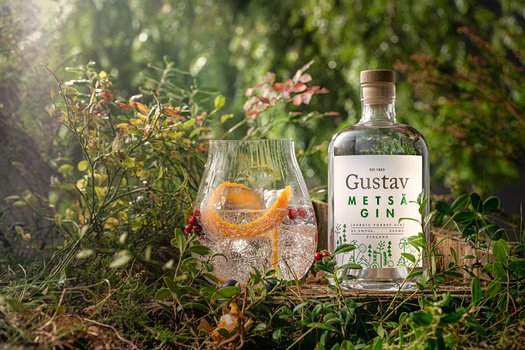
Nice shot, but the out of focus glass is distracting.
I like the shot, have to agree on the glass, maybe a higher aperture... the cord in the back is really bad. Not that I could have done any better, but I kind of feel the spot on the label needed either better fall off or of it was done in post to have feathered it back quite a bit. Nice lighting otherwise
Gave a 3. Solid shot, not perfect. Something I feel most fail to realize on the rating scale...
I disagree in part with the others. There’s alot of good stuff going on here. The label in front is great, I would have removed the size fine print on the side though for the neck label, love the light, but needed to turn so the herzog would be centered, either in post or in real if allowed.
Bottoms label needed its own light for sure though so it was legs legible.
The glass being out of focus is a personal preference, I don’t mind it.
The chord on the back I don’t really get. But also didn’t get it when Carl Taylor did it either in one of his tutorials. Where I assume you got the inspiration. This is quite similar to one of his.