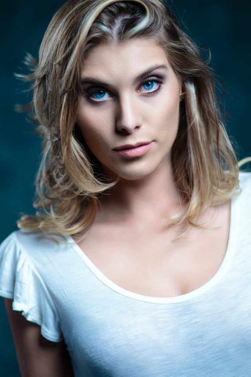
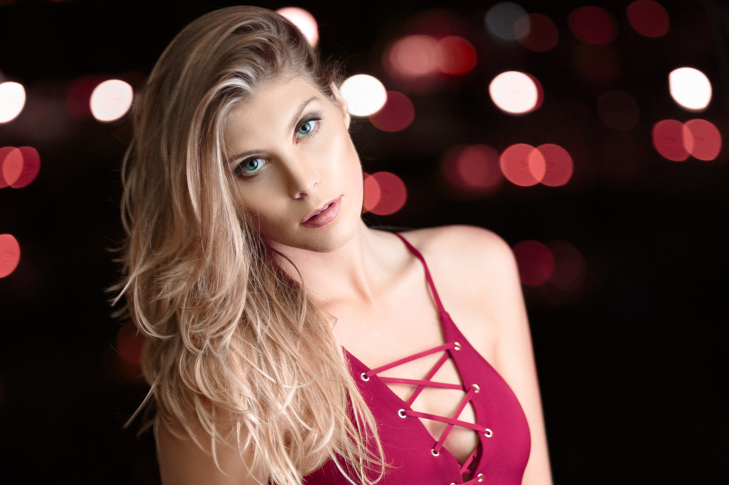
Critique?
Anyone care to critique these images for me? I'm new to the portrait photography game and am happy to hear any comments you may have.
Thanks!
Anyone care to critique these images for me? I'm new to the portrait photography game and am happy to hear any comments you may have.
Thanks!
Another visit to our garden using a vintage lens (Canon FD 50mm f/1.4) on my Canon R5.
"Reaching" - 'Sambucus nigra', as my wife calls it, or Black Lace Elderberry for the rest of us.
Hi all, I was looking for such a group but see that although there are many members there hasn’t been a single post. Is there interest out there in getting this group going?
I thought I would try out my 50 year old lenses: Canon FD 50mm f/1.5 SSC and Canon FD 28mm f/2.8 on my Canon R5 with the use of the appropriate adapter.


These photos were taken just outside of a small town in central Portugal.


2 Comments
First image is not sharp anywhere. The focus point might be on the lips, but not sure. It looks blurry altogether. Second one looks good, but tilted. With the angle her head is, plus the angle of her body, it feels like the hole image is tilted. Second one looks great lighting wise though.
Hi Sean.
First up...the eye colour and detail in both images certainly captures the attention. Something often overlooked. Well done.
On image 1: Attention to the face is diminished due to the overexposure top of breasts. A third to half a stop less light would balance things, allowing her face to remain the dominant feature.
On Image 2: With all the night-life out on the town lighting, combined with the foxy dress, it suggests this is a fun 'come and get me' type photo. With really well matched colours and nice lighting, Sean, your sitter appears to be just 'gazing' into the lens....almost a wee bit vacant or 'out-to-lunch'. Even a hint of a cheeky smile would be enough to give this otherwise well executed photo, a much stronger vibe.
Hence...the top image model is far more purposeful in her intent, which to me makes for a far more dynamic result.
Regards
Greg