Looking for honest comments and suggestions.
What do you think and how could it be made better?

What do you think and how could it be made better?
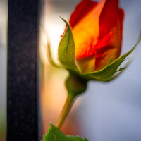
Another visit to our garden using a vintage lens (Canon FD 50mm f/1.4) on my Canon R5.
"Reaching" - 'Sambucus nigra', as my wife calls it, or Black Lace Elderberry for the rest of us.
Hi all, I was looking for such a group but see that although there are many members there hasn’t been a single post. Is there interest out there in getting this group going?
I thought I would try out my 50 year old lenses: Canon FD 50mm f/1.5 SSC and Canon FD 28mm f/2.8 on my Canon R5 with the use of the appropriate adapter.


These photos were taken just outside of a small town in central Portugal.


7 Comments
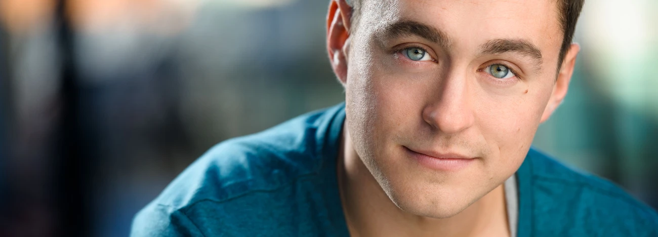
The background isn't great and the colours are strange.
She does have, maybe a green tint, and I am not sure what is in focus. Lighting is a bit flat.
I played with the colors a little bit...what do you think?
After Joseph adjusted the exposure and white balance it is better. Would be good to read up on white balance. Love the color harmony of the coat, wall and face. It isn’t a horrible picture. It could be better though. Your posting here shows you are willing to learn. I hope the following is helpful.
Watch your background. See how the wall corner is cutting through her face. I would have moved her forward until that corner was behind her. Then crop right above her head so the corner line isn’t coming out of her head. The flowers are the brightest thing in the picture. Also they don’t fix into your color pallet. They fight the eye for attention. You want the attention on her face. I would try this again without them. Fix her stray hair strands. Also have her lift her chin so there is more light on it or use a reflector under her face. Leave out the vignette. I like the soft light on her face.
I think you’re off to a good start. Practice practice practice.
The vignetting is too much. Joseph's edit below lessened that effect, while punching up the background.
Composition is off hair is a mess
It's just a horrible photo
It doesn't seem to be quite in focus to me. Did you make sure a focus point was in the eye? Focus and re-compose is very unreliable.
Ignore the comment about composition - the shot is actually a nice example of using thirds points.