
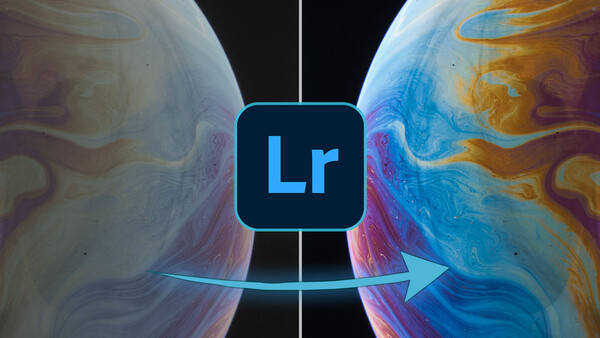
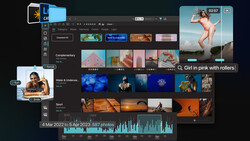
Photos often lack a real punch when we import them for editing, this is especially apparent when importing raw files to Lightroom because it strips the shot of the overriding camera settings making them seem lackluster. Luckily, there are 10 simple ways you can make your colors pop once again.
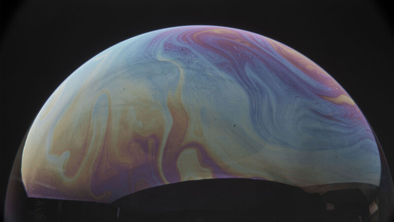
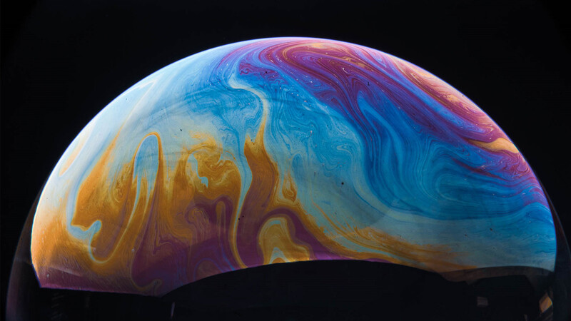
If you've ever gone to process images in Lightroom and wondered what happened between taking the shot and getting it into your computer for editing, you're not alone. There are many reasons why photographs look less impressive when viewing them at home or on a larger monitor when compared with the rear screen on your digital camera. One reason might be that you're capturing in raw file format in which case the camera's settings can be stripped upon import. Another might be that your camera's rear screen is set up to display vibrant colors and contrast, making photos seem more impressive than they really are. Whatever the reason, there are 10 surefire ways to make colors pop in your photos. Just use the before and after image below to see how much of a transformation you can make with these easy steps.
1. Take Control of the Tone
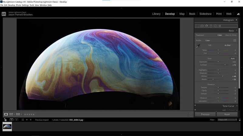
First up, this step might not be what you had in mind when talking about making the colors pop. After all, there's no real specific color control in this initial edit at all. However, boosting tone controls in the Basic panel such as Contrast, Whites, and Blacks can enhance the overall dynamic range in a shot, therefore making the photo appear more vibrant.
I've added much more contrast here (+72) and boosted the Whites slider to +48 and Blacks to -53 to make the bright sections brighter, and dark sections darker. In doing this there's a kind of frequency separation where each color has become more apparent in the overall shot.
2. Add Some Presence
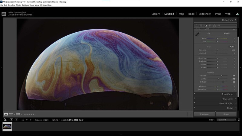
If your tone values are fine then perhaps you'll need to move to the next stop: the Presence pane. Still, within the Basic panel, we'll move down slightly to take control of the localized contrasts applied across the frame. I've added a heavy amount of Dehaze here (+60) to cut away some of the mid-tone gray mush that plagues this photo. I then added a little Clarity (+10) to enhance midtone contrast, enhancing each color and pattern in the photo. I then boosted the Texture slider (+47) to give everything a little more grit and sharpen the tones within the scene. Although not controlling color directly, by improving specific bands of contrast across the image like this we're able to make them perceptibly more apparent.
3. Boost the Vibrance
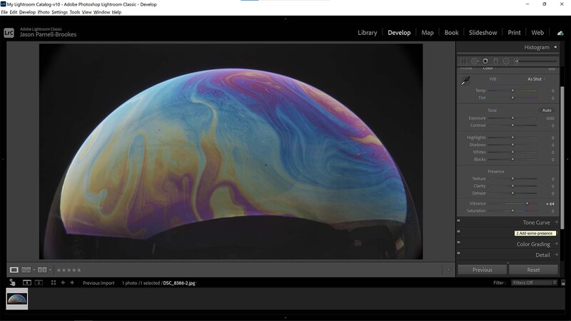
Now we're really starting to turn up the heat. In this step, I'm using the Vibrance slider to literally alter the color levels in the shot. The Vibrance slider differs from the Saturation slider in one key way: it doesn't allow colors to clip. It works intelligently to lift the subtler colors in the image whilst leaving already well-established colors alone so that the image never distorts. Now, this may not be useful in every photo as you might want to keep the different intensities of the color gamut the same throughout the frame, but it's an excellent way to enhance color presence without making a mess of the photo.
4. Increase the Saturation
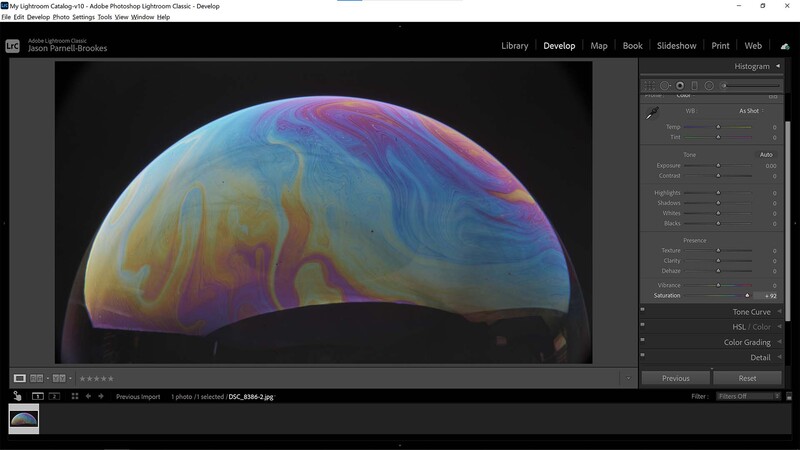
Time for one of the most obvious ways to enhance the color in your photos, it's the Saturation slider. As you might expect from this tool it will simultaneously raise the intensity of all colors in the frame equally. That makes it the ideal tool for simply adding more intense colors to a photo that already has a good balance that you'd want to preserve. Because my example image is so muted I've added +92 on the Saturation slider and things still look good, but it's important to be aware that the Saturation slider can distort colors if you push it too far. Occasionally, it's better to have a balance between the Saturation and Vibrance sliders so that you can avoid clipping.
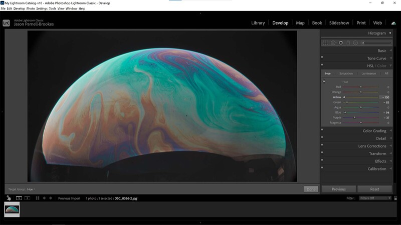
5. Change the HSL/Color Panel
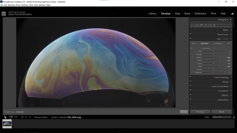
For those used to Lightroom, or who are happy moving to a more intermediate level of color wrangling, the HSL/Color panel may be of more use. Within this panel you can pick out specific color bands (red, orange, yellow etc) and alter not only the saturation but their hue and luminance as well. By selectively boosting specific colors the HSL panel gives much more control over the intensity of particular areas in the image. This can be especially useful for portraiture when boosting general saturation can distort natural skin tones.
If you're unsure of the color that you need to alter simply click on the radio button icon on the left side of the HSL/Color panel and then click and drag on the area you desire you change. By dragging up and down you'll see the slider/s moving in the panel, making adjustments to this area and others of comparable color and tone.
6. Extra Change With the Hue Section
To carry on from the above step, it's important to take note of the Hue section of the HSL/Color panel. Sometimes, no matter how accurate we make the white balance, things can sometimes look off. So by using the selective tool function as described above we can slip specific bandwidths of colors to different hues.
7. Time to Color Grade
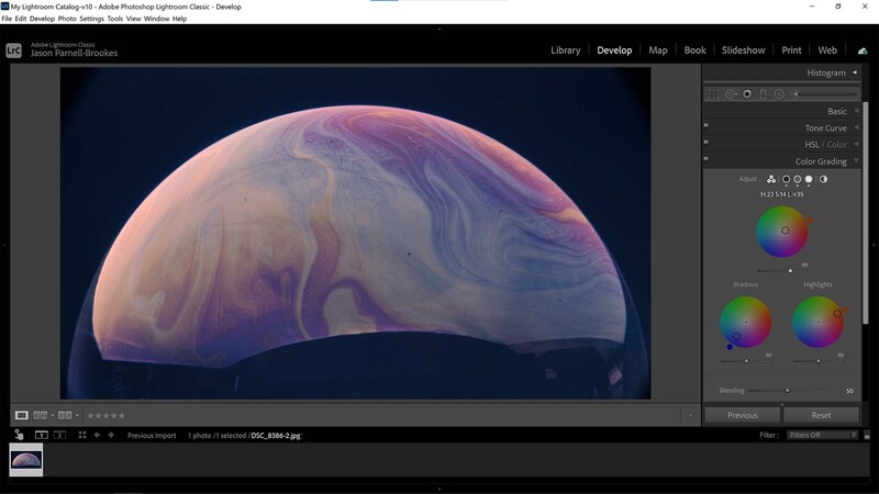
The HSL/Color panel is great for manipulating colors in your photos with extreme precision, but often it isn't necessary to get into such detail. A balance between this fine-tuned approach and a more general option such as the saturation slider is to use the Color Grading feature in Lightroom.
By Color Grading a photo we can split the scene into three: shadows, midtones, and highlights. Click and drag on the colored circles to emphasize specific color tones in the image depending on how light or dark the sections are. It's a helpful way to get more control of color separation while also blending adjustments evenly throughout the scene. If you've ever done any kind of color grading on videos you'll notice the similarity of the user interface.
8. Grade Color Globally

It's also possible to get even more general by flipping to the Global adjustment tool within the Color Grading panel. From here, as with the separate controls, we can influence the hues and intensity of colors by manipulating the selective cursor within the colored wheel. The brightness of this color influence can also be altered by adjusting the Luminance slider below the color wheel. This tool gives a more homogenous approach to color grading, great if you just need to make a quick adjustment.
9. For Best Results Combine Techniques
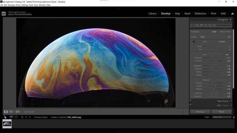
You saw it coming, this is where I say you should try all the options above and put them together. Now, I'm not saying you have to use every tool all at once on every photo — far from it! But by knowing how each tool works we can start to combine the above steps to edit a photograph until the colors pop extraordinarily. In the example above I've adjusted tone, presence, and some HSL controls in order to make a photo that's bright, colorful, and punchy without becoming distorted or overexposed. I'm specifically looking to remove any drab gray or middle tones that appear in the photo here as I want a decisive separation between colors and shades.
10. Add a Preset for a Final Polish
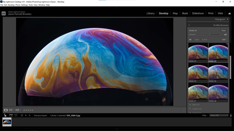
Once you've perfected the colors in your photo, and perhaps have tweaked some of the tone controls to make the image super bright and eye-catching, you should look at the profile presets available within Lightroom. Although some will turn their nose up at presets, I find it can be beneficial to add a final polish to the shot in order to bring everything together. Click on the browse option and in the Profile Browser, you'll be met with many different types of presets, all with their own unique tone and color controls. For my image, I found that the Artistic 04 preset was good at preserving original colors whilst adding a crisp contrast to the scene.
This preset won't work for every photo though, as it depends on the colors and shades already present in the photo. It's good to experiment with this though and you can preview the effect before applying it by either referencing the thumbnails provided or by hovering your cursor over each preset to have the effect overlaid across the full-size image.
If you'd like to learn how to use Adobe Lightroom more efficiently on any device, make sure to check out our Mastering Adobe Lightroom course with Pye Jirsa. The content Pye covers will appeal to every level of photographer and will save you an incredible amount of time on your image editing. Save 15% by using "ARTICLE" at checkout.


Join the Fstoppers community for free
-
Post comments and join in the discussions
-
Browse the site ad-free
-
Share your work and get featured in the community
-
Compete in the photo contests for fun and prizes
4 Comments
What about the Calibration panel??
Presets should be one of the first things you do.
This tutorial is the equivalent of 'Draw 2 circles'
Next Slide
' And now you have a realistic Lion! See? Easy!'