Lightroom’s fall update adds a small control with big impact on color control. If you fight uneven skies or blotchy foliage, this new option helps you smooth or separate tones without wrecking the rest of the frame.
Coming to you from Christian Möhrle - The Phlog Photography, this practical video shows how the new Variance slider inside Point Color works and where it sits in the Color Mixer. You sample a color with the eyedropper, then use hue, saturation, luminance, and the new Variance control to shape that color. Push Variance up to pull nearby hues apart, pull it down to compress a range into a more uniform tone. Used on a sampled blue, it can even out a sky that a circular polarizing filter made patchy. Apply it inside a mask so the rest of the image does not shift, a key move if you have water or clothing with similar blues around the frame.
The walkthrough starts with smart global work that sets you up to use Variance well. Raise exposure to open shadows, bring blacks and shadows up to protect tonality, then nudge highlights down to hold detail. Warm the white balance for autumn color, add a touch of texture and clarity for bite, and use a light drop in dehaze to keep a soft glow in the atmosphere. This stabilizes the file so the color moves you make later look intentional instead of corrective.
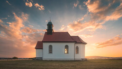
Masking is where Variance becomes surgical. A Sky mask isolates the blue channel so pulling Variance down evens the gradient caused by polarization. A second mask with a linear gradient targets only the upper sky so you can darken the crown and keep the horizon bright, which builds depth without a heavy-handed vignette. Another mask inverts the sky to work the land, then intersects with a radial selection over the small castle to nudge whites, clarity, and texture so the subject reads cleanly at a glance. You also see a targeted Color Range mask grabbing warm foliage so you can lift exposure and temperature just a hair, a safer move than cranking global saturation.
Color work continues in the Mixer with a gentle shift of orange and yellow hues toward warmer values, and a small move in blue hue for a subtle cyan sky. Saturation tweaks keep the warm palette lively while aqua comes down to tame oddities in the bright blue areas. Split toning adds a warm highlight and midtone wash at very low saturation, then Calibration pushes blue primary hue and saturation for a familiar pop many landscape editors like. These touches are restrained, which matters when you have already used masks and Variance to do the heavy lifting on color separation.
Sharpening gets done with a low radius, high detail, and strong masking so you sharpen edges, not noise. Distraction cleanup happens in Photoshop using the Remove tool on a duplicate layer. It works well on small groups of people and clutter, and Adobe’s guide covers the feature if you have not used it yet. Work in small passes to avoid smearing or “fingerprints,” and keep the Healing Brush or Clone Stamp handy for a quick polish on anything the AI guesses wrong. Check out the video above for the full rundown from Möhrle.

Join the Fstoppers community for free
-
Post comments and join in the discussions
-
Browse the site ad-free
-
Share your work and get featured in the community
-
Compete in the photo contests for fun and prizes
1 Comment
In one video, users of Lightroom can sure learn a lot about the fine art of masking and colour grading. It’s brilliant!